Here is something to get you started (adapted from another answer I gave https://stackoverflow.com/a/59856544/9792594):
(Using svg for the shape and inserting normal html inside (with <foreignobject/>) and outside. Note: smil and javascript for animation - optional)

Demo here (and below) https://codepen.io/Alexander9111/pen/JjdbMqM
You can set the "control point" of the bezier curve to create different curvature etc. - https://developer.mozilla.org/en-US/docs/Web/SVG/Tutorial/Paths#Bezier_Curves)
const target = document.querySelector("#target");
const animate_el = document.querySelector("#target > animate");
const from = animate_el.getAttribute("from");
const to = animate_el.getAttribute("to");
var d;

function forwards(){
  d = target.getAttribute("d");
  animate_el.setAttribute("from", d);
  animate_el.setAttribute("to", to);
  animate_el.beginElement();
}

function backwards(){
  d = target.getAttribute("d");
  animate_el.setAttribute("from", d);
  animate_el.setAttribute("to", from);
  animate_el.beginElement();
}

document.querySelector("#input_div > input").addEventListener('focus', forwards);
document.querySelector("#input_div > input").addEventListener('blur', backwards);
div.container {
float: left;
clear: left;
box-sizing: border-box;
padding-left: 0;
padding-right:0;
padding-top:0;
padding-bottom: 100px;
border: 1px solid black;
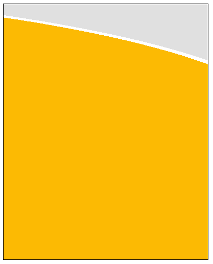
background: linear-gradient(to bottom, #e0e0e0 20%, #fcba03 20%);
}
button, svg {
float: left;
margin: 5px;
}
svg {
clear: left;
margin: 0;
}
#input_row {
float: left;
clear: left;
width: 390px;
}
#input_div {
padding-left: 20%;
}
input {
width: 100%;
text-align: center;
clear: left;
}
<div class="container">
<svg height="400" width="400">
  <path id="target" d="M-5 200 H410 V80 Q 250 40 -5 20 Z" fill="#fcba03" stroke="#ffffff" stroke-width="7">
        <animate
       attributeName="d" from="M-5 200 H410 V80 Q 250 40 -5 20 Z" to="M-5 200 H410 V20 Q 150 20 -5 20 Z"
       dur="0.5s" repeatCount="1" begin="indefinite" fill="freeze" />
  </path>
  <rect id="target2" x="-5" y="195" width="410" height="10" fill="#fcba03">
  </rect>
<foreignobject class="node" x="0" y="250" width="100%" height="100">
<div id="input_row">
  <div id="input_div">
    <label>Enter here: </label>
    <input placeholder="type something here" vlaue =""/>
    <small>Animation takes place on focus and returns again on blur</small>
  </div>
</div>
</foreignobject>
</svg>
</div>
UPDATE - much easier solution with css
Check this out:
Most important line is the combination of two gradients (and using rgba with alpha set to zero for the linear gradient, so not to cover the radial gradient):
background: linear-gradient(to bottom, rgba(255, 255, 255, 0) 0% 40%, #fcba03 40% 100%),
    radial-gradient(farthest-corner at -900px 250px, #fcba03 80%, #ffffff 80% 81%, #e0e0e0 81%);
div.container2 {
  float: left;
  clear: left;
  box-sizing: border-box;
  padding-left: 0;
  padding-right:0;
  padding-top:0;
  padding-bottom: 100px;
  border: 1px solid black;
  background: linear-gradient(to bottom, rgba(255, 255, 255, 0) 0% 40%, #fcba03 40% 100%), radial-gradient(farthest-corner at -900px 250px, #fcba03 80%, #ffffff 80% 81%, #e0e0e0 81%);
}
<div class="container2" style="margin-top: 20px; margin-bottom: 20px;">
  <div style="height: 400px; width:400px;">
  </div>
</div>


