
Hello People.
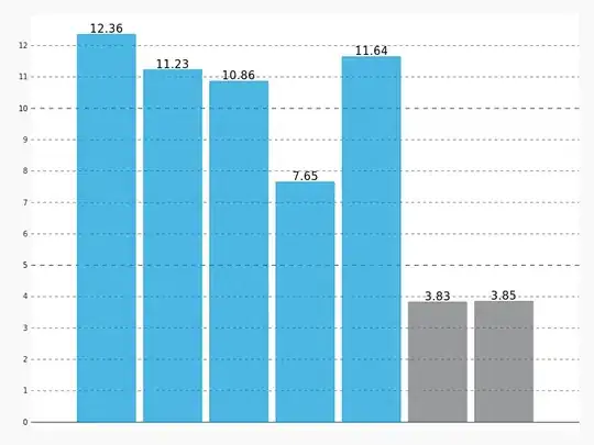
I would like to use pygal to plot an image as shown in the one above:
Plotting the same series with different colors based on the x_label. What I would like to show, basically, is the difference between weekdays and weekends.
However, it seems that pygal only allows color settings per series.
What I was able to accomplish so far is one of the following:
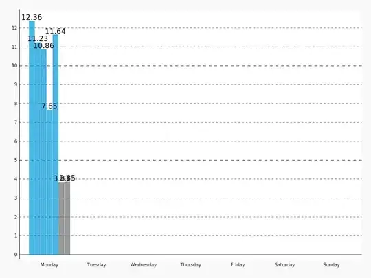
1- consider each day of the week as a series of its own, with a color of its own, without showing the x_lables.
code:
import pygal
from pygal.style import Style

y_values = [12.85, 12.78, 13.74, 16.73, 12.52, 3.71, 1.96]
x_labels = ["Mon", "Tue", "Wed", "Thu", "Fri", "Sat", "Sun"]
filename = 'barchar_test.png'


chart_config = {
    "human_readable": True,
    "pretty_print": True,
    "truncate_legend": -1,
    "value_font_size": 15,
    "print_values": True,
    "show_legend": False,
    "print_values_position": "top",
    "print_labels": True,
    "value_formatter": lambda x: "{0: .2f}".format(x),
}
style_config = {
    "font_family": "googlefont:lato",
    "plot_background": "white",
    "value_font_size": 15,
    "show_y_guides": False,
    "show_y_labels": False,
    "colors": ("#0099d6", "#0099d6", "#0099d6", "#0099d6", "#0099d6", "#6d6f71", "#6d6f71"),
}

def _plot_bar_chart(y_values, x_labels, filename):
    bar_chart = pygal.Bar(style=Style(**style_config), **chart_config)
    for i, item in enumerate(y_values):
        bar_chart.add(
            x_labels[i], {item},
        )
    bar_chart.render_to_png(filename)

_plot_bar_chart(y_values, x_labels, filename)
2- consider the values as one series, displaying the x_labels, but only in one color:
 code:
code:
    dimport pygal
from pygal.style import Style

y_values = [12.85, 12.78, 13.74, 16.73, 12.52, 3.71, 1.96]
x_labels = ["Mon", "Tue", "Wed", "Thu", "Fri", "Sat", "Sun"]
filename = 'barchar_test.png'


chart_config = {
    "human_readable": True,
    "pretty_print": True,
    "truncate_legend": -1,
    "value_font_size": 15,
    "print_values": True,
    "show_legend": False,
    "print_values_position": "top",
    "print_labels": True,
    "value_formatter": lambda x: "{0: .2f}".format(x),
}
style_config = {
    "font_family": "googlefont:lato",
    "plot_background": "white",
    "value_font_size": 15,
    "show_y_guides": False,
    "show_y_labels": False,
    "colors": ("#0099d6", "#0099d6", "#0099d6", "#0099d6", "#0099d6", "#6d6f71", "#6d6f71"),
}

def _plot_bar_chart(y_values, x_labels, filename):
    bar_chart = pygal.Bar(style=Style(**style_config), **chart_config)
    bar_chart.x_labels = x_labels
    bar_chart.add('', y_values)
    bar_chart.render_to_png(filename)

_plot_bar_chart(y_values, x_labels, filename)
3- Consider the values as separate series, show the x_labels, but have all the bars stacked in the first x_label:
code:
import pygal
from pygal.style import Style

y_values = [12.85, 12.78, 13.74, 16.73, 12.52, 3.71, 1.96]
x_labels = ["Mon", "Tue", "Wed", "Thu", "Fri", "Sat", "Sun"]
filename = 'barchar_test.png'


chart_config = {
    "human_readable": True,
    "pretty_print": True,
    "truncate_legend": -1,
    "value_font_size": 15,
    "print_values": True,
    "show_legend": False,
    "print_values_position": "top",
    "print_labels": True,
    "value_formatter": lambda x: "{0: .2f}".format(x),
}
style_config = {
    "font_family": "googlefont:lato",
    "plot_background": "white",
    "value_font_size": 15,
    "show_y_guides": False,
    "show_y_labels": False,
    "colors": ("#0099d6", "#0099d6", "#0099d6", "#0099d6", "#0099d6", "#6d6f71", "#6d6f71"),
}

def _plot_bar_chart(y_values, x_labels, filename):
    bar_chart = pygal.Bar(style=Style(**style_config), **chart_config)
    bar_chart.x_labels = x_labels
    for i, item in enumerate(y_values):
        bar_chart.add(
            x_labels[i], {item},
        )
    bar_chart.render_to_png(filename)

_plot_bar_chart(y_values, x_labels, filename)
Any thoughts on this?
Thanks :)