I am using card-columns class from Bootstrap 4 to design a page for my portfolio. Everything is fine but I want a change in the look so that it looks some more attractive.
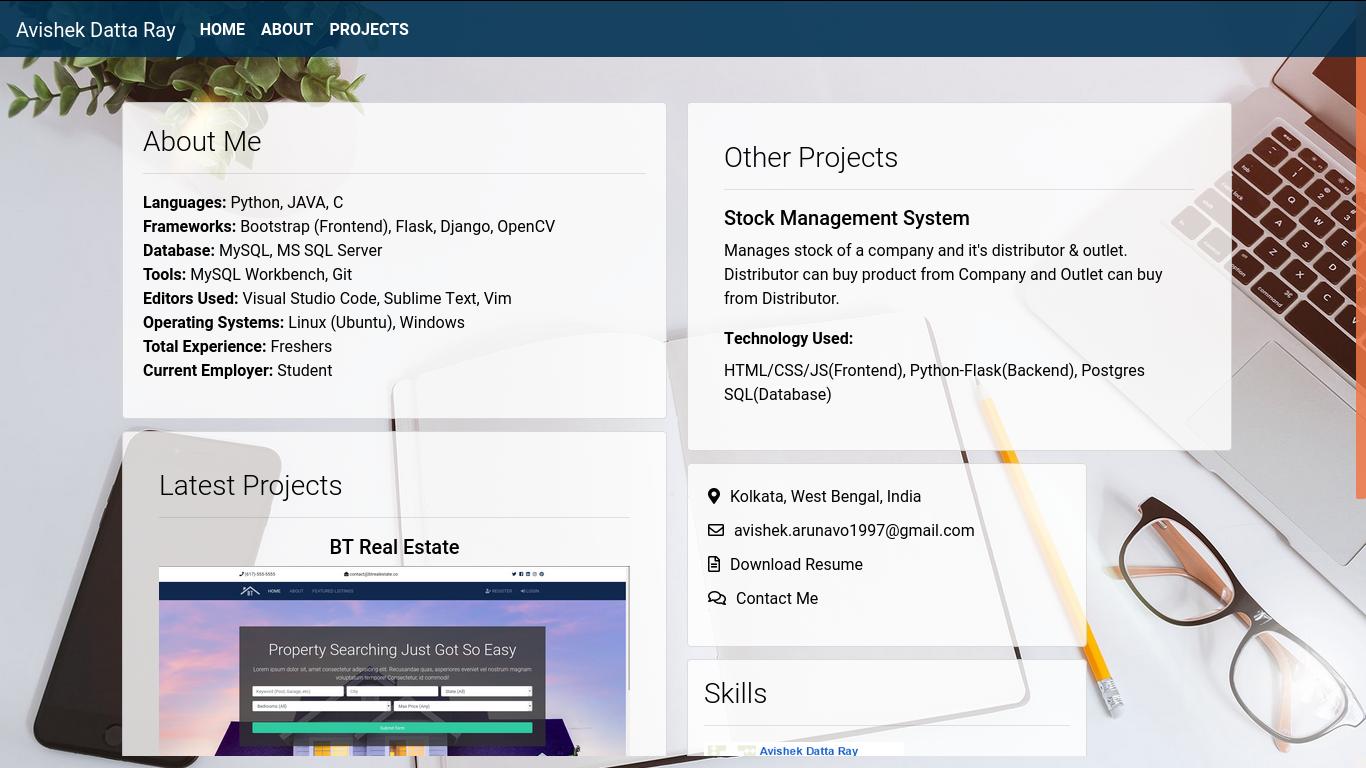
This is the design I have made. I want the Other Projects (same width as of Latest Projects) card to stay below Latest Projects so that the card below Other Projects (as per the current picture) stay on top of that column then Skills.
<div class="card-columns">
    <div class="card">
        <div class="card-body">
            <h3 class="card-title">About Me</h3>
            <hr>
            <div class="card-text">
                <ul>
                    <li><b>Languages:</b> Python, JAVA, C</li>
                    <li><b>Frameworks:</b> Bootstrap (Frontend), Flask, Django, OpenCV</li>
                    <li><b>Database:</b> MySQL, MS SQL Server</li>
                    <li><b>Tools:</b> MySQL Workbench, Git</li>
                    <li><b>Editors Used:</b> Visual Studio Code, Sublime Text, Vim</li>
                    <li><b>Operating Systems:</b> Linux (Ubuntu), Windows</li>
                    <li><b>Total Experience: </b>Freshers</li>
                    <li><b>Current Employer: </b>Student</li>
                </ul>
            </div>
        </div>
    </div>
    <div class="card p-3">
        <div class="card-body">
            <h3 class="card-title">Latest Projects</h3>
            <hr>
            <div class="card-text">
                <h5 class="text-center">BT Real Estate</h5>
                <img src="{{url_for('static', filename='pic/btre.png')}}" alt="BTRE" class="btre">
                <label style="font-size: 10pt;">
                    <b>Technology Used: </b>HTM/CSS/JS(Frontend), Python-Django(Backend), Postgres SQL(Database)
                </label>
            </div>
            <div class="row no-gutters">
                <div class="col-md-4">
                    <img src="{{url_for('static', filename='pic/rms.png')}}" class="card-img" alt="rms" height="150" style="margin-top: 30px;">
                </div>
                <div class="col-md-8">
                    <div class="card-body">
                        <h5 style="font-size: 1.2rem;">Reminder Management System</h5>
                        <label style="font-size: 12pt;"><b>Technology Used: </b></label>
                        <label>HTML/CSS/JS(Frontend), Python-Flask(Backend), Postgres SQL(Database)</label>
                    </div>
                </div>
            </div>
        </div>
    </div>
    <div class="card p-3">
        <div class="card-body">
            <h3 class="card-title">Other Projects</h3>
            <hr>
            <div class="card-text">
                <h5>Stock Management System</h5>
                <p>Manages stock of a company and it's distributor & outlet. Distributor can buy product from Company and Outlet can buy from Distributor.</p>
                <label><b>Technology Used: </b></label>
                <label>HTML/CSS/JS(Frontend), Python-Flask(Backend), Postgres SQL(Database)</label>
            </div>
        </div>
    </div>
    <div class="card" style="max-width: 25rem;">
        <div class="card-body">
            <div class="card-text">
                <ul>
                    <li class="contact"><i class="fas fa-map-marker-alt"></i>Kolkata, West Bengal, India</li>
                    <li class="contact"><i class="far fa-envelope"></i>avishek.arunavo1997@gmail.com</li>
                    <li class="contact"><i class="far fa-file-alt"></i>Download Resume</li>
                    <li class="contact"><i class="far fa-comments"></i>Contact Me</li>
                </ul>
            </div>
        </div>
    </div>
</div>
This is the template

.card-columns
{
    column-count: 2 !important;
    position: relative;
    top: 10%;
    transform: translateY(10%);
    -moz-transform: translateY(10%);
}
This is the card-columns css which I had edited for making 2 columns.
It will be great if you can help me out.