2

I calculated a linear-mixed model using the nlme package. I was evaluating a psychological treatment and used treatment condition and measurement point as predictors. I did post-hoc comparisons using the emmans package. So far so good, everything worked out well and I am looking forward to finish my thesis. There is only one problem left. I am really really bad in plotting. I want to plot the emmeans for the four measurement points for each group. The emmip function in emmeans does this, but I am not that happy with the result. I used the following code to generate the result:

emmip(HLM_IPANAT_pos, Gruppe~TP, CIs=TRUE) + theme_bw() + labs(x = "Zeit", y = "IPANAT-PA")

enter image description here

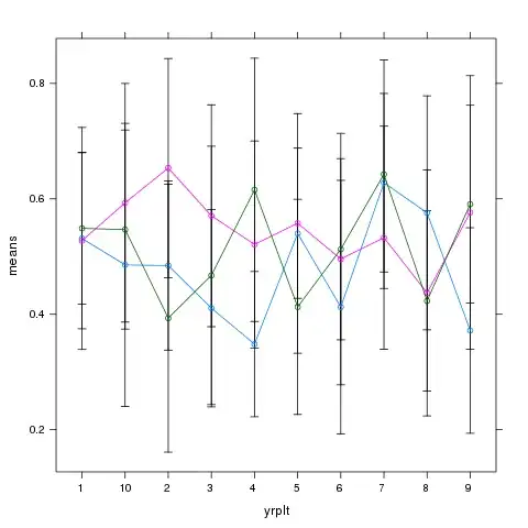
I don't like the way the confidence intervals are presented. I would prefer a line bar with "normal" confidence bars, like the one below, which is taken from Ireland et al. (2017). I tried to do it in excel, but did not find out how to integrate seperate confidence intervals for each line. So I was wondering if there was the possibility to do it using ggplot2. However, I do not know how to integrate the values I obtained using emmeans in ggplot. As I said, I really have no idea about plotting. Does someone know how to do it? This graphic is taken from Ireland et al (2017). I would like to create a plot like this

  • Could you provide a visual example of the type of plot you want to generate, maybe from another paper or web page? – ulfelder Dec 29 '19 at 11:04
  • Dear ulfelder, thanks for your comment. I just added the figure from Ireland et al. (2017). This is pretty much how I want the plot to look like. – Charlotte1408 Dec 29 '19 at 12:47

1 Answers1

2

I think it is possible. Rather than using emmip to create the plot, you could use emmeans to get the values for ggplot2. With ggplot2 and the data, you might be able to better control the format of the plot. Since I do not have your data, I can only suggest a few steps.
First, after fitting the model HLM_IPANAT_pos, get values using emmeans. Second, broom::tidy this object. Third, ggplot the above broom::tidy object.

Using mtcars data as an example:

library(emmeans)
# mtcars data
mtcars$cyl = as.factor(mtcars$cyl)
# Model
mymodel <- lm(mpg ~ cyl * am, data = mtcars)

# using ggplot2 
library(tidyverse)
broom::tidy(emmeans(mymodel,  ~ am | cyl)) %>% 
  mutate(cyl_x = as.numeric(as.character(cyl)) + 0.1*am) %>% 
  ggplot(aes(x = cyl_x, y = estimate, color = as.factor(am))) + 
  geom_point() + 
  geom_line() +
  geom_errorbar(aes(ymin = conf.low, ymax = conf.high), width = 0.1)

Created on 2019-12-29 by the reprex package (v0.3.0)

Zhiqiang Wang
  • 6,206
  • 2
  • 13
  • 27
  • 1
    This is a good answer; but remember you can always do something like `plot.data <- emmip(..., plotit = FALSE)`, thus obtaining a data frame containing all the information in the plot; you may then plot that any way you like. – Russ Lenth Dec 30 '19 at 18:04
  • This is more convenient than my approach. – Zhiqiang Wang Dec 30 '19 at 21:48