-2

I'm looking to plot the histogram of one uint16 image on the x axis and the histogram of another uint16 image on the y axis, such that I get a colormap of the relationship between them as a 2D plot.

this is the sort of plot I am after

I have tried to form two seperate histograms and then construct the 2D array in a loop however this is failing.

first = np.histogram(img1, bins = 1000)
first = first[0]


second = np.histogram(img2, bins = 1000)
second = second[0]


empty_array = np.zeros((1000,1000), dtype = np.float64)

for i in range(1000):
    for j in range(1000):
        empty_array[i,j] = first[j] + second[1000-j]
  • 1
    Sounds interesting. What have you tried to solve your problem? – warped Dec 15 '19 at 12:12
  • At the moment I have two histograms with the bin number and occurrences of each image. : eg hist1 = np.histogram(img1, bins = 1000), hist2 = np.histogram(img2, bins = 1000) . The result of this is two 1D arrays... my only thought is to have a for loop that can sum up the corresponding value pairs into a blank 2D array of size 1000*1000... but not really sure –  Dec 15 '19 at 12:51
  • Ok, so here is the thing that I don't understand: In order for you to make a scatter- or kde-plot from your images, there has to be some relationship between your individual images. How do you choose which pixel in the one image corresponds to which other one? Is it the same position? Can you share your original images? – warped Dec 15 '19 at 17:17
  • The images themselves are identical in terms of position but they are captured using different acquisition settings. unfortunately I am unable to share the images –  Dec 15 '19 at 20:13

2 Answers2

1

If you're trying to study the histogram of two variables and how they relate to each other in a single function, consider reading about multi-variate normal distributions. This would apply to studying distributions of pixels in a image for sure. https://juanitorduz.github.io/multivariate_normal/

It looks like this is what you were trying to do?:

import numpy as np
import matplotlib as mpl
import matplotlib.pyplot as plt
import seaborn as sns; sns.set(color_codes=True)
sns.set_context("notebook")
sns.set_style("darkgrid")


# %% Construct normal distribution data
n = 100
hist1 = np.random.normal(0,1,n)
hist2 = np.random.normal(0,1,n)

# %% Plot distributions on their own axis
sns.jointplot(x=hist1, y=hist2, kind="kde", space=0)

KDE Plot of multi-variate normal

A different process than the KDE plot that actually finds the multi-variate PDF that defines your data then plots the PDF. This time hist2 has a different distribution than hist1 which makes the spread on the contour plot different:

import numpy as np
import matplotlib as mpl
import matplotlib.pyplot as plt
import seaborn as sns; sns.set(color_codes=True)
sns.set_context("notebook")
sns.set_style("darkgrid")
from scipy.stats import multivariate_normal as mvn

# %% Create test data for multivariate PDF
n = 1000
hist1 = np.random.normal(0,1,n)
hist2 = np.random.normal(0,2,n)

# %% Calculate mean and covariance of data
mean = [hist1.mean(), hist2.mean()]
cov_mat = np.cov( np.array([hist1, hist2]) )

# %% Create multivariate function with calculated means and covariance
mv_norm_f = mvn(mean=mean, cov=cov_mat)

# %% Setup ranges of variables for PDF function
range = np.linspace(-1,1,n)
x, y = np.meshgrid(range, range, indexing='xy')
xy = np.empty(x.shape + (2,))
xy[:, :, 0] = x
xy[:, :, 1] = y
print(x.shape)
print(xy.shape)

# %% Call PDF function on ranges of variables
z = mv_norm_f.pdf( xy )

# %% Shaded contour plot the PDF
plt.figure()

plt.contourf(x, y, z)

plt.xlabel("X")
plt.ylabel("Y")
plt.colorbar()
plt.grid('on')
plt.show()
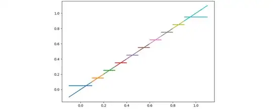
Shaded contour plot of multi-variate PDF

kilozulu
  • 347
  • 1
  • 9
1

This is a solution using seaborn, as already suggested by @kilozulu. I would not use data that is already binned to generate this plot, because you are losing the association of data points between the two images. Rather, feed in the pixel intentities directly:

import seaborn as sns
import numpy as np
import matplotlib.pyplot as plt

#dummy images
img1 = np.random.normal(0,10,(100,100))
img2 = np.random.normal(0,10,(100,100))

# make jointplot with linearised images:
sns.jointplot(img1.ravel(), img2.ravel(), kind='kde')

enter image description here

warped
  • 8,947
  • 3
  • 22
  • 49
  • That's a good point, using ravel on a 2D array of pixels will ensure the indexing matches up between images, provided the two images are the same size. This way `Img1` and `Img2` will share the same indexes for seaborn's KDE calculation to properly resolve the relationships between the two variables. – kilozulu Dec 16 '19 at 00:12
  • @kilozulu I would argue that if the two images aren't the same size, plotting the data in a jointplot makes no sense. – warped Dec 16 '19 at 07:51