17

It seems that creating publication-quality graphics with mma is a black art that dates back decades. Although things have much improved in recent years, it is still hard to get consistent results when exporting to files. The way the final result looks seems to be somewhat format-dependent (with EPS working best in my experience).

Quite often, the lines in frames and tick marks end up being too faint in the EPS file, and when trying to do something like FrameStyle->AbsoluteThickness[2], it is easy to get lines that are too thick. So, my current approach involves taking five parameters -- three line thicknesses (in FrameStyle, AxesStyle, and PlotStyle), ImageSize, and FontSize in BaseStyle -- and randomly tweaking them until the exported plot looks acceptable. This is somewhat unsatisfactory and time consuming.

Is there a better way and/or a standard prescription to follow in order to achieve balanced, good-looking plots?

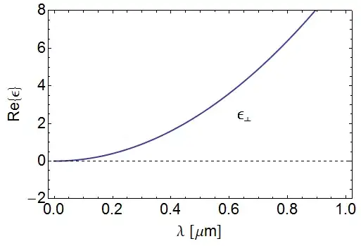
Edit: here's one example. Looks good on screen (see screenshot), but export it into EPS and you'll probably see two things: (a) There's a bug with EPS font embedding: for me, the epsilon inside the figure doesn't embed properly unless I remove the FontWeight->Normal directive. (b) The frame/tick lines are light-gray and 1 pixel thick. If I wanted to shrink this figure (e.g. to place it as an inset), it would trash the quality. However, using AbsoluteThickness[2] looks bad -- so I have to increase ImageSize. But then the fonts are too small and/or lines in the plot look too thin, etc, etc.

With[{exSubscript = "\[UpTee]", epsFontSize = 24, 
   xcoords = {0.63, 2.2}}, testInset = Style[Inset[Cell[TextData[Cell[
      BoxData[FormBox[SubscriptBox["\[Epsilon]", exSubscript], 
           TraditionalForm]]]]], xcoords, {Left, Baseline}], 
     FontWeight -> Normal, FontSize -> epsFontSize];
  ];
Show[Plot[10 x^2, {x, 0, 1}, PlotStyle -> Thick, Frame -> True, 
  PlotRange -> {-2, 8}, Epilog -> {testInset}], Axes -> {True, True}, 
 AxesOrigin -> {0, 0}, AxesStyle -> Dashed, 
 FrameLabel -> {"\[Lambda] [\[Mu]m]", "Re{\[Epsilon]}"}, 
 BaseStyle -> {FontSize -> 22, FontWeight -> Plain, 
   FontFamily -> Helvetica}, ImageSize -> 500]
Export["test.eps", %]

Sample plot

Edit: Accepting Szabolcs' answer, but Mr.Wizard should be given credit for pointing out the FontFamily -> Helvetica vs FontFamily -> "Helvetica" behavior (which seems like a bug). Without the quotes, PDF export is a non-starter due to screwed-up fonts.

Leo Alekseyev
  • 12,893
  • 5
  • 44
  • 44
  • @Leo: I agree with rcollyer. I've used LS for my publication figures and they always come out looking great. You can look through [some](http://stackoverflow.com/questions/5818888/how-to-make-a-grid-of-plots-with-a-single-pair-of-framelabels/5820813#5820813) [answers](http://stackoverflow.com/questions/5429204/is-there-an-equivalent-of-matlabs-subplot/5429802#5429802) here that use levelscheme, to get a feel of how the plots look. – abcd May 09 '11 at 04:24
  • Interesting (and frustrating) that if I export to PDF, the fonts change, but if I print the notebook to a PDF printer, it looks right. – Mr.Wizard May 09 '11 at 06:54
  • If I use `FontFamily -> "Helvetica"` (quote marks important) it works. – Mr.Wizard May 09 '11 at 06:59
  • @Mr.Wizard When you print notebook to a PDF printer under Windows *Mathematica* generates an EMF-representation of the notebook in the printer's spool file. The printer's driver then generates PostScript from this EMF. So there is principal difference between printing to a PDF printer and direct exporting to PDF. You should also know that positioning of objects inside EMF is much less precise that inside PDF and outlined fonts in EMF are often distorted. – Alexey Popkov May 09 '11 at 13:40
  • @Mr.Wizard You can extract the EMF file from the spool file by using free [PrintMirror](http://sourceforge.net/projects/printmirror/) utility but this program works only up to Windows XP SP2. Starting from Windows XP SP3 it does not work. – Alexey Popkov May 09 '11 at 13:43
  • @Mr.Wizard [Here](http://www.angelfire.com/extreme4/vprint/) is description of the PrintMirror and relevant papers. – Alexey Popkov May 09 '11 at 13:53

3 Answers3

17

Screen vs print viewing

It is difficult to compare line thicknesses on screen, especially when the displayed thickness would get close to 1 pixel. I found it's best to print figures at the final publication size, and check their quality that way.

Use absolute measurements

Most of the problems I had with this stem from the fact that Mathematica uses both absolute and relative (to the plot size) measurements. For figures that will appear in print, it's easiest to use absolute sizes that do not scale with the plot, in particular for font sizes and for line thickness. This way you can have a good idea about what the result will look like in print (and it will be independent of figure size). The numbers you give to Mathematica are in printer's points.

Exporting

Finally, I found that exporting to EPS is less reliable than exporting to PDF (e.g. fonts might not be embedded, as you mentioned), and Mathematica is unable to preserve all features (e.g. opacity!) when exporting to EPS. For 2D plots PDF is usually a good choice. However, there's a bug when exporting PDF's and specifying the ImageSize in Export. The workaround I use is

cm = 72/2.54 (* centimetres *)
Export["figure.pdf", Show[figure, ImageSize -> 7 cm]] (* 7 cm wide figure *)

The you can include the result in the paper without any scaling, and you'll have consistent font sizes and line thicknesses throughout all figures.

In summary, this has more or less worked for me:

  1. use absolute measurements for things that need to be consistent across figures in print
  2. export to PDF, with the intended final size, and don't rescale the result before including it (e.g. don't specify a width in LaTeX)
Szabolcs
  • 24,728
  • 9
  • 85
  • 174
  • 1
    In really recent versions of PDF and EPS fully support vertex colors. See [this](http://groups.google.com/group/comp.soft-sys.math.mathematica/browse_thread/thread/f2327233ca2faa9f/2dad0f66979ad134) thread and [this video (14 Mb)](http://research.microsoft.com/en-us/um/people/jiansun/videos/GMesh_336.wmv). – Alexey Popkov May 09 '11 at 13:49
  • That's good to hear. However, unfortunately Mathematica's EPS export still seems to have issues with fonts (font embedding?), e.g. the \[UpTee] from the example isn't displayed correctly here. – Szabolcs May 09 '11 at 13:54
  • 1
    You can be interested in [Jens Nockel's thoughts on the matter](http://pages.uoregon.edu/noeckel/MathematicaGraphics.html#OutlineFonts). – Alexey Popkov May 09 '11 at 14:01
  • @Alexey, is there any reason, in your experience, to use EPS instead of PDF as the export format? – Szabolcs May 09 '11 at 15:01
  • 1
    @Szabolcs My experience shows that PDF export in *Mathematica* is much better than EPS. And Adobe Acrobat has the ability to convert PDF to EPS and also embed into PDF file fonts those *Mathematica* cannot embed. So I prefer always export as PDF. It is often also better not to export graphics directly to raster from *Mathematica* but export it as PDF first and then convert PDF to raster using Adobe Acrobat: it gives you full control over antialiasing that *Mathematica* cannot give and requires MUCH less physical memory if you prefer to export graphics with high resolution. – Alexey Popkov May 09 '11 at 15:36
  • Using PDF as intermediate format before converting to raster also makes it much easier to control such things as thickness and font size in the resulting graphics: you do not need to think about the dependence of these parameters on `ImageSize` etc. And PDF export is quite fast and not memory-consuming as opposed to export to raster formats such as PNG and GIF (export uses programs PNG.exe and GIF.exe correspondingly located in `$InstallationDirectory`\SystemFiles\Converters\Binaries\Windows). – Alexey Popkov May 09 '11 at 15:45
  • @Alexey, actually it was opacity that gets destroyed when exporting to EPS, not gradients. I remembered wrong. EPS probably supports these features (Illustrator does), but Mathematica's EPS export does not. – Szabolcs May 09 '11 at 15:46
  • @Szabolcs You can convert PDF with transparency to EPS with simulated transparency by using Adobe Acrobat. – Alexey Popkov May 09 '11 at 15:49
  • I'm not sure, but I think it should be "cm = 72/2.54", otherwise figures become really small. – Jorge Leitao Dec 20 '12 at 16:30
  • @J.C.Leitão That's correct, thanks for noting it! Now I fixed it in the main post. – Szabolcs Dec 20 '12 at 17:50
5

I substituted FontFamily -> "Helvetica" and exported to PDF. Opening that PDF in Foxit Reader I see this:

enter image description here

Other than different zoom (not sure why) it looks quite similar to your rendering.

Mr.Wizard
  • 24,179
  • 5
  • 44
  • 125
  • When I export to PDF, my lines look way thinner; also, the fonts look way too thin -- part of the reason I started using EPS or TIFF exports. – Leo Alekseyev May 09 '11 at 08:05
  • @Leo What are you using to view the PDF? Have you tried Foxit Reader? Could you upload an exported PDF for me to view and screen cap? – Mr.Wizard May 09 '11 at 08:11
  • @Mr.Wizard: If you insist :) http://www.princeton.edu/~leoa/test.pdf Viewed in Chrome or Acrobat, it's much uglier than the screencaps we posted in this thread – Leo Alekseyev May 09 '11 at 08:54
  • @Leo, viewing that file in Foxit Reader, it appears very much like what I saw before I included quote marks in `FontFamily -> "Helvetica"`. Would you please make that change, and export and upload a new PDF? I will then post a screen capture of what it looks like on my PC. – Mr.Wizard May 09 '11 at 09:40
  • 1
    @Mr.Wizard: well, I'll be... putting the quotes did make a difference. (Note that it's only the PDF export that seems to be strongly affected by quotes vs no quotes). PDF is updated, now it looks more or less like your screenshot – Leo Alekseyev May 09 '11 at 21:31
  • @Leo That's good. I think PDF is the best general print format, so getting it working should be quite helpful. Also, be sure to actually print your graphics, preferably on a genuine PostScript compatible printer. I have been surprised before by the difference between on-screen and on-paper output. (The exception would be if for some rare reason you are printing to a raster machine like a LightJet, in which case you need to pre-rasterize at 240 ppi). – Mr.Wizard May 10 '11 at 07:27
1

I'd look closely at LevelScheme, which I have used for publication quality graphics.

rcollyer
  • 10,475
  • 4
  • 48
  • 75