97

I'm trying to set a rounded border to a button but the border of the button is not correct.

Code:

Button(action: {
        print("sign up bin tapped")          
}) {
    Text("SIGN UP")
      .frame(minWidth: 0, maxWidth: .infinity)
      .font(.system(size: 18))
      .padding()
      .foregroundColor(.white)
 }
  .border(Color.white, width: 2)
  .cornerRadius(25)

Output:

enter image description here

As you can see the border at corner are cut-off.

Any suggestion what am I doing wrong?

mfaani
  • 33,269
  • 19
  • 164
  • 293
Mahendra
  • 8,448
  • 3
  • 33
  • 56

12 Answers12

115

Instead of setting the cornerRadius to the Button use an overlay for the inside View:

Edit: If you have a background for the button you also need to apply the cornerRadius to the background.

    Button(action: {
        print("sign up bin tapped")
    }) {
        Text("SIGN UP")
            .frame(minWidth: 0, maxWidth: .infinity)
            .font(.system(size: 18))
            .padding()
            .foregroundColor(.white)
            .overlay(
                RoundedRectangle(cornerRadius: 25)
                    .stroke(Color.white, lineWidth: 2)
        )
    }
    .background(Color.yellow) // If you have this
    .cornerRadius(25)         // You also need the cornerRadius here
    
mfaani
  • 33,269
  • 19
  • 164
  • 293
Teetz
  • 3,475
  • 3
  • 21
  • 34
41

Updated for Swift 5 & iOS 13.4+ with Press States!

None of the examples worked for buttons with both dark and white background colors as well as none of them had press state updates, so I built this LargeButton view that you can see below. Hope this helps, should be pretty simple to use!

Example Photos

enter image description here

Example Use

// White button with green border.
LargeButton(title: "Invite a Friend", 
            backgroundColor: Color.white, 
            foregroundColor: Color.green) {
                        print("Hello World")
                    }

// Yellow button without a border
LargeButton(title: "Invite a Friend", 
            backgroundColor: Color.yellow) {
                        print("Hello World")
                    }

Code

struct LargeButtonStyle: ButtonStyle {
    
    let backgroundColor: Color
    let foregroundColor: Color
    let isDisabled: Bool
    
    func makeBody(configuration: Self.Configuration) -> some View {
        let currentForegroundColor = isDisabled || configuration.isPressed ? foregroundColor.opacity(0.3) : foregroundColor
        return configuration.label
            .padding()
            .foregroundColor(currentForegroundColor)
            .background(isDisabled || configuration.isPressed ? backgroundColor.opacity(0.3) : backgroundColor)
            // This is the key part, we are using both an overlay as well as cornerRadius
            .cornerRadius(6)
            .overlay(
                RoundedRectangle(cornerRadius: 6)
                    .stroke(currentForegroundColor, lineWidth: 1)
        )
            .padding([.top, .bottom], 10)
            .font(Font.system(size: 19, weight: .semibold))
    }
}

struct LargeButton: View {
    
    private static let buttonHorizontalMargins: CGFloat = 20
    
    var backgroundColor: Color
    var foregroundColor: Color
    
    private let title: String
    private let action: () -> Void
    
    // It would be nice to make this into a binding.
    private let disabled: Bool
    
    init(title: String,
         disabled: Bool = false,
         backgroundColor: Color = Color.green,
         foregroundColor: Color = Color.white,
         action: @escaping () -> Void) {
        self.backgroundColor = backgroundColor
        self.foregroundColor = foregroundColor
        self.title = title
        self.action = action
        self.disabled = disabled
    }
    
    var body: some View {
        HStack {
            Spacer(minLength: LargeButton.buttonHorizontalMargins)
            Button(action:self.action) {
                Text(self.title)
                    .frame(maxWidth:.infinity)
            }
            .buttonStyle(LargeButtonStyle(backgroundColor: backgroundColor,
                                          foregroundColor: foregroundColor,
                                          isDisabled: disabled))
                .disabled(self.disabled)
            Spacer(minLength: LargeButton.buttonHorizontalMargins)
        }
        .frame(maxWidth:.infinity)
    }
}
Zorayr
  • 23,770
  • 8
  • 136
  • 129
25

Official .bordered modifier support in iOS 15+

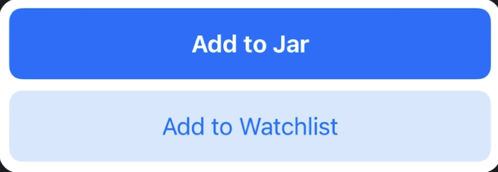
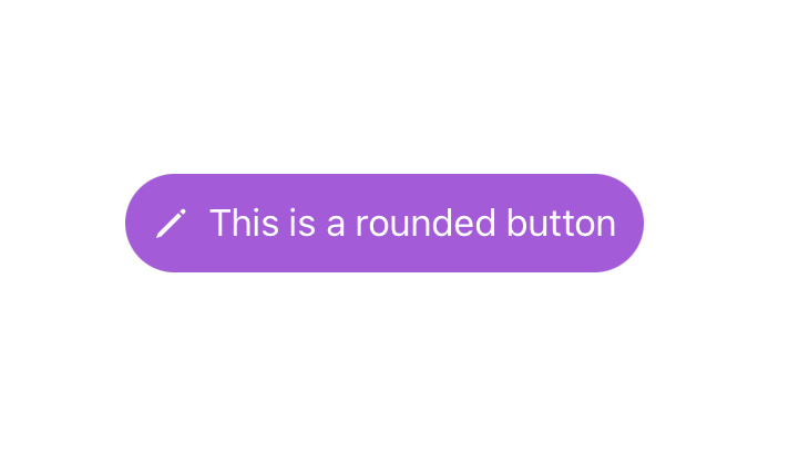
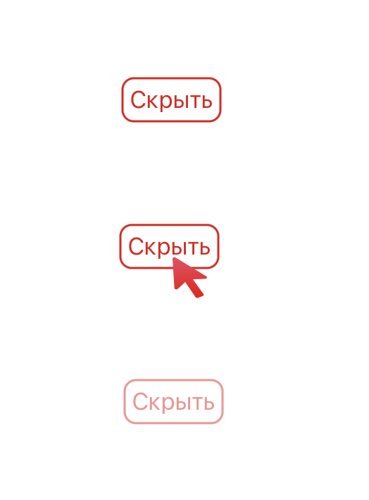
Buttons now have baked in border styling support using the .buttonStyle(.bordered) modifier. I would suggest using the corner radius Apple provides for these buttons for the best platform-specific styling. We can change the color to be consistent with the system styles for buttons and tint the background as well as text using the .tint modifier:

Button("Add") { ... }
.buttonStyle(.bordered)
.tint(.green)

Green Tint Buttons

You can make the tint color more prominent (bolder) using .borderedProminent and control the size using .controlSize:

Button("food") { ... }
.tint(.red)
.controlSize(.small) // .large, .medium or .small
.buttonStyle(.borderedProminent)

Small buttons

You can also use this modifier on parent Views of Buttons and toggle lighter color schemes using .accentColor in child Buttons:

ScrollView {
    LazyVStack {
        Button("Test Button 1") { ... }
        .buttonStyle(.borderedProminent)
        .keyboardShortcut(.defaultAction) // Tapping `Return` key actions this button

        Button("Test Button 2") { ... }
        .tint(.accentColor)
    }
}
.buttonStyle(.bordered)
.controlSize(.large)

Large Button Style

Advice

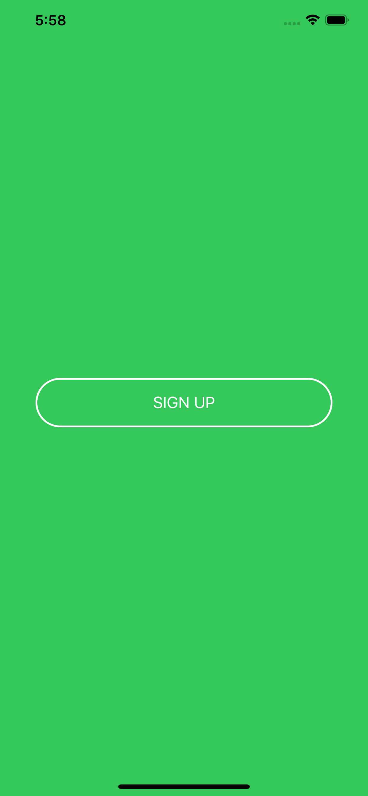
Apple for some reason doesn't like single-line bordered buttons which is why the .border() modifier was deprecated in Xcode 12. With this change, I suggest developers avoid creating single-line bordered buttons because they now are not preferred in Apple's Human Interface Guidelines. Using prominent buttons everywhere also violates HIG.

Extra NOTE: Apple's .bordered style provides the standard platform style across device types. In addition, the Button responds to Dark Mode dynamically and scales its size with Dynamic Type (native accessibility support).

Pranav Kasetti
  • 8,770
  • 2
  • 50
  • 71
  • 1
    `.controlProminence(.increased)` has been deprecated in favor of `.buttonStyle(.borderedProminent)`. https://www.fivestars.blog/articles/xcode-13-beta-4/ – Felix May 05 '22 at 12:28
10

Just add the cornerRadius argument:

.border(Color.white, width: 2, cornerRadius: 25)

using this simple extension:

extension View {
    func border(_ color: Color, width: CGFloat, cornerRadius: CGFloat) -> some View {
        overlay(RoundedRectangle(cornerRadius: cornerRadius).stroke(color, lineWidth: width))
    }
}

Preview

Mojtaba Hosseini
  • 95,414
  • 31
  • 268
  • 278
8

Swift 5 & iOS 14 – Borders also react when pressed

struct PrimaryButtonStyle: ButtonStyle {
    func makeBody(configuration: Configuration) -> some View {
        configuration.label
            .padding(5)
            .foregroundColor(configuration.isPressed ? Color.red.opacity(0.5) : .red)
            .overlay(
                RoundedRectangle(cornerRadius: 8)
                    .stroke(configuration.isPressed ? Color.red.opacity(0.5) : .red, lineWidth: 1.5)
            )
     }
}

How to use

Button("Hide") {
    print("tapped")
}.buttonStyle(PrimaryButtonStyle())

borders also react when pressed

Evgeniy
  • 127
  • 1
  • 4
7

Swift version 5.6 You can use Button properties for example

       Button(action: {
            //define action
        }) {
            Image(systemName: "arrow.triangle.2.circlepath.circle.fill")
                .imageScale(.large)
            Text("Restart")
                .font(.system(.title2))
        }
        .buttonStyle(.borderedProminent)
        .buttonBorderShape(.capsule)
        .controlSize(.large)

enter image description here

        .buttonBorderShape(.roundedRectangle) //change bordershape see below

enter image description here

        .buttonBorderShape(.roundedRectangle(radius: 4)) // see below

enter image description here

similarly you can change the buttonSytle and controlSize

Gurjinder Singh
  • 9,221
  • 1
  • 66
  • 58
6

Xcode 11.4.1

                            Button(action: self.action) {
                                Text("Button Name")
                                    .font(.system(size: 15))
                                    .fontWeight(.bold)
                                    .foregroundColor(.white)
                                    .padding(10)
                                    .background(Color.darkGray)
                                    .cornerRadius(10)
                            }
                            .buttonStyle(PlainButtonStyle())

There isn't a need to add an overlay. You can substitute padding modifier with frame modifier. The action is a non return method outside of the body variable.

Right specifically for @MinonWeerasinghe:

Button(action: self.action) {
            Text("Button Name")
                .font(.system(size: 15))
                .fontWeight(.bold)
                .foregroundColor(.black)
                .padding(10)
                .background(RoundedRectangle(cornerRadius: 10).stroke().foregroundColor(Color.red))
                .cornerRadius(10)
        }
        .buttonStyle(PlainButtonStyle())
Alexander
  • 1,424
  • 18
  • 23
4

You can try this:

var body: some View {
        ZStack {
            Color.green
            .edgesIgnoringSafeArea(.all)

            HStack {
            Button(action: {
                    print("sign up bin tapped")
            }){
                HStack {
                    Text("SIGN UP")
                        .font(.system(size: 18))
                    }
                .frame(minWidth: 0, maxWidth: 300)
                .padding()
                .foregroundColor(.white)
                .overlay(
                    RoundedRectangle(cornerRadius: 40)
                        .stroke(Color.white, lineWidth: 2)
                )

                }
            }
        }
    }

I also did not set the maxWidth to .infinity because it means the button will fill the width of your container view.

The result will be :

enter image description here

Hope it helps :)

Aira Samson
  • 226
  • 2
  • 10
2

SwiftUI :- You can also try this!

Currently I added check on same button for different shapes. you can separate my code if you want.

 // Global declaration
        @State var isFollowed = false
        Button {
            // Toggle Your isFollowed with true and false
            isFollowed = true
        } label: {
            Text(isFollowed ? "Following" : "Follow")
                .padding(.horizontal, 10)
                .padding(.vertical, 6)
                .foregroundColor(.white)
                .font(.custom(MyFont.GilroyBold, size: 13))
                .background(
                    ZStack {
                        RoundedRectangle(
                            cornerRadius: 20,
                            style: .continuous
                        )
                        .fill(isFollowed ? .red : .clear)
                        RoundedRectangle(
                            cornerRadius: 20,
                            style: .continuous
                        )
                        .stroke(.red, lineWidth: 2)
                    }
                )
        }

eg. Like I need Follow and following button. On Follow button I shown corner rounds and only border. On Following button I shown corner rounds and background colour.

enter image description here enter image description here

Sukh
  • 1,278
  • 11
  • 19
1

This worked for me

Button(action: {
  print("Exit the onboarding")
}) {
HStack (spacing: 8) {
  Text("NEXT")
  .foregroundColor(Color("ColorAccentOppBlack"))
}
.padding(.horizontal, 16)
.padding(.vertical, 10)
.foregroundColor(Color("ColorYellowButton"))
.background(
   Capsule().strokeBorder(Color("ColorYellowButton"), lineWidth: 1.25)
 )
} 
.accentColor(Color("ColorYellowButton"))
Junior
  • 1,007
  • 4
  • 16
  • 26
1

You should use Capsule. This is built-in into SwiftUI. It takes care of rounded corners. Full implementation is here https://redflowerinc.com/how-to-implement-rounded-corners-for-buttons-in-swiftui/

public struct ButtonStyling : ButtonStyle {
    public var type: ButtonType
    public init(type: ButtonType = .light) {
        self.type = type
    }
    public func makeBody(configuration: Configuration) -> some View {
        configuration.label.foregroundColor(Color.white)
            .padding(EdgeInsets(top: 12,
                                   leading: 12,
                                   bottom: 12,
                                   trailing: 12))
               .background(AnyView(Capsule().fill(Color.purple)))
               .overlay(RoundedRectangle(cornerRadius: 0).stroke(Color.gray, lineWidth: 0))
    }
}

enter image description here

Darren
  • 10,182
  • 20
  • 95
  • 162
barryjones
  • 2,149
  • 1
  • 17
  • 21
-1

Wonder how to add button border with color gradient and corner radius Here's how..

  Button(action: {self.isCreateAccountTapped = true},label: {Text("Create an Account")
.foregroundColor(Color("TextThemeColor36"))}
 )
.frame(height: 44)
.frame(width: 166)
.background(Color.clear)
.cornerRadius(8)
.overlay(RoundedRectangle(cornerRadius: 10)
.stroke(LinearGradient(gradient: Gradient(colors: [Color("BtnGradientClr1"),Color("BtnGradientClr2"),Color("BtnGradientClr3")]), startPoint: .leading, endPoint: .trailing)))
Jin Lee
  • 3,194
  • 12
  • 46
  • 86