Iam working with Gatsby's Img component but I cannot figure out how to properly set the width. It seems to sort of ignore the width and just choose its own width. The image should be exactly 276px like specified in the width attribute and the text container should be shrinked if needed.
Why doesn't something simple like a explicit width works with html? What am I missing?
WIP site can be found here https://lucid-noether-af1c61.netlify.com/
Html output of the card (picture and srcset stripped)
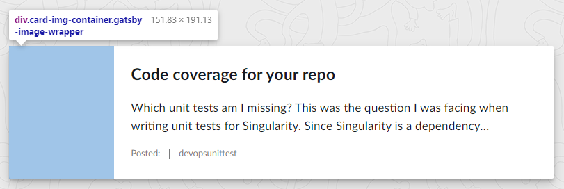
<a class="card blog-card" href="/Code coverage for your repo/">
  <div class="card-img-container gatsby-image-wrapper"
    style="position: relative; overflow: hidden; display: inline-block; width: 276px;"><img
      src="data:image/jpeg;base64,/9j/2wBDABALDA4MChAODQ4SERATGCgaGBYWGDEjJR0oOjM9PDkzODdASFxOQERXRTc4UG1RV19iZ2hnPk1xeXBkeFxlZ2P/2wBDARESEhgVGC8aGi9jQjhCY2NjY2NjY2NjY2NjY2NjY2NjY2NjY2NjY2NjY2NjY2NjY2NjY2NjY2NjY2NjY2NjY2P/wgARCAANABQDASIAAhEBAxEB/8QAGAAAAgMAAAAAAAAAAAAAAAAAAAUCAwT/xAAVAQEBAAAAAAAAAAAAAAAAAAABAP/aAAwDAQACEAMQAAABWW5Iw9EwP//EABoQAAICAwAAAAAAAAAAAAAAAAABAxECEiH/2gAIAQEAAQUC41GYyUmy2bM//8QAFBEBAAAAAAAAAAAAAAAAAAAAEP/aAAgBAwEBPwE//8QAFREBAQAAAAAAAAAAAAAAAAAAABH/2gAIAQIBAT8BR//EABQQAQAAAAAAAAAAAAAAAAAAACD/2gAIAQEABj8CX//EABsQAAMAAgMAAAAAAAAAAAAAAAABESExYXGB/9oACAEBAAE/IXJiekLTnbMe2MTiOYUNn//aAAwDAQACAAMAAAAQDz//xAAVEQEBAAAAAAAAAAAAAAAAAAAAEf/aAAgBAwEBPxBX/8QAFREBAQAAAAAAAAAAAAAAAAAAEBH/2gAIAQIBAT8Qg//EAB0QAAICAgMBAAAAAAAAAAAAAAERACFBYTFRcZH/2gAIAQEAAT8QdELgq5PimJlqlZWDgwqQt3LAWC6qZh9n/9k="
      alt=""
      style="position: absolute; top: 0px; left: 0px; width: 100%; height: 100%; object-fit: cover; object-position: center center; opacity: 0; transition-delay: 500ms;">
    <picture>
      <source media="/static/47e1d99f504ee308027e0b7670c909dc/731d3/reinterpretcode.jpg" srcset="/static/47e1d99f504ee308027e0b7670c909dc/731d3/reinterpretcode.jpg 1x,
  /static/47e1d99f504ee308027e0b7670c909dc/2055f/reinterpretcode.jpg 1.5x,
  /static/47e1d99f504ee308027e0b7670c909dc/b8c04/reinterpretcode.jpg 2x"><img srcset="/static/47e1d99f504ee308027e0b7670c909dc/731d3/reinterpretcode.jpg 1x,
  /static/47e1d99f504ee308027e0b7670c909dc/2055f/reinterpretcode.jpg 1.5x,
  /static/47e1d99f504ee308027e0b7670c909dc/b8c04/reinterpretcode.jpg 2x"
        src="/static/47e1d99f504ee308027e0b7670c909dc/731d3/reinterpretcode.jpg" alt="" width="276" loading="lazy"
        style="position: absolute; top: 0px; left: 0px; width: 100%; height: 100%; object-fit: cover; object-position: center center; opacity: 1; transition: opacity 500ms ease 0s;">
    </picture><noscript>
      <picture>
        <source media="/static/47e1d99f504ee308027e0b7670c909dc/731d3/reinterpretcode.jpg" srcset="/static/47e1d99f504ee308027e0b7670c909dc/731d3/reinterpretcode.jpg 1x,
  /static/47e1d99f504ee308027e0b7670c909dc/2055f/reinterpretcode.jpg 1.5x,
  /static/47e1d99f504ee308027e0b7670c909dc/b8c04/reinterpretcode.jpg 2x" /><img loading="lazy" width="276" srcset="/static/47e1d99f504ee308027e0b7670c909dc/731d3/reinterpretcode.jpg 1x,
  /static/47e1d99f504ee308027e0b7670c909dc/2055f/reinterpretcode.jpg 1.5x,
  /static/47e1d99f504ee308027e0b7670c909dc/b8c04/reinterpretcode.jpg 2x"
          src="/static/47e1d99f504ee308027e0b7670c909dc/731d3/reinterpretcode.jpg" alt=""
          style="position:absolute;top:0;left:0;opacity:1;width:100%;height:100%;object-fit:cover;object-position:center" />
      </picture>
    </noscript>
  </div>
  <article class="card-body">
    <h2 class="card-title">Code coverage for your repo</h2>
    <p class="card-text">Which unit tests am I missing? This was the question I was facing when writing unit tests for
      Singularity. Since Singularity is a dependency…</p>
    <div class="card-subtext muted-text">
      <p>Posted:<time datetime="2018-11-07T18:48:51.000Z"></time></p>
      <p>devopsunittest</p>
    </div>
  </article>
</a>