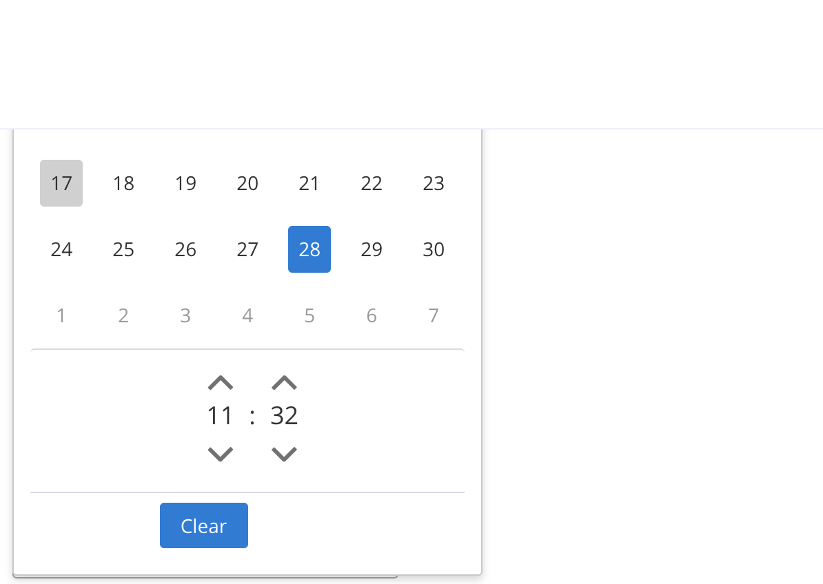
I am using primeng '7.0.0' for the p-calendar component. when I click on the datepicker icon the calendar component is opening in the upside direction (Pic below).
I want to reduce the width and height of this component. I tried the below code but it didn't work.
calendar.html
<p-calendar
  value="#{property.propDate}" id="date"
  [showIcon]="true"
  [utc]='true'
  (onSelect)="sendCalendarTimeValueToParent()"
  placeholder="{{ timePickerPlaceHolder }}"
  [showTransitionOptions]="'100ms'"
  [hideTransitionOptions]="'100ms'"
  [inputStyle]="{ width: '100px' }"
  [(ngModel)]="value"
  [defaultDate]="defaultDate"
  showTime="true"
  [readonlyInput]="true"
  hourFormat="24"
  showButtonBar="true"
  [clearButtonStyleClass]="'clear-button'"
  [timeOnly]="true">
</p-calendar>
calendar.css
.ui-calendar .ui-datepicker {
  height : 200px;
}

.ui-datepicker td span, .ui-datepicker td a {
  padding: 0px;
}
Can anyone please tell me what am I doing wrong?