0

The Problem:

I create a little iPhone app with React Native v 0.61 My content follows a general line on the left and right with a margin of 25px which looks very good on the bigger iPhones (iPhone X+) but when viewed on the Iphone SE it doesn't look too good. Too much margin. How to find out the perfect margin per Device?

Mainly I'm thinking about aligning the most left content to the "current time" from the status bar and the most right content to have the same margin as left

Something like that:
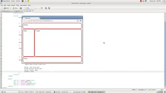
enter image description here

GeraltDieSocke
  • 1,524
  • 3
  • 20
  • 51

4 Answers4

1

You can use dimensions to calculate width and height of the device and then set margin or padding

import { Dimensions } from 'react-native'

var deviceWidth = Dimensions.get('window').width
var deviceHeight: Dimensions.get('window').height

View code

View style={styles.viewStyle}>

 </View>
 const styles=StyleSheet.create({
  ViewStyle:{      
  marginTop: deviceHeight * 0.05, // 5 percentage of the screen height
  marginBottom: deviceHeight * 0.05 ,
  marginLeft: deviceWidth * 0.05, , // 5 percentage of the screen width
  marginRight: deviceWidth * 0.05, 
  },
})


Reference Links

Dimensions link

have a look at this link too PixelRatio

React Native Styling Cheat Sheet

  • I am having a similar issue: https://stackoverflow.com/questions/66243736/screen-responsive-top-or-margintop-for-different-screen-sizes but still this doesn't work, any insights? – RowanX Feb 18 '21 at 09:48
0

You can easily achieve this with the SafeAreaView component, its purpose is to render content within the safe area boundaries of a iOS device (version 11 or higher).

SafeAreaView renders nested content and automatically applies paddings to reflect the portion of the view that is not covered by navigation bars, tab bars, toolbars, and other ancestor views. Moreover, and most importantly, Safe Area's paddings reflect the physical limitation of the screen, such as rounded corners or camera notches (i.e. the sensor housing area on iPhone X).

Jurrian
  • 850
  • 6
  • 20
0

I have been using this small utility library react-native-size-matters

The best thing about this library is you can vary the scale by how much the size can grow with device.Only thing that is slightly a problem is setting the base device from which measurements are drawn.I cloned the repo and changed according to my needs.Check it out!

Thakur Karthik
  • 3,034
  • 3
  • 15
  • 24
0

Use this library for responsive design: React Native Responsive screen

import {widthPercentageToDP as wp, heightPercentageToDP as hp} from 'react-native-responsive-screen';

class Login extends Component {
  render() {
    return (
      <View style={styles.container}>
        <View style={styles.textWrapper}>
          <Text style={styles.myText}>Login</Text>
        </View>
      </View>
    );
  }
}

const styles = StyleSheet.create({
  container: { flex: 1 },
  textWrapper: {
    height: hp('70%'), // 70% of height device screen
    width: wp('80%')   // 80% of width device screen
  },
  myText: {
    fontSize: hp('5%') // End result looks like the provided UI mockup
  }
});

export default Login;

Abdullah Sheikh
  • 243
  • 1
  • 16