I'm currently learning to make a responsive website. I'm confused about how do I do the breakpoints of the content when the screen size changed. Here's what I wanted to do :
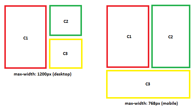
This code below only work for the desktop size :
             <div className="row wrapper-about">
                <div className="col-lg-6 col-md-6 col-6">
                    <div className="img-box">
                      <img src="/pp1.jpg" alt="foto.jpg" />
                    </div>
                </div>
               <div className="col-lg-6 col-md-6 col-6">
                  <div className="row">
                      <div className="desc-container">
                        <h5 className="text-justify">
                          Content 2
                        </h5>
                      </div>
                  </div>
                  <div className="row desc2-d">
                      <span>
                        Content3
                      </span>
                  </div>
                </div>
             </div>