125

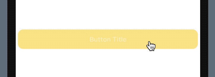
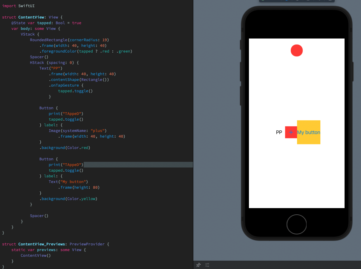
The background area of my button is not detecting user interaction. Only way to interact with said button is to tap on the Text/ Label area of the button. How to make entire Button tappable?

struct ScheduleEditorButtonSwiftUIView: View {

    @Binding  var buttonTagForAction : ScheduleButtonType
    @Binding  var buttonTitle        : String
    @Binding  var buttonBackgroundColor : Color


    let buttonCornerRadius = CGFloat(12)

    var body: some View {

        Button(buttonTitle) {
              buttonActionForTag(self.buttonTagForAction)
        }.frame(minWidth: (UIScreen.main.bounds.size.width / 2) - 25, maxWidth: .infinity, minHeight: 44)

                            .buttonStyle(DefaultButtonStyle())
                            .lineLimit(2)
                            .multilineTextAlignment(.center)
                            .font(Font.subheadline.weight(.bold))
                            .foregroundColor(Color.white)

                            .border(Color("AppHighlightedColour"), width: 2)
                           .background(buttonBackgroundColor).opacity(0.8)

                            .tag(self.buttonTagForAction)
                            .padding([.leading,.trailing], 5)
       .cornerRadius(buttonCornerRadius)

    }
}
RyanTCB
  • 7,400
  • 5
  • 42
  • 62

13 Answers13

98

The proper solution is to use the .contentShape() API.

Button(action: action) {
  HStack {
    Spacer()
    Text("My button")
    Spacer()
  }
}
.contentShape(Rectangle())

You can change the provided shape to match the shape of your button; if your button is a RoundedRectangle, you can provide that instead.

Daniel van der Merwe
  • 1,570
  • 2
  • 10
  • 20
85

I think this is a better solution, add the .frame values to the Text() and the button will cover the whole area

Button(action: {
    //code
}) {
    Text("Click Me")
    .frame(minWidth: 100, maxWidth: .infinity, minHeight: 44, maxHeight: 44, alignment: .center)
    .foregroundColor(Color.white)
    .background(Color.accentColor)
    .cornerRadius(7)
}
Lorenzo R
  • 993
  • 1
  • 7
  • 9
35

You can define content Shape for hit testing by adding modifier: contentShape(_:eoFill:)

And important thing is you have to apply inside the content of Button.

Button(action: {}) {
    Text("Select file")
       .frame(width: 300)
       .padding(100.0)
       .foregroundColor(Color.black)
       .contentShape(Rectangle()) // Add this line
}
.background(Color.green)
.cornerRadius(4)
.buttonStyle(PlainButtonStyle())

Another

Button(action: {}) {
    VStack {
       Text("Select file")
           .frame(width: 100)
       Text("Select file")
           .frame(width: 200)
    }
    .contentShape(Rectangle()) // Add this inside Button.
}
.background(Color.green)
.cornerRadius(4)
.buttonStyle(PlainButtonStyle())
Lal Krishna
  • 15,485
  • 6
  • 64
  • 84
24

This fixes the issue on my end:

var body: some View {
    GeometryReader { geometry in
        Button(action: {
            // Action
        }) {
            Text("Button Title")
                .frame(
                    minWidth: (geometry.size.width / 2) - 25,
                    maxWidth: .infinity, minHeight: 44
                )
                .font(Font.subheadline.weight(.bold))
                .background(Color.yellow).opacity(0.8)
                .foregroundColor(Color.white)
                .cornerRadius(12)

        }
        .lineLimit(2)
        .multilineTextAlignment(.center)
        .padding([.leading,.trailing], 5)
    }
}

button

Is there a reason why you are using UIScreen instead of GeometryReader?

backslash-f
  • 7,923
  • 7
  • 52
  • 80
21

Short Answer

Make sure the Text (or button content) spans the length of the touch area, AND use .contentShape(Rectangle()).

Button(action:{}) {
  HStack {
    Text("Hello")
    Spacer()
  }
  .contentShape(Rectangle())
}

Long Answer

There are two parts:

  1. The content (ex. Text) of the Button needs to be stretched
  2. The content needs to be considered for hit testing

To stretch the content (ex. Text):

// Solution 1 for stretching content
HStack {
  Text("Hello")
  Spacer()
}

// Solution 2 for stretching content
Text("Hello")
  .frame(maxWidth: .infinity, alignment: .leading)

// Alternatively, you could specify a specific frame for the button.

To consider content for hit testing use .contentShape(Rectangle()):

// Solution 1
Button(action:{}) {
  HStack {
    Text("Hello")
    Spacer()
  }
  .contentShape(Rectangle())
}

// Solution 2
Button(action:{}) {
  Text("Hello")
    .frame(maxWidth: .infinity, alignment: .leading)
    .contentShape(Rectangle())
}
kgaidis
  • 14,259
  • 4
  • 79
  • 93
5

You might be doing this:

Button { /*to do something on button click*/} 
label: { Text("button text").foregroundColor(Color.white)}
.frame(width: 45, height: 45, alignment: .center)
.background(Color.black)

Solution:

Button(action: {/*to do something on button click*/ }) 
{ 
HStack { 
Spacer()
Text("Buttton Text")
Spacer() } }
.frame(width: 45, height: 45, alignment: .center)
.foregroundColor(Color.white)
.background(Color.black).contentShape(Rectangle())
Haseeb Javed
  • 1,769
  • 17
  • 20
3

I was working with buttons and texts that need user interaction when I faced this same issue. After looking and testing many answers (including some from this post) I ended up making it works in the following way:

For buttons:

/* WITH IMAGE */
Button {
    print("TAppeD")
} label: {
    Image(systemName: "plus")
        .frame(width: 40, height: 40)
}
/* WITH TEXT */
Button {
    print("TAppeD")
} label: {
    Text("My button")
       .frame(height: 80)
}
 

For Texts:

Text("PP")
    .frame(width: 40, height: 40)
    .contentShape(Rectangle())
    .onTapGesture {
        print("TAppeD")
    }

In the case of the texts, I only need the .contentShape(Rectangle()) modifier when the Text doesn't have a .background in order to make the entire Text frame responsive to tap gesture, while with buttons I use my Text or Image view with a frame and neither a .background nor a .contentShape is needed.

Image of the following code in preview (I'm not allowed to include pictures yet )

import SwiftUI

struct ContentView: View {
    @State var tapped: Bool = true
    var body: some View {
        VStack {
            RoundedRectangle(cornerRadius: 19)
                .frame(width: 40, height: 40)
                .foregroundColor(tapped ? .red : .green)
            Spacer()
            HStack (spacing: 0) {
                Text("PP")
                    .frame(width: 40, height: 40)
                    .contentShape(Rectangle())
                    .onTapGesture {
                        tapped.toggle()
                    }
                
                Button {
                    print("TAppeD")
                    tapped.toggle()
                } label: {
                    Image(systemName: "plus")
                        .frame(width: 40, height: 40)
                }
                .background(Color.red)
                
                Button {
                    print("TAppeD")
                    tapped.toggle()
                } label: {
                    Text("My button")
                        .frame(height: 80)
                }
                .background(Color.yellow)
            }
            
            Spacer()
        }
    }
}

struct ContentView_Previews: PreviewProvider {
    static var previews: some View {
        ContentView()
    }
}
2

A bit late to the answer, but I found two ways to do this —

Option 1: Using Geometry Reader

Button(action: {
}) {
    GeometryReader { geometryProxy in
        Text("Button Title")
            .font(Font.custom("SFProDisplay-Semibold", size: 19))
            .foregroundColor(Color.white)
            .frame(width: geometryProxy.size.width - 20 * 2) // horizontal margin
            .padding([.top, .bottom], 10) // vertical padding
            .background(Color.yellow)
            .cornerRadius(6)
    }
}

Option 2: Using HStack with Spacers

HStack {
    Spacer(minLength: 20) // horizontal margin
    Button(action: {

    }) {
        Text("Hello World")
            .font(Font.custom("SFProDisplay-Semibold", size: 19))
            .frame(maxWidth:.infinity)
            .padding([.top, .bottom], 10) // vertical padding
            .background(Color.yellow)
            .foregroundColor(Color.white)
            .cornerRadius(6)
    }
    Spacer(minLength: 20)
}.frame(maxWidth:.infinity)

My thought process here is that although option 1 is more succinct, I would choose option 2 since it's less coupled to its parent's size (through GeometryReader) and more in line of how I think SwiftUI is meant to use HStack, VStack, etc.

Zorayr
  • 23,770
  • 8
  • 136
  • 129
0

this way makes the button area expand properly but if the color is .clear, it dosen't work‍♂️

                Button(action: {
                   doSomething()
                }, label: {
                    ZStack {
                        Color(.white)
                        Text("some texts")
                    }
                })
0

When I used HStack then it worked for button whole width that's fine, But I was facing issue with whole button height tap not working at corners and I fixed it in below code:

Button(action:{
                print("Tapped Button")
            }) {
                VStack {
                   //Vertical whole area covered
                    Text("")
                    Spacer()
                    HStack {
                     //Horizontal whole area covered
                        Text("")
                        Spacer()
                    }
                }
            }
Kudos
  • 1,224
  • 9
  • 21
0

If your app needs to support both iOS/iPadOS and macOS, you may want to reference my code!

Xcode 14.1 / iOS 14.1 / macOS 13.0 / 12-09-2022

Button(action: {
    print("Saved to CoreData")
    
}) {
    Text("Submit")
    .frame(minWidth: 100, maxWidth: .infinity, minHeight: 44, maxHeight: 60, alignment: .center)
    .foregroundColor(Color.white)
    #if !os(macOS)
    .background(Color.accentColor)
    #endif
}
#if os(macOS)
.background(Color.accentColor)
#endif
.cornerRadius(7)
Will
  • 1,573
  • 14
  • 13
0

Easier work around is to add .frame(maxWidth: .infinity) modifier. and wrap your button inside a ContainerView. you can always change the size of the button where it's being used.

    Button(action: tapped) {
        HStack {
            if let icon = icon {
                icon
            }

            Text(title)
        }
        .frame(maxWidth: .infinity) // This one
    }
Shahriyar
  • 520
  • 7
  • 18
0

These are behaviours with SwiftUI which usually surprise developers:

  • When you modify a button with .frame, it changes the container, but the button size didn't change. That's because the button label is fixed size.
  • When you subsequently modify the frame with .contentShape, it doesn't change the button hittable area as you are modifying the frame

The initialization using Button(title) uses a fixed size label, which you can't do much about. The solution is to create the label view yourself.

Button {
  // action
} label: {
  Text(title)
    .frame(minWidth: 100, minHeight: 44)
}
samwize
  • 25,675
  • 15
  • 141
  • 186