4

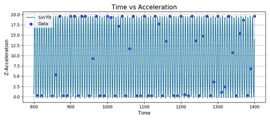
I have some data I gathered analyzing the change of acceleration regarding time. But when I wrote the code below to have a good fit for the sinusoidal wave, this was the result. Is this because I don't have enough data or am I doing something wrong here?

Here you can see my graph:

Measurements plotted directly(no fit)

enter image description here

Fit with horizontal and vertical shift (curve_fit)

enter image description here

Increased data by linspace

enter image description here

Manually manipulated amplitude

enter image description here

Edit: I increased the data size by using the linspace function and plotting it but I am not sure why the amplitude doesn't match, is it because there are very few data to analyze? (I was able to manipulate the amplitude manually but I don't understand why it can't do it)

The code I am using for the fit

def model(x, a, b):

    return a * np.sin(b * x)

param, parav_cov = cf(model, time, z_values)

array_x = np.linspace(800, 1400, 1000)

fig = plt.figure(figsize = (9, 4))

plt.scatter(time, z_values, color = "#3333cc", label = "Data")

plt.plot(array_x, model(array_x, param[0], param[1], param[2], param[3]), label = "Sin Fit")
eyllanesc
  • 235,170
  • 19
  • 170
  • 241
  • 1
    Try adding vertical and horizontal shifts to your model. `a * np.sin(b * x + c) + d`. But you're sampling rate looks to be pretty low to try to reconstruct that signal. I'm not sure it will be possible to get results that will be satisfactory off that data. – Kyle Parsons Jul 29 '19 at 14:33
  • I am afraid you're right, I will have to fix the sampling rate. You can see the new fit, with horizontal and vertical shift added here, https://imgur.com/a/bMcESO2, which didn't actually work to do what I wanted. Thanks for your comment. – Barış Onat Jul 29 '19 at 15:08
  • 1
    You can use FFT to find a peak in spectrum, next use it as a very good starting point for nonlinear least squares – tstanisl Jul 29 '19 at 16:32
  • @BarışOnat note that the data is only just below nyquist frequency, I'd thoroughly recommend rerecording the data at a higher frequency. e.g. try getting at least twice as many samples over the same time period to get more confidence that this isn't aliasing – Sam Mason Jul 29 '19 at 16:58
  • @SamMason I will definitely do it; if my accelerometer provided me with the sampling rate it offered, it would be well above the nyquist. I will probably buy another one. Thanks for your replies btw. – Barış Onat Jul 29 '19 at 17:18

1 Answers1

5

I'd use an FFT to get a first guess at parameters, as this sort of thing is highly non-linear and curve_fit is unlikely to get very far otherwise. the reason for using a FFT is to get an initial idea of the frequency involved, not much more. 3Blue1Brown has a great video on FFTs if you've not seem it

I used web plot digitizer to get your data out of your plots, then pulled into Python and made sure it looked OK with:

import pandas as pd
import matplotlib.pyplot as plt

df = pd.read_csv('sinfit2.csv')
print(df.head())

giving me:

       x     y
0  809.3   0.3
1  820.0   0.3
2  830.3  19.6
3  839.9  19.6
4  849.6   0.4

I started by doing a basic FFT with NumPy (SciPy has the full fftpack which is more complete, but not needed here):

import numpy as np
from numpy.fft import fft

d = fft(df.y)

plt.plot(np.abs(d)[:len(d)//2], '.')

the np.abs(d) is because you get a complex number back containing both phase and amplitude, and [:len(d)//2] is because (for real valued input) the output is symmetric about the midpoint, i.e. d[5] == d[-5].

this says the largest component was 18, I tried plotting this by hand and it looked OK:

x = np.linspace(0, np.pi * 2, len(df))

plt.plot(df.x, df.y, '.-', lw=1)
plt.plot(df.x, np.sin(x * 18) * 10 + 10)

I'm multiplying by 10 and adding 10 is because the range of a sine is (-1, +1) and we need to take it to (0, 20).

next I passed these to curve_fit with a simplified model to help it along:

from scipy.optimize import curve_fit

def model(x, a, b):
    return np.sin(x * a + b) * 10 + 10

(a, b), cov = curve_fit(model, x, df.y, [18, 0])

again I'm hardcoding the * 10 + 10 to get the range to match your data, which gives me a=17.8 and b=2.97

finally I plot the function sampled at a higher frequency to make sure all is OK:

plt.plot(df.x, df.y)
plt.plot(
    np.linspace(810, 1400, 501),
    model(np.linspace(0, np.pi*2, 501), a, b)
)

giving me:

validation plot

which seems to look OK. note you might want to change these parameters so they fit your original X, and note my df.x starts at 810, so I might have missed the first point.

Sam Mason
  • 15,216
  • 1
  • 41
  • 60
  • 1
    Outstanding work. I would like to add that as a practical matter, fitting only the first couple of cycles can often make initial parameter estimation a bit easier for then fitting the entire data set - but here that does not matter. – James Phillips Jul 29 '19 at 17:27
  • Your answer is pure gold, thanks a lot. But I am having trouble grasping some of the concepts you mentioned. I have 2 questions for you: 1. plt.plot(np.abs(d)[:len(d)//2], '.') What does this line do? 2. Is there a reason you picked 10 here, or is it just a number you picked and made the plot fit to (plt.plot(df.x, np.sin(x * 18) * 10 + 10) – Barış Onat Jul 29 '19 at 18:04
  • Ok, I understood my first question, I didn't know the syntax. But can you please explain to me what we are actually analyzing here because I just learned what FFT is or could you at least direct me to a good source? – Barış Onat Jul 29 '19 at 18:33
  • @BarışOnat I've added some detail, but there's quite a bit going on so not sure what is useful to point to – Sam Mason Jul 29 '19 at 18:53
  • Thanks a lot, Sam. It was all very useful, appreciate it – Barış Onat Jul 30 '19 at 13:43