0

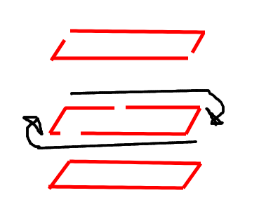
I want to create a border animation for a button element. The design is that the ends of the slanted rectangle are open and then close on hover.

This is what we're trying to do (excuse my artistic "style"): Button

Here's some code and a codepen example:

a svg rect {
  stroke: red;
  stroke-width: 5;
  transition: 1s;
  stroke-dasharray: 100%;
  stroke-dashoffset: 0;
}

a:hover svg rect {
  stroke-dasharray: 0%;
stroke-dashoffset: 0;
}

codepen example

I'm having trouble understanding the math behind stroke-dasharray, but it seems this should be possible without too much complex math.

The other issue is that it would need to be responsive. So the button can contain different amounts text.

Let me know if you need further clarification.

Adam
  • 47
  • 2
  • 9

2 Answers2

4

Here is, I think, about the best you can do to create an automatically responsive button that meets your requirements.

It has a couple of failings:

  1. The gap in the outline of the button varies in size based on the label length.
  2. It needs a fairly recent browser (in order to support pathLength on a <rect> element)

.btn {
  display: inline-block;
  position: relative;
  overflow: auto;
}

.btn + .btn {
  margin-left: 20px;
}

.btn svg {
  position: absolute;
  top: 0;
  left: 0;
}

.label {
  position: relative;
  font-size: 18px;
  font-weight: bold;
  padding: 5px 20px;
}

.btn, .btn svg {
  overflow: visible;
}

.btn svg rect {
  fill: gold;
  stroke: black;
  stroke-width: 2px;
  stroke-dasharray: 47 3;
  transform-origin: 50% 50%;
  transform-box: fill-box;
  transform: skewX(-10deg) scale(1, -1);
  transition: all 0.75s;
}

.btn:hover svg rect {
  stroke-dasharray: 50 0;
  stroke-dashoffset: 50;
}
<div class="btn">
  <svg width="100%" height="100%">
    <rect width="100%" height="100%" pathLength="100"/>
  </svg>
  <div class="label">Button</div>
</div>

<div class="btn">
  <svg width="100%" height="100%">
    <rect width="100%" height="100%" pathLength="100"/>
  </svg>
  <div class="label">Much longer button</div>
</div>
Paul LeBeau
  • 97,474
  • 9
  • 154
  • 181
3

Instead of using a skewed svg element I'm using a polygon. This way I can calculate the total length (perimeter length) of the polygon. I've done this using javascript: console.log(poly.getTotalLength()). This gave me 543.7. For the polygon's stroke-dasharray I'm using 250, 21.85 where 250 + 21.85 = 543.7 / 2.

I'm animating the stroke-dashoffset to 543.7 / 2 = 271.85; and stroke-dasharray to 271.85 0. (the stroke goes from 250 to 271.85 and the gap from 21.85 to 0)

Another change I've made: I'm using a svg <a> element instead of the one you are using and the polygon has pointer-events:all; I've added this to make it sensitive to the mouse although the fill:none.

I hope you'll find this useful.

polygon {
  stroke: red;
  stroke-width: 4;
  stroke-dasharray:250, 21.85;
  fill: none;
  transition: 1s;
  pointer-events:all;
}

polygon:hover{
  stroke: #ff0;
  stroke-dashoffset: 271.85;
  stroke-dasharray: 271.85 0;
}
<svg viewBox = "0 0 250 50" width="250">
  <a xlink:href="#" class="py-2 px-5">
    <text x="125" y="30" text-anchor="middle">Button Button Button</text>
    <polygon id="poly" points="2,48 220,48 248,2 30,2 2,48" />
  </a>
</svg>
enxaneta
  • 31,608
  • 5
  • 29
  • 42
  • 2
    You've missed the "responsive" part of the OPs question though! ;) – Paul LeBeau Jul 19 '19 at 14:56
  • @enxaneta Great work! The math makes more sense now. The only problem is the responsiveness. I'm going to try to use different units (maybe percentages?) or write some javascript and see where I end up. – Adam Jul 19 '19 at 14:59
  • Thank you @PaulLeBeau! nice answer! – enxaneta Jul 19 '19 at 15:35