77

In UIKit drawing a stroked and filled path/shape is pretty easy.

Eg, the code below draws a red circle that is stroked in blue.

override func draw(_ rect: CGRect) {
    guard let ctx = UIGraphicsGetCurrentContext() else { return }
        
    let center = CGPoint(x: rect.midX, y: rect.midY)

    ctx.setFillColor(UIColor.red.cgColor)
    ctx.setStrokeColor(UIColor.blue.cgColor)
        
    let arc = UIBezierPath(arcCenter: center, radius: rect.width/2, startAngle: 0, endAngle: CGFloat.pi * 2, clockwise: true)
        
    arc.stroke()
    arc.fill()
}

How does one do this with SwiftUI?

Swift UI seems to support:

Circle().stroke(Color.blue)
// and/or
Circle().fill(Color.red)

but not

Circle().fill(Color.red).stroke(Color.blue) // Value of type 'ShapeView<StrokedShape<Circle>, Color>' has no member 'fill'
// or 
Circle().stroke(Color.blue).fill(Color.red) // Value of type 'ShapeView<Circle, Color>' has no member 'stroke'

Am I supposed to just ZStack two circles? That seems a bit silly.

shim
  • 9,289
  • 12
  • 69
  • 108
orj
  • 13,234
  • 14
  • 63
  • 73

12 Answers12

100

You can also use strokeBorder and background in combination.

Code:

Circle()
    .strokeBorder(Color.blue,lineWidth: 4)
    .background(Circle().foregroundColor(Color.red))

Result:

LinusGeffarth
  • 27,197
  • 29
  • 120
  • 174
Burak Dizlek
  • 4,805
  • 2
  • 23
  • 19
  • 4
    This is probably the simplest solution I've seen. Not sure how I missed strokeBorder in iOS 13. Still think having stroke and fill work together would be a better API. :) – orj Aug 26 '20 at 04:43
  • Very smart! In this way, I can also use ternary condition into view modifier and resolve my huge if-else statement with one line :) – Sayonara May 15 '21 at 19:10
  • I would really prefer not to repeat the shape twice in code. This is very inconvenient when I'm using a custom shape that accepts multiple parameters. This can't be the best way to do this. – Peter Schorn Feb 08 '22 at 03:54
  • It works, thanks! But it's crazy to have to do that, super non-composable for a developer who got as far as using `fill` and `stroke` separately – Robert Monfera Jun 19 '22 at 09:54
  • @orj agreed. syntax wise i think most devs expect that as well. – chitgoks Dec 02 '22 at 09:10
58

You can draw a circle with a stroke border

struct ContentView: View {
    var body: some View {
        Circle()
            .strokeBorder(Color.green,lineWidth: 3)
            .background(Circle().foregroundColor(Color.red))
   }
}

circle with stroked border

shim
  • 9,289
  • 12
  • 69
  • 108
Imran
  • 3,045
  • 2
  • 22
  • 33
19

My workaround:

import SwiftUI

extension Shape {
    /// fills and strokes a shape
    public func fill<S:ShapeStyle>(
        _ fillContent: S, 
        stroke       : StrokeStyle
    ) -> some View {
        ZStack {
            self.fill(fillContent)
            self.stroke(style:stroke)
        }
    }
}

Example:


struct ContentView: View {
    // fill gradient
    let gradient = RadialGradient(
        gradient   : Gradient(colors: [.yellow, .red]), 
        center     : UnitPoint(x: 0.25, y: 0.25), 
        startRadius: 0.2, 
        endRadius  : 200
    )
    // stroke line width, dash
    let w: CGFloat   = 6       
    let d: [CGFloat] = [20,10]
    // view body
    var body: some View {
        HStack {
            Circle()
                // ⭐️ Shape.fill(_:stroke:)
                .fill(Color.red, stroke: StrokeStyle(lineWidth:w, dash:d))
            Circle()
                .fill(gradient, stroke: StrokeStyle(lineWidth:w, dash:d))
        }.padding().frame(height: 300)
    }
}

Result:

fill and stroke circles

lochiwei
  • 1,240
  • 9
  • 16
16

Seems like it's either ZStack or .overlay at the moment.

The view hierarchy is almost identical - according to Xcode.

struct ContentView: View {

    var body: some View {

        VStack {
            Circle().fill(Color.red)
                .overlay(Circle().stroke(Color.blue))
            ZStack {
                 Circle().fill(Color.red)
                 Circle().stroke(Color.blue)
            }
        }

    }

}

Output:

enter image description here


View hierarchy:

enter image description here

Matteo Pacini
  • 21,796
  • 7
  • 67
  • 74
  • 3
    Yeah, at the moment this appears to be the only way. I've provided "Feedback" to Apple that this isn't ideal and think this is an oversight in the API. – orj Jul 01 '19 at 01:41
8

Another simpler option just stacking the stroke on top of the fill with the ZStack

    ZStack{
        Circle().fill()
            .foregroundColor(.red)
        Circle()
            .strokeBorder(Color.blue, lineWidth: 4)
    }

The result is

shim
  • 9,289
  • 12
  • 69
  • 108
coffeecoder
  • 514
  • 7
  • 7
5

For future reference, @Imran's solution works, but you also need to account for stroke width in your total frame by padding:

struct Foo: View {
    private let lineWidth: CGFloat = 12
    var body: some View {
        Circle()
            .stroke(Color.purple, lineWidth: self.lineWidth)
        .overlay(
            Circle()
                .fill(Color.yellow)
        )
        .padding(self.lineWidth)
    }
}

enter image description here

manman
  • 4,743
  • 3
  • 30
  • 42
4

I put the following wrapper together based on the answers above. It makes this a bit more easy and the code a bit more simple to read.

struct FillAndStroke<Content:Shape> : View
{
  let fill : Color
  let stroke : Color
  let content : () -> Content

  init(fill : Color, stroke : Color, @ViewBuilder content : @escaping () -> Content)
  {
    self.fill = fill
    self.stroke = stroke
    self.content = content
  }

  var body : some View
  {
    ZStack
    {
      content().fill(self.fill)
      content().stroke(self.stroke)
    }
  }
}

It can be used like this:

FillAndStroke(fill : Color.red, stroke : Color.yellow)
{
  Circle()
}

Hopefully Apple will find a way to support both fill and stroke on a shape in the future.

Ky -
  • 30,724
  • 51
  • 192
  • 308
jensrodi
  • 590
  • 4
  • 11
4

my 2 cents for stroking and colouring the "flower sample from Apple (// https://developer.apple.com/documentation/quartzcore/cashapelayer) moved to SwiftUI

extension Shape {
    public func fill<Shape: ShapeStyle>(
        _ fillContent: Shape,
        strokeColor  : Color,
        lineWidth    : CGFloat

    ) -> some View {
        ZStack {
            self.fill(fillContent)
            self.stroke( strokeColor, lineWidth: lineWidth)

        }
    }

in my View:

struct CGFlower: Shape {
    func path(in rect: CGRect) -> Path {
        var path = Path()
        
        let width = rect.width
        let height = rect.height

        stride(from: 0, to: CGFloat.pi * 2, by: CGFloat.pi / 6).forEach {
            angle in
            var transform  = CGAffineTransform(rotationAngle: angle)
                .concatenating(CGAffineTransform(translationX: width / 2, y: height / 2))
            
            let petal = CGPath(ellipseIn: CGRect(x: -20, y: 0, width: 40, height: 100),
                               transform: &transform)
            
            let p = Path(petal)
            path.addPath(p)
        }
        
        return path
        
    }
}

struct ContentView: View {
    var body: some View {
        
        CGFlower()
            .fill( .yellow, strokeColor: .red, lineWidth:  5 )
    }
}

img: enter image description here

ingconti
  • 10,876
  • 3
  • 61
  • 48
3

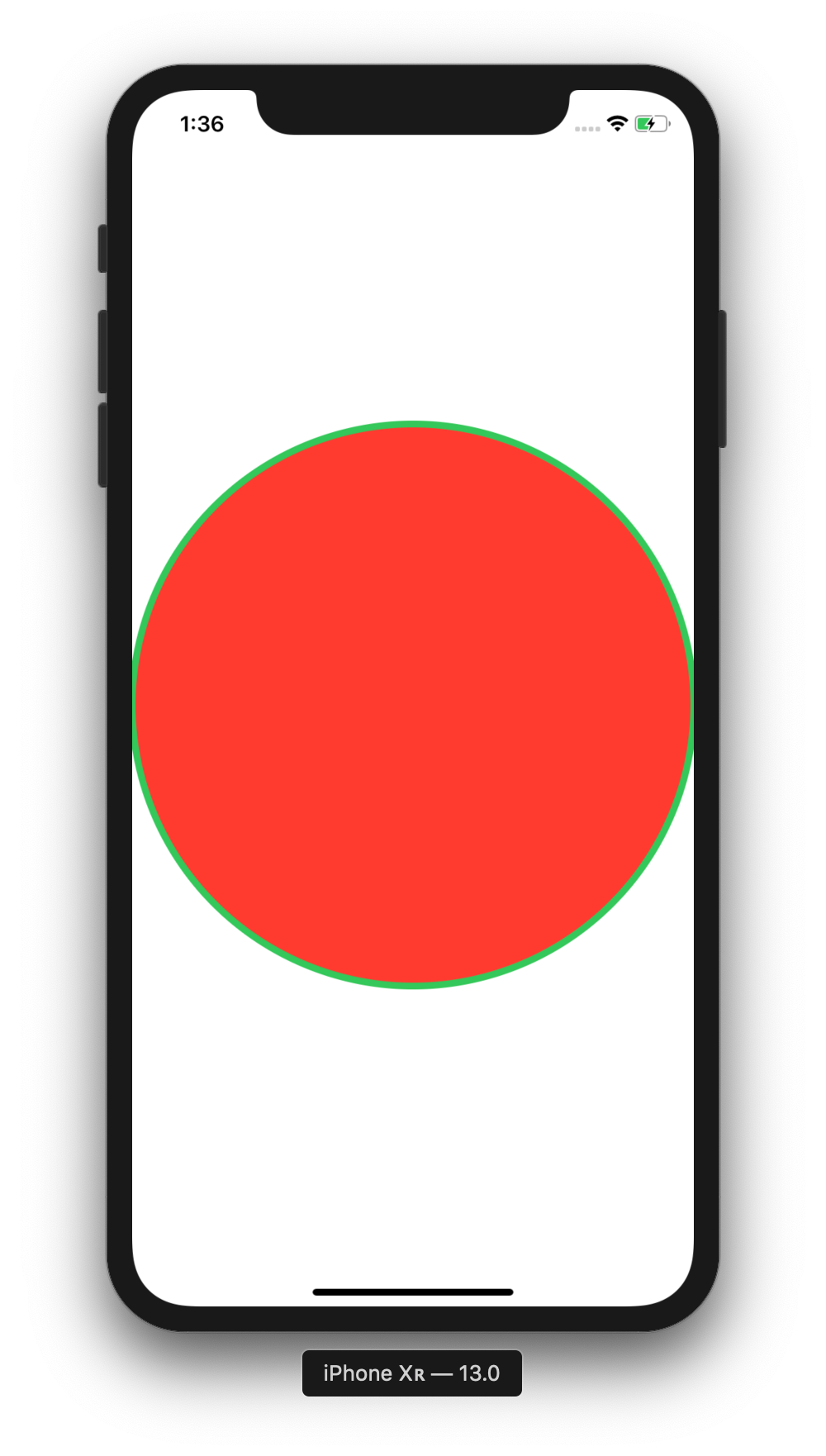
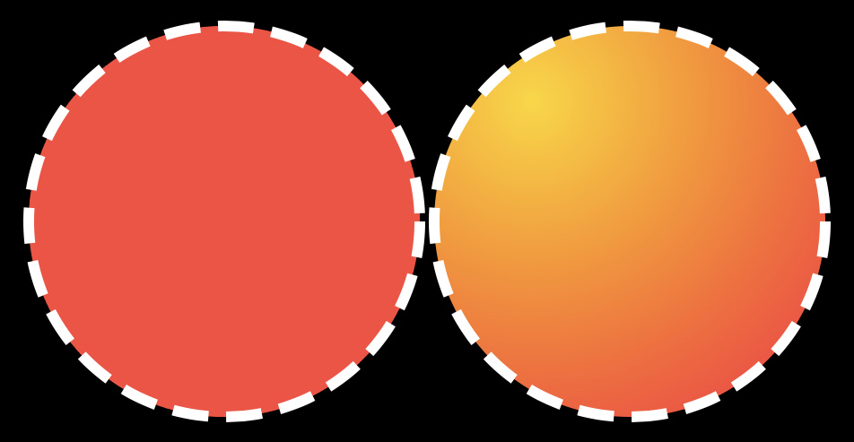
If we want to have a circle with no moved border effect as we can see doing it by using ZStack { Circle().fill(), Circle().stroke }

I prepared something like below:

First step

We are creating a new Shape

struct CircleShape: Shape {
    
    // MARK: - Variables
    var radius: CGFloat
    
    func path(in rect: CGRect) -> Path {
        let centerX: CGFloat = rect.width / 2
        let centerY: CGFloat = rect.height / 2
        var path = Path()
        path.addArc(center: CGPoint(x: centerX, y: centerY), radius: radius, startAngle: Angle(degrees: .zero)
            , endAngle: Angle(degrees: 360), clockwise: true)
        
        return path
    }
}

Second step

We are creating a new ButtonStyle

struct LikeButtonStyle: ButtonStyle {
        
        // MARK: Constants
        private struct Const {
            static let yHeartOffset: CGFloat = 1
            static let pressedScale: CGFloat = 0.8
            static let borderWidth: CGFloat = 1
        }
        
        // MARK: - Variables
        var radius: CGFloat
        var isSelected: Bool
        
        func makeBody(configuration: Self.Configuration) -> some View {
            ZStack {
                if isSelected {
                    CircleShape(radius: radius)
                        .stroke(Color.red)
                        .animation(.easeOut)
                }
                CircleShape(radius: radius - Const.borderWidth)
                    .fill(Color.white)
                configuration.label
                    .offset(x: .zero, y: Const.yHeartOffset)
                    .foregroundColor(Color.red)
                    .scaleEffect(configuration.isPressed ? Const.pressedScale : 1.0)
            }
        }
    }

Last step

We are creating a new View

struct LikeButtonView: View {
    
    // MARK: - Typealias
    typealias LikeButtonCompletion = (Bool) -> Void
    
    // MARK: - Constants
    private struct Const {
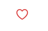
        static let selectedImage = Image(systemName: "heart.fill")
        static let unselectedImage = Image(systemName: "heart")
        static let textMultiplier: CGFloat = 0.57
        static var textSize: CGFloat { 30 * textMultiplier }
    }
    
    // MARK: - Variables
    @State var isSelected: Bool = false
    private var radius: CGFloat = 15.0
    private var completion: LikeButtonCompletion?
    
    init(isSelected: Bool, completion: LikeButtonCompletion? = nil) {
        _isSelected = State(initialValue: isSelected)
        self.completion = completion
    }
    
    var body: some View {
        ZStack {
            Button(action: {
                withAnimation {
                    self.isSelected.toggle()
                    self.completion?(self.isSelected)
                }
            }, label: {
                setIcon()
                    .font(Font.system(size: Const.textSize))
                
            })
                .buttonStyle(LikeButtonStyle(radius: radius, isSelected: isSelected))
        }
    }
    
    // MARK: - Private methods
    private func setIcon() -> some View {
        isSelected ? Const.selectedImage : Const.unselectedImage
    }
}

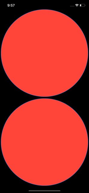
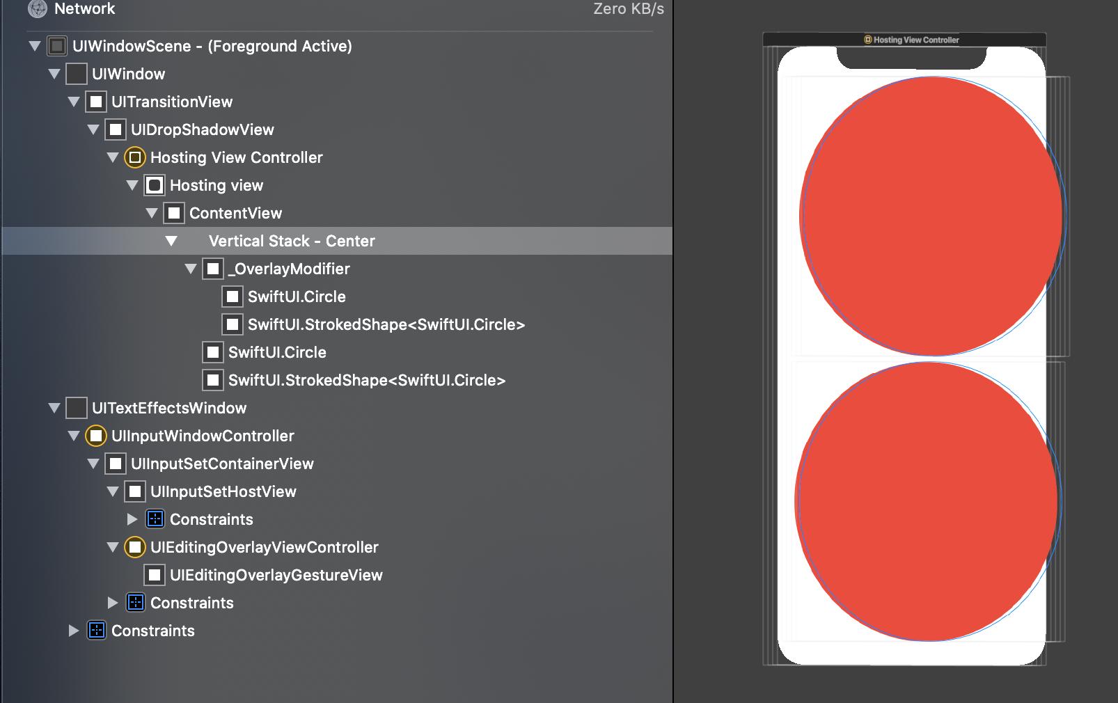
Output (Selected and unselected state):

enter image description here

enter image description here

Şafak Gezer
  • 3,928
  • 3
  • 47
  • 49
PiterPan
  • 1,760
  • 2
  • 22
  • 43
3

Building on the previous answer by lochiwei...

public func fill<S:ShapeStyle>(_ fillContent: S,
                                   opacity: Double,
                                   strokeWidth: CGFloat,
                                   strokeColor: S) -> some View
    {
        ZStack {
            self.fill(fillContent).opacity(opacity)
            self.stroke(strokeColor, lineWidth: strokeWidth)
        }
    }

Used on a Shape object:

struct SelectionIndicator : Shape {
    let parentWidth: CGFloat
    let parentHeight: CGFloat
    let radius: CGFloat
    let sectorAngle: Double


    func path(in rect: CGRect) -> Path { ... }
}

SelectionIndicator(parentWidth: g.size.width,
                        parentHeight: g.size.height,
                        radius: self.radius + 10,
                        sectorAngle: self.pathNodes[0].sectorAngle.degrees)
                    .fill(Color.yellow, opacity: 0.2, strokeWidth: 3, strokeColor: Color.white)
user6902806
  • 280
  • 1
  • 12
1

Here are the extensions I use for filling and stroking a shape. None of the other answers allow full customization of the fill and stroke style.

extension Shape {
    
    /// Fills and strokes a shape.
    func style<F: ShapeStyle, S: ShapeStyle>(
        fill: F,
        stroke: S,
        strokeStyle: StrokeStyle
    ) -> some View {
        ZStack {
            self.fill(fill)
            self.stroke(stroke, style: strokeStyle)
        }
    }
    
    /// Fills and strokes a shape.
    func style<F: ShapeStyle, S: ShapeStyle>(
        fill: F,
        stroke: S,
        lineWidth: CGFloat = 1
    ) -> some View {
        self.style(
            fill: fill,
            stroke: stroke,
            strokeStyle: StrokeStyle(lineWidth: lineWidth)
        )
    }
    
}

extension InsettableShape {
    
    /// Fills and strokes an insettable shape.
    func style<F: ShapeStyle, S: ShapeStyle>(
        fill: F,
        strokeBorder: S,
        strokeStyle: StrokeStyle
    ) -> some View {
        ZStack {
            self.fill(fill)
            self.strokeBorder(strokeBorder, style: strokeStyle)
        }
    }
    
    /// Fills and strokes an insettable shape.
    func style<F: ShapeStyle, S: ShapeStyle>(
        fill: F,
        strokeBorder: S,
        lineWidth: CGFloat = 1
    ) -> some View {
        self.style(
            fill: fill,
            strokeBorder: strokeBorder,
            strokeStyle: StrokeStyle(lineWidth: lineWidth)
        )
    }
    
}
Peter Schorn
  • 916
  • 3
  • 10
  • 20
0

There are several ways to achieve "fill and stroke" result. Here are three of them:

struct ContentView: View {
    var body: some View {
        let shape = Circle()
        let gradient = LinearGradient(gradient: Gradient(colors: [.orange, .red, .blue, .purple]), startPoint: .topLeading, endPoint: .bottomTrailing)
        VStack {
            Text("Most modern way (for simple backgrounds):")
            shape
                .strokeBorder(Color.green,lineWidth: 6)
                .background(gradient, in: shape) // Only `ShapeStyle` as background can be used (iOS15)
            Text("For simple backgrounds:")
            shape
                .strokeBorder(Color.green,lineWidth: 6)
                .background(
                    ZStack { // We are pretty limited with `shape` if we need to keep inside border
                       shape.fill(gradient) // Only `Shape` Views as background
                       shape.fill(.yellow).opacity(0.4) // Another `Shape` view
                       //Image(systemName: "star").resizable() //Try to uncomment and see the star spilling of the border
                    }
                )
            Text("For any content to be clipped:")
            shape
                .strokeBorder(Color.green,lineWidth: 6)
                .background(Image(systemName: "star").resizable()) // Anything
                .clipShape(shape) // clips everything
        }
    }
}

Also ZStack'ing two shapes (stroked and filled) for some cases is not a bad idea to me.

If you want to use an imperative approach, here is a small Playground example of Canvas view. The tradeoff is that you can't attach gestures to shapes and objects drawn on Canvas, only to Canvas itself.

import SwiftUI
import PlaygroundSupport

struct ContentView: View {
    let lineWidth: CGFloat = 8
    var body: some View {
        Canvas { context, size in
            let path = Circle().inset(by: lineWidth / 2).path(in: CGRect(origin: .zero, size: size))
            context.fill(path, with: .color(.cyan))
            context.stroke(path, with: .color(.yellow), style: StrokeStyle(lineWidth: lineWidth, lineCap: .round, dash: [30,20]))
        }
        .frame(width: 100, height: 200)
    }
}

PlaygroundPage.current.setLiveView(ContentView())
Paul B
  • 3,989
  • 33
  • 46