24

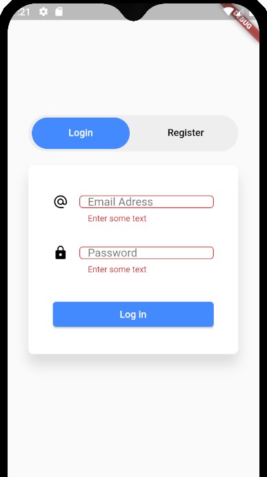
When the error message shows up, it reduces the height of the TextFormField. If I understood correctly, that's because the height of the error message is taking into account in the height specified.

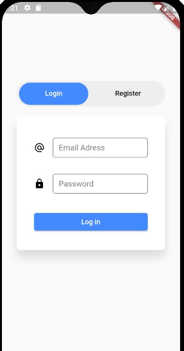
Here's a screen before :

before

and after :

after

Tried to put conterText: ' ' to the BoxDecoration (as I've seen on another topic) but it didn't help.

An idea ?

EDIT : OMG completly forgot to put the code, here it is :

 return Form(
      key: _formKey,
      child: Column(
        crossAxisAlignment: CrossAxisAlignment.center,
        mainAxisAlignment: MainAxisAlignment.spaceEvenly,
        children: <Widget>[
          Container(
            height: 40.0,
            child: _createTextFormField(loginEmailController, Icons.alternate_email, "Email Adress", false, TextInputType.emailAddress),
          ),
          Container(
            height: 40.0,
            child: _createTextFormField(loginPasswordController, Icons.lock, "Password", true, TextInputType.text),
          ),

          SizedBox(
            width: double.infinity,
            child: loginButton
          )
        ],
      ),
    );

  }

  Widget _createTextFormField(TextEditingController controller, IconData icon, String hintText, bool obscureText, TextInputType inputType){
      return TextFormField(
        keyboardType: inputType,
        controller: controller,
        obscureText: obscureText,
        /* style: TextStyle(
          fontSize: 15.0,
        ), */
        decoration: InputDecoration(
         /*  contentPadding:
              EdgeInsets.symmetric(vertical: 5.0, horizontal: 8.0), */
          border: OutlineInputBorder(borderRadius: BorderRadius.circular(5.0)),
          icon: Icon(
            icon,
            color: Colors.black,
            size: 22.0,
          ),
          //hintText: hintText,
          labelText: hintText,
        ),
        validator: (value) {
          if (value.isEmpty) {
            return 'Enter some text';
          }
          return null;
        },
      );
    }
user54517
  • 2,020
  • 5
  • 30
  • 47

6 Answers6

37

In your Code - you need to comment out the 40 height given to each container.

Container(
             // height: 40.0,
              child: _createTextFormField(
                  loginEmailController,
                  Icons.alternate_email,
                  "Email Adress",
                  false,
                  TextInputType.emailAddress),
            ),
            Container(
            //  height: 40.0,
              child: _createTextFormField(loginPasswordController, Icons.lock,
                  "Password", true, TextInputType.text),
            ),

and then in your - TextFormField in InputDecoration, you can alter these value as per your liking.

  contentPadding:
      EdgeInsets.symmetric(vertical: 10.0, horizontal: 10.0),
anmol.majhail
  • 48,256
  • 14
  • 136
  • 105
  • 3
    Yes, but what if you want the form field to be smaller, I find the default size too big, and the only way I have found to make it smaller is by using a container. The padding doesn't change the height of the field. So still a problem, for me at least. – Wesley Barnes Sep 19 '21 at 00:20
  • 2
    Use `isDense: true` – Elihai David Vanunu Dec 23 '21 at 13:22
12

Above solutions did not work for me however I have figured out a very simple solution to avoid the above issue

TextFormField(
    decoration: InputDecoration(
      **errorStyle: const TextStyle(fontSize: 0.01),**
      errorBorder: OutlineInputBorder(
        borderRadius: BorderRadius.circular(borderRadius),
        borderSide: const BorderSide(
          color: AppColor.neonRed,
          width: LayoutConstants.dimen_1,
          style: BorderStyle.solid,
        ),
      ),
   );

Catch in the above solution is that we are setting the size of the error message to 0.01 so as a result it don't show up.

Additionally we can have custom border for the error.

Note : Setting the Text size to 0 is not working as it don't consider the text size and textFormField widget gets shrinked.

akshay toshniwal
  • 180
  • 1
  • 11
10

Instead of using a fixed height container to wrap the textFormField, You can try to put a space in the helper text so it will keep the height of the field constant while only displaying when there is an error.

return TextFormField(
   // ...
   decoration: InputDecoration(
     // ...
     helperText: " ",
     helperStyle: <Your errorStyle>,
   )
        

According to Flutter Doc :

To create a field whose height is fixed regardless of whether or not an error is displayed, either wrap the TextFormField in a fixed height parent like SizedBox, or set the InputDecoration.helperText parameter to a space.

GG.
  • 226
  • 4
  • 10
4

The problem is that we are not able to see your code so it might be challenging to assist you but I will do everything from scratch. You can firstly create the authentication class in one dart file

class AuthBloc{
   StreamController _passController = new StreamController();
   Stream get passStream => _passController.stream;
   bool isValid(String pass){
       _passController.sink.add("");
       if(pass == null || pass.length < 6){
         _passController.sink.addError("Password is too short");
         return false;
       }
       else{
         return true;
       }
    }

    void dispose(){
      _passController.close();    
     }
}

And then insert the following code in another dart file...

class LoginPage extends StatefulWidget{
  @override
  _LoginPageState createState() => _LoginPageState();
}
class _LoginPageState extends State<LoginPage>{
   AuthBloc authBloc = new AuthBloc();
   @override
   void dispose(){
     authBloc.dispose();
   }
   @override
   Widget build(BuildContext context){
     return Scaffold(
       body: Container(
         padding: EdgeInsets.fromLTRB(30, 0, 30, 0),
         constraints: BoxConstraints.expand(),
         children: <Widget>[
           Padding(
            padding: const EdgeInsets.fromLTRB(0, 40, 0, 20),
            child: StreamBuilder(
                stream: authBloc.passStream,
                builder: (context, snapshot) => TextField(
                  controller: _passController,
                  style: TextStyle(fontSize: 18, color: Colors.black),
                  decoration: InputDecoration(
                      errorText: snapshot.hasError ? snapshot.error:null,
                      labelText: "Password",
                      prefixIcon: Container(
                        width: 50,
                        child: Icon(Icons.lock),
                      ),
                      border: OutlineInputBorder(
                          borderSide: BorderSide(color: Color(0xffCED802), width: 1),
                          borderRadius: BorderRadius.all(Radius.circular(6))
                      )
                  ),
                ),
            )
          ),
          Padding(
            padding: const EdgeInsets.fromLTRB(0, 30, 0, 40),
            child: SizedBox(
              width: double.infinity,
              height: 52,
              child: RaisedButton(
                onPressed: _onLoginClicked,
                child: Text(
                  "Login",
                  style: TextStyle(fontSize: 18, color: Colors.white),
                ),
                color: Color(0xff327708),
                shape: RoundedRectangleBorder(
                    borderRadius: BorderRadius.all(Radius.circular(6))
                ),
              ),
            ),
          ),
         ]
       )
     )
   }
   _onLoginClicked(){
     var isValid = authBloc.isValid(_passController.text);
     if(isValid){
       //insert your action
     }
   }
}

I hope it works :)

1

The problem with content padding is that you cant decrease the size of the field to UI requirement with an emphasize on decrease but how ever the second answer helped me come with a solution for my perticular problem, so am sharing that

StreamBuilder(
                    stream: viewModel.outEmailError,
                    builder: (context, snap) {
                      return Container(
                        width: MediaQuery.of(context).size.width*.7,
                        height: (snap.hasData)?55:35,
                        child: AccountTextFormField(
                          "E-mail",
                          textInputType: TextInputType.emailAddress,
                          focusNode: viewModel.emailFocus,
                          controller: viewModel.emailController,
                          errorText: snap.data,
                          textCapitalization: TextCapitalization.none,
                          onFieldSubmitted: (_) {
                            nextFocus(viewModel.emailFocus,
                                viewModel.passwordFocus, context);
                          },
                        ),
                      );
                    }),
ammar188
  • 83
  • 1
  • 5
0

I tried all the above answers. Nothing worked. After a struggle for one day, I could able to achieve it.

To apply custom height to the TextFormField without shrinking its height even after the error text, We have to use a combination of constraints, contentPadding, and isDense.

TextFormField(
  controller: controller,//use your controller
  autovalidateMode: AutovalidateMode.onUserInteraction,
  decoration: InputDecoration(
    constraints: const BoxConstraints(maxHeight: 70, minHeight: 35),
    border: OutlineInputBorder(borderRadius: BorderRadius.circular(6)),
    contentPadding:const EdgeInsets.symmetric(vertical: 15, horizontal: 10),
    hintText: hintText,
    isDense: true,
  ),
  validator: validator, //use your custom validator
),

I hope it helps. Happy Coding

toyota Supra
  • 3,181
  • 4
  • 15
  • 19