15

Take a look at these screenshots:

https://i.stack.imgur.com/1TFuj.png

https://i.stack.imgur.com/3fukT.png

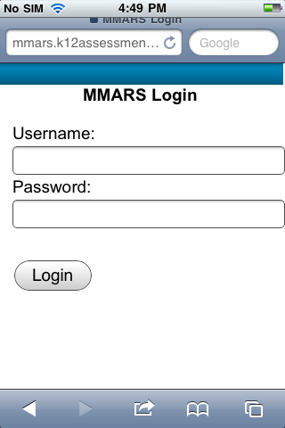
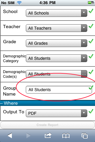
I am having trouble getting text inputs to render as expected when set to 'width: 100%'. The text box extends too far to the right, past the right padding in the first screenshot and past the right margin of the div in the second screenshot.

Is this a bug in mobile Safari? If so, can anyone suggest a workaround? It seems to work fine in other mobile browsers and also in the desktop version of Safari. The problem seems limited to input elements, as select elements seem to have the proper width when styled in the exact same way.

Thanks in advance for any help!

Here's the code for the first screenshot:

<div style="padding-left: 1em; padding-right: 1em;">
    <div style="font-size: 1.2em;">
       Username:
    </div>
    <div>
        <input type="text" style="width: 100%; font-size: 1.1em;" id="tbUsername" name="tbUsername">
    </div>
</div>

And here's the code for the second (notice how the select elements, which are styled the exact same way, are unafflicted):

 <div class="item">
    <hr />
      <div class="title">Group Name</div>
      <div class="content">
         <asp:TextBox ID="tbGroupName" runat="server">
         </asp:TextBox>
      </div>
      <div class="confirmation">
         <img alt="" src="../Graphics/Check-icon.png" runat="server" id="imgConfirmGroupName"/>
     </div>
  <hr />
</div>

And here's the CSS:


.item
{
padding-top: .5em; padding-bottom: .5em;
border-left: 1px solid black;
border-bottom: 1px solid black;

padding-left: 0.5em;

}

.item .title { float: left; width: 25%; }

.item .content { float: left; width: 67%; }

.item .confirmation { float:left; width: 8%; }

.item .confirmation img { padding-left: .3em; height: 1.1em; }

.item hr { clear: both; visibility: hidden; padding: 0; margin: 0; }

.item select { width: 100% !important; font-size: 0.9em; }

.item input { width: 100% !important; font-size: 0.9em; }

nw.
  • 4,795
  • 8
  • 37
  • 42
  • It looks like (based on the screen shots) that there is padding being applied to your input field. 100% + Padding = more than 100%. – DA. Apr 11 '11 at 01:40
  • There is padding on the div two divs above the container element in both cases. My understanding is that a div of 'width: auto' inside a div with padding would be the width of the parent div minus the padding, and an element inside that inner div with a width of 100% would should be 100% the width of the child div (width of the parent div minus the padding). Is this correct? – nw. Apr 11 '11 at 05:30
  • 2
    I'm suggesting that your INPUT tag may have padding on it--either default padding or perhaps padding inherited from other CSS somewhere. Try setting it to 0 to see if that fixes the problem. – DA. Apr 11 '11 at 05:39
  • 1
    Looks like you hit the nail on the head, mobile safari seems to add some padding to the default style for text inputs. Thanks for the help! – nw. Apr 12 '11 at 20:45

1 Answers1

36

Maybe this property on inputs will help you?

input[type="text"]{
   -moz-box-sizing:    border-box;
   -webkit-box-sizing: border-box;
    box-sizing:        border-box;
}
Rustam
  • 1,875
  • 2
  • 16
  • 33
  • Be sure to explicitly set your input type attribute -- otherwise this may not work for you. – Kaganar Sep 23 '15 at 21:24
  • You should probably think about [applying this universally](http://www.paulirish.com/2012/box-sizing-border-box-ftw/). Even in the
    , there could be other input types like "tel" or "email". Also, developer prefixes are pretty much dead - [http://caniuse.com/#feat=css3-boxsizing](http://caniuse.com/#feat=css3-boxsizing)
    – timbo Sep 16 '16 at 22:18
  • I tried `box-sizing` in an Ipad 1 and it didn't work. So I added `-webkit-box-sizing:` and the prefix fixed it. Thanks so much! – DR01D Feb 28 '17 at 22:52