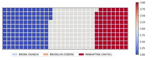
I can't get the chart legend colors to match with the actual plot colors. They are all off, some are close. I'll post the code below and the steps I took to get to the final plot.
Here is what I ended up getting:
import pandas as pd
import numpy as np
import matplotlib as mpl
import matplotlib.pyplot as plt
import matplotlib.patches as mpatches # needed for waffle Charts
%matplotlib inline

#The Data Frame:
borough3_df=borough_df.loc[['BRONX','BROOKLYN','MANHATTAN']]
borough3_df.head()
Borough has been set as index, the other column is 'Total'

Step 1. The first I took is to determine the proportion of each category with respect to the total.
# compute the proportion of each category with respect to the total
total_values = sum(borough3_df['Total'])
category_proportions = [(float(value) / total_values) for value in borough3_df['Total']]

# print out proportions
for i, proportion in enumerate(category_proportions):
    print (borough3_df.index.values[i] + ': ' + str(proportion))

BRONX: 0.3771366608264604
BROOKLYN: 0.35929220439297466
MANHATTAN: 0.26357113478056493
Step 2. The second step is defining the overall size of the waffle chart.
width = 30 # width of chart
height = 10 # height of chart

total_num_tiles = width * height # total number of tiles
Step 3. The third step is using the proportion of each category to determine its respective number of tiles
# compute the number of tiles for each catagory
tiles_per_category = [round(proportion * total_num_tiles) for proportion in category_proportions]

# print out number of tiles per category
for i, tiles in enumerate(tiles_per_category):
    print (borough3_df.index.values[i] + ': ' + str(tiles))
BRONX: 113 BROOKLYN: 108 MANHATTAN: 79
Step 4. The fourth step is creating a matrix that resembles the waffle chart and populating it.
# initialize the waffle chart as an empty matrix
waffle_chart = np.zeros((height, width))

# define indices to loop through waffle chart
category_index = 0
tile_index = 0

# populate the waffle chart
for col in range(width):
    for row in range(height):
        tile_index += 1

        # if the number of tiles populated for the current category is equal to its corresponding allocated tiles...
        if tile_index > sum(tiles_per_category[0:category_index]):
            # ...proceed to the next category
            category_index += 1

        # set the class value to an integer, which increases with class
        waffle_chart[row, col] = category_index
Step 5. Mapped the waffle chart matrix into a visual.
# instantiate a new figure object
fig = plt.figure()

# use matshow to display the waffle chart
colormap = plt.cm.coolwarm
plt.matshow(waffle_chart, cmap=colormap)
plt.colorbar()

# get the axis
ax = plt.gca()

# set minor ticks
ax.set_xticks(np.arange(-.5, (width), 1), minor=True)
ax.set_yticks(np.arange(-.5, (height), 1), minor=True)

# add gridlines based on minor ticks
ax.grid(which='minor', color='w', linestyle='-', linewidth=2)

plt.xticks([])
plt.yticks([])

#ADDITIONS

# compute cumulative sum of individual categories to match color schemes between chart and legend
values_cumsum = np.cumsum(borough3_df['Total'])
total_values = values_cumsum[len(values_cumsum) - 1]

# create legend
legend_handles = []
for i, category in enumerate(borough3_df.index.values):
    label_str = category + ' (' + str(borough3_df['Total'][i]) + ')'
    color_val = colormap(float(values_cumsum[i])/total_values)
    legend_handles.append(mpatches.Patch(color=color_val, label=label_str))


# add legend to chart
plt.legend(handles=legend_handles,
           loc='lower center',
           ncol=len(borough3_df.index.values),
           bbox_to_anchor=(0., -0.2, 0.95, .1)
          )
Bronx should be a darker blue Brooklyn should be lighter blue Manhattan seems to be working just fine.
Here's the image: