0

I have an unordered list in three columns:

    ul#menu-referenzen {
list-style:none;
-moz-column-count: 3;
-moz-column-gap: 50px;
-webkit-column-count: 3;
-webkit-column-gap: 50px;
column-count: 3;
column-gap: 50px;
}
ul#menu-referenzen li { 
    display:block;
    text-align:center;
    border:1px solid #f00; 
    padding: 2% 5% 2% 5%;
    font-weight:600;
    background-color: rgba(255, 255, 255, 0.7);     
    color:#333;
    padding:10px;
    margin-bottom:10px;
}    
    ul#menu-referenzen li.current-cat a { color:#333; background-color:rgba(235, 234, 102, 0.8);    }
    ul#menu-referenzen li.cat-item a:hover {    background-color: rgba(235, 234, 102, 0.8); }
<div class="fullwidth-referenzen">
        <nav class="fullwidth-menu-referenzen">
            <ul id="menu-referenzen" class="fullwidth-menu nav downwards">
                <li class="cat-item cat-item-30"><a href="#" >Büro &amp; Verwaltung</a></li>
                <li class="cat-item cat-item-36"><a href="#" >Gesundheitswesen</a></li>
                <li class="cat-item cat-item-31"><a href="#" >Gewerbe &amp; Industrie</a></li>
                <li class="cat-item cat-item-34"><a href="#" >Pflegeheime</a></li>
                <li class="cat-item cat-item-33"><a href="#" >Schulen &amp; Kitas</a></li>
                <li class="cat-item cat-item-32"><a href="#" >Verkaufsstätten</a></li>
                <li class="cat-item cat-item-35"><a href="#" >Versammlungsstätten</a></li>
                <li class="cat-item cat-item-29"><a href="#" >Wohnen</a></li>
             </ul>
        </nav>
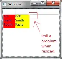
    </div> 

When I add margin-bottom:10px; for having some space between the list items it works in Firefox and Chrome, but not in IE11.

What can I do to fix this? enter image description here

EDIT:

Thanks for your help. I changed it to grid-layout. This works for Firefox, but nothing works for IE. I don't know why?!

ul#menu-referenzen {
list-style:none;
display:grid;
-ms-grid-template-rows:50px 50px 50px; 
-ms-grid-template-columns:33% 33% 33%; 
-ms-grid-auto-flow: column; 
-ms-grid-row-gap: 20px; 
-ms-grid-column-gap: 10px;
-ms-align-items:center;

grid-template-rows:50px 50px 50px; 
grid-template-columns:33% 33% 33%; 
grid-auto-flow: column; 
grid-row-gap: 20px; 
grid-column-gap: 10px;
align-items:center;
}

Changed Syntax to: (display: -ms-grid; and to -ms-grid-rows / -ms-grid-columns) but this did not work either.

bummi
  • 27,123
  • 14
  • 62
  • 101
isd17
  • 13
  • 3
  • I'm not as familiar with some of the tags you're using but it sounds like a problem that occurs a lot with responsive grid layouts. The solution on the grid layouts is to ensure that you're using 'box-sizing: border-box;' on all relevant elements. – MaKR Apr 29 '19 at 17:40
  • I recommend you using `grid` display. – Mostafa Ghadimi Apr 29 '19 at 17:45
  • It's unclear from your problem description and your screenshot what, exactly, is 'not working' in IE. Can you please clarify what your expected outcome is and how your code's layout differs from said outcome in IE? – TylerH Apr 29 '19 at 18:33

4 Answers4

0

I tried adding padding-bottom:1px to ul#menu-referenzen li {} class. it's working fine for me not only on chrome and firefox but also IE.

ul#menu-referenzen li { 
   display:block;
   text-align:center;
   border:1px solid #f00; 
   padding: 2% 5% 2% 5%;
   font-weight:600;
   background-color: rgba(255, 255, 255, 0.7);  
   color:#333;
   padding:10px;
   margin-bottom:10px;
   padding-bottom:1px
}   

hope it helps

Irf
  • 4,285
  • 3
  • 36
  • 49
0

Try This CSS add in li

.li{
-webkit-column-count: 3; /* Chrome, Safari, Opera */
-moz-column-count: 3; /* Firefox */
 column-count: 3;

-webkit-column-gap: 10px; /* Chrome, Safari, Opera */
-moz-column-gap: 10px; /* Firefox */
 column-gap: 10px;
 }
AjayGohil
  • 101
  • 3
0

Looks like other browsers are adjusting the elements but IE is not adjusting elements in the same way.

if possible than you can just add one more LI tag. So now every column has 3 LI tags and it will look properly in IE.

<!DOCTYPE html>
<html>
<head>
 <title>Page Title</title>
 <style>
 ul#menu-referenzen {

list-style:none;
-moz-column-count: 3;
-moz-column-gap: 50px;
-webkit-column-count: 3;
-webkit-column-gap: 50px;
column-count: 3;
column-gap: 50px;


}
ul#menu-referenzen li { 
   display:block;
    text-align:center;
    border:1px solid #f00; 
    padding: 2% 5% 2% 5%;
    font-weight:600;
    background-color: rgba(255, 255, 255, 0.7);     
    color:#333;
  
    margin-bottom:10px;
}    
    ul#menu-referenzen li.current-cat a { color:#333; background-color:rgba(235, 234, 102, 0.8);    }
    ul#menu-referenzen li.cat-item a:hover {    background-color: rgba(235, 234, 102, 0.8); }
 </style>
</head>
<body>
<div class="fullwidth-referenzen">
        <nav class="fullwidth-menu-referenzen">
            <ul id="menu-referenzen" class="fullwidth-menu nav downwards">
                <li class="cat-item cat-item-30"><a href="#" >Büro &amp; Verwaltung</a></li>
                <li class="cat-item cat-item-36"><a href="#" >Gesundheitswesen</a></li>
                <li class="cat-item cat-item-31"><a href="#" >Gewerbe &amp; Industrie</a></li>
                <li class="cat-item cat-item-34"><a href="#" >Pflegeheime</a></li>
                <li class="cat-item cat-item-33"><a href="#" >Schulen &amp; Kitas</a></li>
                <li class="cat-item cat-item-32"><a href="#" >Verkaufsstätten</a></li>
                <li class="cat-item cat-item-35"><a href="#" >Versammlungsstätten</a></li>
                <li class="cat-item cat-item-29"><a href="#" >Wohnen</a></li>
   <li class="cat-item cat-item-29"><a href="#" >Wohnen</a></li>
             </ul>
        </nav>
    </div> 


</body>
</html>

Output in IE 11:

enter image description here

Further, you can modify the css code to display it properly when elements get added dynamically.

Deepak-MSFT
  • 10,379
  • 1
  • 12
  • 19
-1

I think given the current level of support for css grid it is probably your best bet (see coverage for css grid here: https://caniuse.com/#search=grid). For this, IE11 needs the -ms- prefix.

Just use display:grid in the parent element along with grid-template-columns. If you need mandatory spacing between elements you can use the grid-column-gap and grid-row-gap properties in the parent element. The child elements do not need to be changed in your case, just define the grid you want in the parent element and you're good to go. I also suggest using Firefox developer edition if you can for testing since it has the grid view highlighting in its developer tools and is of great help when first getting started with css grid.

Just define the columns and rows will be allocated based on the amount and sizes of the child elements.

For more info on css grid check this out: https://css-tricks.com/snippets/css/complete-guide-grid.

ul#menu-referenzen {
list-style:none;
display: grid;
grid-template-columns: 3fr;
grid-column-gap: 10px;
grid-row-gap: 10px;
-ms-grid-template-columns: 3fr;
-ms-grid-column-gap: 10px;
-ms-grid-row-gap: 10px;
}