3

I'm trying to think an interface for a time-keeping system that will let users see "at a glance" how much time still needs to be completed.

This is complicated by the fact that there are no fixed hours - employees must work at least 6 hours on any given week day, and at the end of each month should have worked 7.5 hours for each week day that month. 7.5 hours either way can be carried over to next month. Employees can also take up to 1 morning and 1 afternoon per month 'flex' time. Time needs should be recorded by 10.15 the following day, but this rule is bent during busy times, and end of week and particularly end of month boundaries become more important.

So what's the most readable format to display the currently entered time and highlight approaching deadlines for uncompleted entries, while still giving a feeling for how far ahead/behind track the employee is (i.e. if you have a week to go that month and you're 8 hours ahead you could schedule a little extra duvet time).

My first take was a bar chart for each day with a red line at 6. But this doesn't give you any idea of how far ahead or behind you are for each day or month or whether you are close to missing a deadline...

bar chart
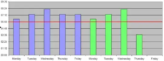
(Please excuse the horrible mockup)

Maybe I'm trying to convey too much info in one place?

--

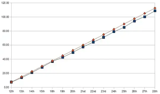
Here's a mockup of time recorded v.s. time required as suggested by Dickon Reed graph of time v.s. target

--

EDIT: this side works great for stuff like this. i'm going to kick some of these ideas around in the morning and hopefully get something posted back here.

gunr2171
  • 16,104
  • 25
  • 61
  • 88
Colin Pickard
  • 45,724
  • 13
  • 98
  • 148
  • Would "Help on a UI for time tracking" do for a title? – tehvan Feb 16 '09 at 13:16
  • "Maybe I'm trying to convey too much info in one place?" -- Having too much information is very rare - it's just a matter of how the information is organized. When everything is well ordered and visualized, you can fit lots of information on screen at once, without much mental load on the user. – Esko Luontola Feb 16 '09 at 19:22

6 Answers6

2

how about a "test tube/thermometer" image, like they have for charities... it fills up as you add time, trying to reach a goal (the red line).

Fill each day with a different color, and label accordingly... if the user works overtime M-T, they may have reached the line before Friday, etc.

similar to: alt text http://goyamarketing.com/blog/wp-content/uploads/2008/11/goal_thermometer.gif

scunliffe
  • 62,582
  • 25
  • 126
  • 161
  • I quite like this idea. it's just a vertical progress bar I suppose but you could mark off the hours and target hours for the month easier and calculate average day length remaining. the multi-colours might get confusing though, so I might have this alongside the bar chart. – Colin Pickard Feb 16 '09 at 15:22
  • exactly. The image was the best I could snag on the Internet, but I'm sure you could create a better one that more accurately indicates the status. – scunliffe Feb 16 '09 at 18:13
2

Your first chart could be improved by showing the remaining time as shown below. The remaining time until the next weekly/montly deadline is divided evenly over the remaining days before the deadline. So the UI will answer to the question: "How many hours per day will I need to work to meet my deadline?" If the user wants to take one morning/afternoon off (or did I understand you incorrectly?), you should have a checkbox for that day, after checking which the estimates will be adjusted accordingly.

You should also show the exact time on top of every vertical bar, so that the user doesn't need to estimate it in his head (I was lazy and added them to only a couple of bars in the mockup). Also highlight the current day, for example in the below picture this was done by circling "Thursday" and using a bold font for the time that the user has been working today. You could also use some visual effect for today's vertical bar.

improved bar chart http://img11.imageshack.us/img11/6755/20090216203339em2.png

For your second chart you should also draw in the weekly or monthly deadlines, as horizontal bars. In some cases the second chart might be better, but in this case I would settle with the first chart (with my improvements), because it might better correspond to the users' mental model, and that way you can also visualize the daily minimum 6h some way.

Esko Luontola
  • 73,184
  • 17
  • 117
  • 128
1

The char bar looks nice visually, but what you really need to know is how far behind/ahead you are in your hours totally.

If i understood correctly, you are interested only in your current saldo and your current deadline, so you could display that information in 2 seperate fields (e.g. below the chart). Of course, you could also mark the deadline with some horizontal line in the graph.

tehvan
  • 10,189
  • 5
  • 27
  • 31
1

How about a pie chart where the total size represents the minimum goal and add pie slices for each day with actual days that met the minimum one color, days with extra time another and then fill the remaining days as gray slices with the number of hours the employee would have to work divided evenly among them?

Echostorm
  • 9,678
  • 8
  • 36
  • 50
  • the problem with a pie chart is that you have 20-odd slices of almost the same size. – Colin Pickard Feb 16 '09 at 15:17
  • In general, pie charts are bad for visualizing data, because comparing the size of different slides accurately is difficult, when they are not side by side. Pie charts represent 1D data needlessly in 2D. – Esko Luontola Feb 16 '09 at 18:48
  • Its totally your call but I saw it as having the numbers on each slice to help make the whole thing visually compelling. – Echostorm Feb 16 '09 at 19:09
  • i actually do like the idea, i'll have a fiddle with it and maybe use it as an alternate view – Colin Pickard Feb 16 '09 at 22:44
1

A line plot with "working days elapsed" on the X axis and "fraction of monthly required work done" on the Y axis? With only a few data points, it should be clear by visually extrapolating whether you'll hit the top early or late. The plot would look like an irregular staircase.

ps. "The Visual Display of Quantative Information" by Edward Tufte is a great book for ideas on this kind of topic.

Dickon Reed
  • 3,575
  • 4
  • 23
  • 25
1

To take Dickon Reed's idea one step further, why not do each point as a +/- hours ahead or behind, with your baseline always 0. That way you have more detail. I'm not sure if I got my point across, but it's hard to do without an example, and I'm short on time.

Moose
  • 5,354
  • 3
  • 33
  • 46