1

I'm trying the componant named Flickity, super-cool but the problem is that the carousel height is hard defined in CSS, and does not take the height of the content in carousel-cell. I tried to use the option setGallerySize: false but it's not working.

I have a mobile-first website, with content that shrinks according to the device, and I want the Flickity carousel to match with content height.

Do you have any solutions pls? Many thanks

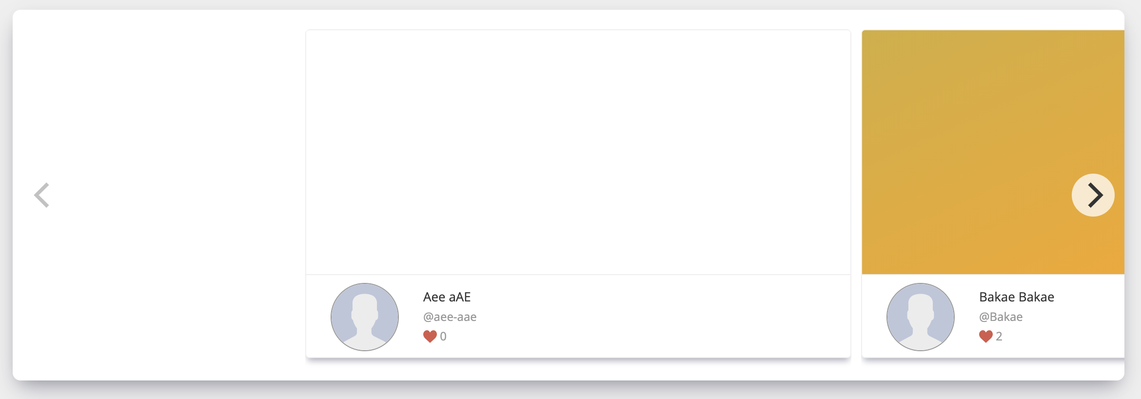
Desktop render (see space below cards) : enter image description here

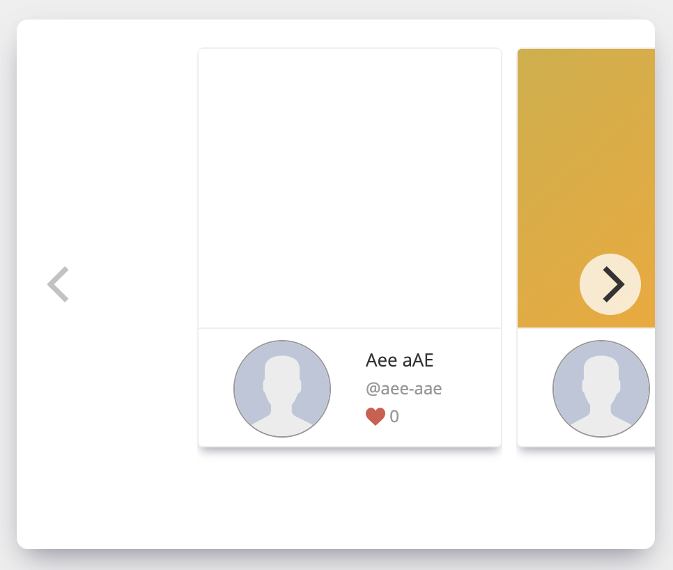
Mobile view render (see space below cards) : enter image description here

Gdebrig
  • 193
  • 1
  • 9

1 Answers1

0

Without seeing the code, I can't really suggest how to change the flickity css, but I would recommend changing and padding-bottom on the container or the margin-bottom on the flickity content from percentages (%) to pixels (px) if you want it to stay the same.

If you're opposed to using pixels, try an @media query to reduce the padding-bottom on the container div when displayed on mobile:

<style>
.container {
    padding-bottom: 10%;
}
@media screen and (max-width: 500px) { //replace max-width if too high or low
    .container {
        padding-bottom: 5%;
    }
}
</style>

<div class="container">
//content
</div>
Zohan
  • 11
  • 4