I have trouble using plotnine: I can't make graphic with 3 classes in(separated by color).
import pandas as pd
import numpy as np

from plotnine import *

path = '/home/punkproger/workspace/MyWorkPython/TestWork/galaxy_identificator/data/train.csv'

df = pd.read_csv(path)

my_plot = ggplot(data=df[:30000], mapping=aes(x='ra', fill='class', color='class')) + geom_density( alpha=0.7)
print(my_plot)
There is new 'class'(0-2) in each 10k samples.
Result will be:
But If I change number of samples to 10k(there is only 1 class):
import pandas as pd
import numpy as np

from plotnine import *

path = '/home/punkproger/workspace/MyWorkPython/TestWork/galaxy_identificator/data/train.csv'

df = pd.read_csv(path)

my_plot = ggplot(data=df[:10000], mapping=aes(x='ra', fill='class', color='class')) + geom_density( alpha=0.7)
print(my_plot)
Result is:
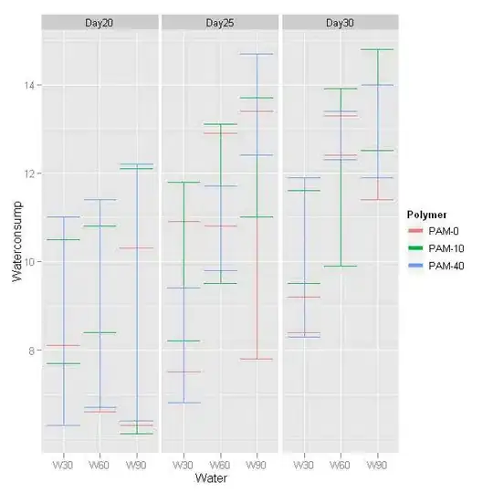
Now this one has tittle of class and color. I want to make 3 graphs in one plane, like:
I am newbee at plotnine and don't see what is wrong. Spent a lot of time trying to google and to solve this problem.
Here you can download data : https://drive.google.com/file/d/1IMK1YtXG8Zl1lY8JJ12RtzDpHn65vQKi/view


