3

My x-axis being time in hours and minutes, I am not able to plot in intervals of 1 hour, by default it is plotting in interval of 5 hours.

Here x-axis is "newtime" which is in the format below

 00:00:00
 00:15:00
 00:30:00
 00:45:00
 01:00:00
 01:15:00
 01:30:00
 01:45:00
 02:00:00
 02:15:00
 02:30:00
     .
     .
     .
 23:45:00

First tried like this but got error

ggplot(data = temp1)+
aes(x="newtime", y="SALES" ,color="newdate")+
geom_line()+
labs(x = "Time", y = "SALES", title = s)+
scale_x_datetime(breaks="1 hour")

TypeError: Discrete value supplied to continuous scale

Second tried like this but got error

ggplot(data = temp1)+
aes(x="newtime", y="SALES" ,color="newdate")+
geom_line()+
labs(x = "Time", y = "SALES", title = s)+
scale_x_continuous(breaks=range(0,24,1))

TypeError: Discrete value supplied to continuous scale

Third tried like this but got error

ggplot(data = temp1)+
aes(x="newtime", y="SALES" ,color="newdate")+
geom_line()+
labs(x = "Time", y = "SALES", title = s)+
scale_x_discrete(breaks=range(0,24,1))

TypeError: Continuous value supplied to discrete scale

ggplot(data = temp1)+
aes(x="newtime", y="SALES" ,color="newdate")+
geom_line()+
labs(x = "Time", y = "SALES", title = s)

The entire code is here

import pandas as pd
from plotnine import *
import numpy as np

temp1=pd.read_excel("C:\\Users\\Desktop\\2019\\DATA.xlsx")
a=temp1.Date.astype(str)
temp1["newdate"]=a
b=pd.to_timedelta(temp1.Hour, unit='h') + pd.to_timedelta(temp1.Min, 
unit='m')
temp1["newtime"]=b
v=(
 ggplot(data = temp1)+
 aes(x="newtime", y="SALES" ,color="newdate")+
 geom_line()+
 labs(x = "Time", y = "SALES", title = "s")+
 scale_x_datetime(breaks="1 hour")

  )
print(v)

And the data is in the link link

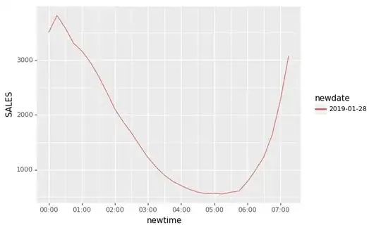
I'm trying to plot something like this !https://i.stack.imgur.com/xOMRE.jpg. I'm getting plot like this !https://i.stack.imgur.com/Mr9cb.jpg.

  • Welcome to SO! Please, provide a [Minimal, Complete, and Verifiable example](https://stackoverflow.com/help/mcve) which would include a sample dataframe to demonstrate the problem. Without that, I can only assure you that `scale_x_datetime` works for me. – krassowski Feb 13 '19 at 20:58
  • This still does not make a reproducible example. What is `s`? What type are your data? How do you create the data frame? – krassowski Feb 14 '19 at 07:52
  • Hi @krassowski The post has been edited.Please let me know if you are able to reproduce the issue. – Srihari Uttanur Feb 14 '19 at 16:26
  • Still, works for me. You may need to provide a reproducible (like in copy-paste runnable) example (plus possibly versions of plotnine/pandas/numpy). – krassowski Feb 14 '19 at 20:07
  • Installed pandas version - '0.24.1', numpy - '1.16.1', plotnine - '0.5.1'. For same code I am getting error, snaps of code and error provided in the below link. [link](https://imgur.com/a/Is6pWJX) – Srihari Uttanur Feb 15 '19 at 09:01
  • 1
    Hi @krassowski I have edited the post, the entire code and dataset is provided. Please let me know if you are able to reproduce the issue. – Srihari Uttanur Feb 16 '19 at 16:04
  • Posted an answer below. Let me know if the solution works for you! – krassowski Feb 17 '19 at 20:11

1 Answers1

3

When using timedelta dtype you need to use scale for this type: scale_x_timedelta. However, this may require some tricks to specify breaks, e.g.:

scale_x_timedelta(
    breaks=lambda x: pd.to_timedelta(
        pd.Series(range(0, 10)),
        unit='h'
    )
)

Which looks like this:

using deltatime

Alternatively, you could keep using scale_x_datetime, converting your newtime column:

temp1.newtime = pd.to_datetime(temp1.newtime)

And if you want to have nice labels, use mizani formatters:

from mizani.formatters import date_format

v = (
    ggplot(data=temp1)
    + aes(x="newtime", y="SALES", color="newdate")
    + geom_line()
    + scale_x_datetime(
        breaks="1 hour",
        labels=date_format('%H:%M') # for nice labels
    )
)
print(v)

And here is the result:

using datetime

krassowski
  • 13,598
  • 4
  • 60
  • 92