3

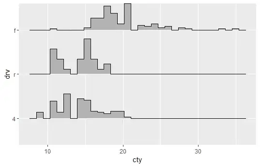
How do I change the scaling of a ggridges figure so that the plot behaves more like a histogram, and less like a kernel density plot? That is, I would like the figure to reflect the disparate size of the categorical variable.

For instance

library(tidyverse)
library(ggridges)

data(mpg)    

mpg %>% 
  mutate(
    drv = drv %>% 
      fct_reorder(
        cty
        )
    ) %>% 
  ggplot(
    aes(cty, drv)
    ) +
  geom_density_ridges(
    stat = "binline", 
    scale = .8
    )

enter image description here

the issue here is that the r category of mpg$drv has only 25 observations, while both f and 4 have over 100 observations each. I want the height of the figure to reflect the count of observations at each point
tomw
  • 3,114
  • 4
  • 29
  • 51

1 Answers1

5

Funny enough, your title is essentially the solution. You will want to include the height = ..count.. in your aes()

mpg %>% 
  mutate(
    drv = drv %>% 
      fct_reorder(
        cty
      )
  ) %>% 
  ggplot(
    aes(cty, drv, height = ..count..)
  ) +
  geom_density_ridges(
    stat = "binline", 
    scale = .8
  )

Which gives you the following: unscaled height ggpridges

Dave Gruenewald
  • 5,329
  • 1
  • 23
  • 35
  • 2
    I was going to ask a separate question for this, but is it possible to somehow include a secondary y-axis that shows the count values for each of the different values of drv? Perhaps on the right side? – qdread Jul 20 '20 at 18:12