I currently have a data frame of frequencies and would like to make a heatmap. The Heat map that I have is not in-depth enough, and I am unsure of how to cluster the data by rows and by columns. What else should I add to my code?
Here is some sample data, to give a solid example, the first 6 rows of my .txt file:
df <- matrix(c("cdr3aa", "Ana-Wk0-CD4", "Ana-Wk27-CD4", "Ana-Wk0-CD8", "Ana-Wk27-CD8", "nonshared", "shared",
 "CASSLSPSTGNYGYTF", 1.12E-05, 0, 0.067313861, 0.049220624, 0.188215557, 0,
 "CASCSRTSTDTQYF", 0, 3.19E-06, 0.065083991, 0.034558507, 0.105607859, 0,
 "CASGGQG_GNQPQHF", 4.61E-04, 2.98E-04, 0, 0, 0.079950136, 0,
 "CASRLRTGYDTEAFF", 7.50E-06, 6.38E-06, 0.057943843, 0.047042366, 0.073757427, 0,
 "CAISEWDRAGELFF", 3.75E-06, 1.12E-05, 0.069951496, 0.060104224, 0.060978181, 0,
 "CASSFPIREESSYNEQFF", 0, 0, 0.018718651, 0.015058722, 0.023803322, 0), ncol = 7, byrow = TRUE)
This is what I currently have so far:
#Input of data
df <- read.table("TESTING.txt", header=TRUE, comment.char="", sep = "\t")
#Removing the first row
result <-df[-1]
#Setting the rownames as the CDR3 sequences
row.names(result) <- df$cdr3aa
#Making the HeatMap
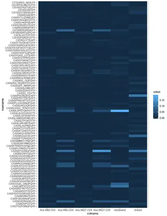
dt2 <- result %>%
rownames_to_column() %>%
gather(colname, value, -rowname)
head(dt2)
ggplot(dt2, aes(x = colname, y = rowname, fill = value)) +
geom_tile()
This gives me a heatmap like so:
Now, I am trying to make my heatmap more like this:
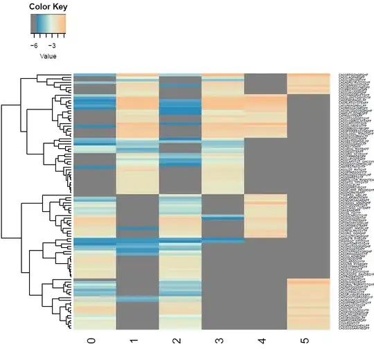
As you can see, this heatmap has the clustering of rows that I am looking for and the color scheme that I would like.
I am also guessing that a proper heatmap is done on a logarithmic scale. The first pic is not like that, and I apologize. I know that I am close to my goal but I am unsure on how to proceed to get to the final result. I would like to keep the format of the first pic; all I would have to do is put "Sample ID" as the x title and "CDR3AA" as the y title. Any help for this would be greatly appreciated. I am still learning R, so anything that there is to learn I am willing to learn it. Thx!