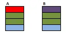
How do I get precise sizing on different platforms, if each platform renders text at a different size? This issue was exacerbated with the recent release of Firefox 4. This version enables hardware rendering of text using DirectWrite. The size of the text written with DirectWrite is much taller than text written with no hardware acceleration. Note the following example. Here's the live example if you need to see the CSS.

- Windows 7 64-bit Home
- ATI Radeon HD 4670
- DirectWrite is off because my drivers are not updated.
- 620 x 283

- Windows Vista 64-bit Business
- nVidia GeForce 8800GT
- DirectWrite is on because I just updated my drivers.
- 620 x 293
HTML
<ul>
 <li><a>Nav</a></li>
 <li><a>Nav</a></li>
 <li><a>Nav</a></li>
</ul>
<div>
 Content
</div>
CSS
ul {
 float: left;
 width: 10em;
}

div {
 margin: 0 0 0 12.7em;
 min-height: 26.1em;
}
Do you see how the navigation lines up with the content when DirectWrite is off, but the navigation is taller than the content when DirectWrite is on? I know there are some hacky solutions. One is to specify everything (font-size, width, height) in px. This is not ideal because the component will not be modular - that is, it can't be re-used in another setting scaled to another size. It also breaks IE6's font size options. Another solution is to use JavaScript to read the physical height of the navigation and make the content the same height. This is not ideal because it is CSS's role to style. Is there any CSS solution for this?
This is just one of many examples. Another is Firefox 3 on Ubuntu 9 has much wider text, so not all links fit in my primary navigation. I was forced to chop off the last navigation link with max-width: 37em; overflow: hidden.