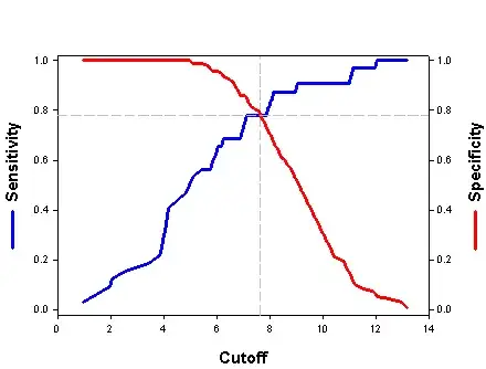
If you are using the pROC package, the first step is to extract the coordinates of the curve. For instance:
library(pROC)
data(aSAH)
myroc <- roc(aSAH$outcome, aSAH$ndka)
mycoords <- coords(myroc, "all")
Once you have that you can plot anything you like. This should be somewhat close to your example.
plot(mycoords["threshold",], mycoords["specificity",], type="l",
     col="red", xlab="Cutoff", ylab="Performance")
lines(mycoords["threshold",], mycoords["sensitivity",], type="l",
      col="blue")
legend(100, 0.4, c("Specificity", "Sensitivity"),
       col=c("red", "blue"), lty=1)
Choosing the "optimal" cutpoint is as difficult as defining what is optimal in the first place. It highly depends on the context and your application.
A common shortcut is to use the Youden index, which is simply the point with the cutoff with max(specificity + sensitivity). Again with pROC:
best.coords <- coords(myroc, "best", best.method="youden")
abline(v=best.coords["threshold"], lty=2, col="grey")
abline(h=best.coords["specificity"], lty=2, col="red")
abline(h=best.coords["sensitivity"], lty=2, col="blue")
With pROC you can change the criteria for the "best" threshold. See the ?coords help page and the best.method and best.weights arguments for quick ways to tune it. You may want to look at the OptimalCutpoints package for more advanced ways to select your own optimum.
The output plot should look something like this:


