48

I am playing with Checkbox to see how it works, but I don't see a title option with it.

Checkbox(
  title: Text("Checkbox label"),  // The named parameter 'title' isn't defined.
  value: true,
  onChanged: (newValue) { },
);

Do I have to create my own widget to add a title to it?

Suragch
  • 484,302
  • 314
  • 1,365
  • 1,393

5 Answers5

118

If you need a Checkbox with a label then you can use a CheckboxListTile.

enter image description here

  CheckboxListTile(
    title: Text("title text"), //    <-- label
    value: checkedValue,
    onChanged: (newValue) { ... },
  )

If you want the checkbox on the left of the text then you can set the controlAffinity parameter.

enter image description here

  CheckboxListTile(
    title: Text("title text"),
    value: checkedValue,
    onChanged: (newValue) { ... },
    controlAffinity: ListTileControlAffinity.leading,  //  <-- leading Checkbox
  )

Notes

  • Since it is a ListTile, clicking anywhere on the row activates the onChanged() callback. You need to rebuild it with the correct checked values yourself, though. See this answer.
  • An alternate solution would be to make your own widget using a Row with a Checkbox and a Text widget. You would probably want to wrap it in a gesture detector, though, so that taps on the text would also trigger an onChanged() callback. You could start with the CheckboxListTile source code as a reference.
Suragch
  • 484,302
  • 314
  • 1,365
  • 1,393
  • Seems about perfect as-is, given that almost no one has pointy enough fingers to only hit the checkbox all the time. – ChrisH Jun 01 '19 at 20:02
  • This can be recognized by [Screen reader](https://en.wikipedia.org/wiki/Screen_reader) services? – eapo Sep 16 '20 at 16:49
  • @eapo I haven't tested that yet, but it should. The standard Flutter widgets have a semantics property that supports accessibility. – Suragch Sep 16 '20 at 23:52
  • How can we adjust left right padding/margin of checkbox in CheckboxListTile? Please suggest. Thanks. – Kamlesh Oct 07 '20 at 13:41
4

I used a Wrap with negative spacing to get a label right under the checkbox.

child: Wrap(
    direction: Axis.vertical,
    crossAxisAlignment: WrapCrossAlignment.center,
    spacing: -15,
    children: [
       Checkbox(
           value: isPaid,
           onChanged: (bool? value) {
               setState(() {
                   isPaid = value ?? false;
               });
           },
       ),

       const Text("Paid"),
    ],
 ),

This was the result: Checkbox with label

Skhoooler
  • 71
  • 3
3

The CheckboxListTile wasn't quite right for my use case, so I took the LabeledCheckbox class from the docs and modified it a little:

import 'package:flutter/material.dart';

class LabeledCheckbox extends StatelessWidget {
  const LabeledCheckbox({
    Key? key,
    required this.label,
    required this.value,
    required this.onChanged,
  }) : super(key: key);

  final String label;
  final bool value;
  final Function onChanged;

  @override
  Widget build(BuildContext context) {
    return InkWell(
      onTap: () {
        onChanged(!value);
      },
      child: Row(
        children: <Widget>[
          Checkbox(
            value: value,
            onChanged: (bool? newValue) {
              onChanged(newValue);
            },
          ),
          Text(label),
        ],
      ),
    );
  }
}

Rafał G.
  • 1,529
  • 22
  • 35
3

Here is a simple stateful version.

import 'package:flutter/material.dart';

class LabeledCheckbox extends StatefulWidget {
  final bool? value;
  final String label;
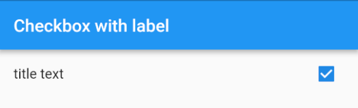
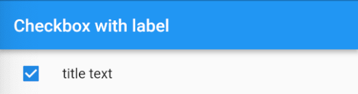
  final bool leadingCheckbox;
  final ValueChanged<bool?>? onChanged;

  const LabeledCheckbox({
    Key? key,
    this.value,
    this.onChanged,
    this.label = '',
    this.leadingCheckbox = true,
  }) : super(key: key);

  @override
  State<StatefulWidget> createState() => _LabeledCheckboxState();
}

class _LabeledCheckboxState extends State<LabeledCheckbox> {
  var value = false;

  @override
  void initState() {
    super.initState();
    value = widget.value == true;
  }

  @override
  Widget build(BuildContext context) {
    var widgets = <Widget>[
      _buildCheckbox(context),
    ];
    if (widget.label.isNotEmpty) {
      if (widget.leadingCheckbox) {
        widgets.add(_buildLabel(context));
      } else {
        widgets.insert(0, _buildLabel(context));
      }
    }
    return InkWell(
      borderRadius: BorderRadius.circular(4),
      onTap: () => _onCheckedChanged(),
      child: Row(
        mainAxisSize: MainAxisSize.min,
        children: widgets,
      ),
    );
  }

  Widget _buildCheckbox(BuildContext context) {
    return Checkbox(
      value: value,
      onChanged: (v) => _onCheckedChanged(),
    );
  }

  Widget _buildLabel(BuildContext context) {
    var padding =
        widget.leadingCheckbox ? const EdgeInsets.only(right: 8) : const EdgeInsets.only(left: 8);

    return Padding(
      padding: padding,
      child: Text(widget.label),
    );
  }

  void _onCheckedChanged() {
    setState(() {
      value = !value;
    });
    if (widget.onChanged != null) {
      widget.onChanged!.call(value);
    }
  }
}
david.krasznai
  • 101
  • 2
  • 3
-1

You can also simply put the Checkbox and Text in a Column like so:

Column(
  children: [
    Checkbox(
        value: true,
        onChanged: (bool? selected) {
          ///Your logic here
        }),
    const Text("Label"),
  ],
),

Sludge
  • 6,072
  • 5
  • 31
  • 43