70

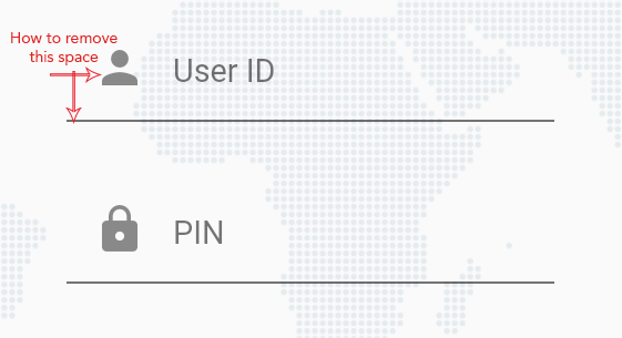
I am new to flutter and I am creating login form, for that I have used TextField and added prefix icon but I am getting some extra spaces in between textfields (user id and pin) and before the prefix icon. I have also tried InputDecorationTheme but it didn't work.

Please let me know how can I remove or reduce the space.??

Below is my code:

TextField(
  maxLength: 8,
  keyboardType: TextInputType.number,
  decoration: InputDecoration(
    hintText: hint,
    hintStyle: TextStyle(fontSize: 12.0),
    prefixIcon: Icon(icon),
    counterText: '',
  ),
)

x

Uttam Panchasara
  • 5,735
  • 5
  • 25
  • 41
Zubair Rehman
  • 2,335
  • 2
  • 20
  • 25

16 Answers16

115

Update (August 2022): still the same as of flutter 3.0.5
Update (April 2021): still work in flutter 2.0.4

As of flutter 1.17.5 (and still the same in 2.X) to completely remove or manipulate the padding manually, first you must set isDense: true and then you can adjust the contentPadding as you wanted or apply padding on the parent widget instead.

// using theme
ThemeData(
  inputDecorationTheme: InputDecorationTheme(
     isDense: true,// this will remove the default content padding
     // now you can customize it here or add padding widget
     contentPadding: EdgeInsets.symmetric(horizontal: 0, vertical: 0),
     ...
  ),
)

// per widget
TextField(
   decoration: InputDecoration(
     isDense: true,
     contentPadding: EdgeInsets.symmetric(horizontal: 0, vertical: 0),
     ...
   ),
)

As mentioned in the comment by Ataberk you can also use contentPadding: EdgeInsets.zero

TextField(
   decoration: InputDecoration(
     isDense: true,
     contentPadding: EdgeInsets.zero,
     ...
   ),
)
Alexander Dischberg
  • 1,890
  • 2
  • 13
  • 26
39

You can use contentPadding of InputDecoration. Here is sample code

TextField(
   maxLines: 8,
   decoration: InputDecoration(
      contentPadding: EdgeInsets.symmetric(vertical: 5),
      labelText: 'Description',
      labelStyle: txtHintStyle,
   )
 )
Ketan Ahir
  • 6,678
  • 1
  • 23
  • 45
26

I was able to easily achieve that by adding prefix constraints to the prefixIcon and wrapping the prefixIcon with padding like this

      TextFormField(
         enabled: true,
         decoration: InputDecoration(
         prefixIconConstraints:BoxConstraints(minWidth: 23, maxHeight: 20),
         prefixIcon: Padding(
                       padding: const EdgeInsets.only(right: 20),
                       child: Icon(
                                Icons.email,
                                color: clockColor,
                               ),
                        ),
         hintText:"Email Address"
         hintStyle:TextStyle(color: hintColor, fontSize: 14),
       ),
    ),

heres the output,hope this helps

enter image description here

Mahesh Jamdade
  • 17,235
  • 8
  • 110
  • 131
18

I come a bit late, but the only thing you have to do is to use negative padding :

TextField(
   decoration: InputDecoration(
      contentPadding: EdgeInsets.symmetric(vertical: -5),
      labelText: 'Description',
   )
 )
Skyost
  • 1,429
  • 1
  • 16
  • 31
13

By applying minus padding by using

transform: Matrix4.translationValues(-10.0, 0.0, 0.0),

put above line inside the icon container

TextFormField(
          keyboardType: TextInputType.number,
          style: new TextStyle(color: Colors.white, fontSize: 17),
          decoration: new InputDecoration(
              prefixIcon: Container(
                transform: Matrix4.translationValues(-10.0, 0.0, 0.0),
                child: Icon(
                  Icons.vpn_key,
                  color: Colors.white,
                ),
              ),
              labelText: "Enter Password",
              labelStyle: new TextStyle(color: Colors.white)),
        ),
Brinda Rathod
  • 2,693
  • 1
  • 20
  • 32
5

You can try this hack by reducing height of TextField

SizedBox(
  height: 44, // set this
  child: TextField(),
)
CopsOnRoad
  • 237,138
  • 77
  • 654
  • 440
4

You can use:

TextField(
   maxLines: 1,
   decoration: InputDecoration(contentPadding: EdgeInsets.only(bottom: -10.0))
 )
Javier Hinmel
  • 599
  • 6
  • 9
4
TextField(
   decoration: InputDecoration(
      isDense: true, //Set this to true
      contentPadding: EdgeInsets.symmetric(vertical: 0),
      hintText: 'Description',
   )
 )

Setting isDense: true will give you full control of setting the contentPadding. Make sure to set the EdgeInsets. as your need.

Sayuru_Sandaru
  • 320
  • 5
  • 12
3

That prefixIcon has already contained the padding of 12.0 according to documentation. So you don't need to provide extra padding.

See this below explanation & code which you can find in input_decorator.dart.

The prefix icon is constrained with a minimum size of 48px by 48px, but can be expanded beyond that. Anything larger than 24px will require additional padding to ensure it matches the material spec of 12px padding between the left edge of the input and leading edge of the prefix icon. To pad the leading edge of the prefix icon:

prefixIcon: Padding(
     padding: const EdgeInsetsDirectional.only(start: 12.0),
     child: myIcon, // icon is 48px widget.
)

I hope it will help.

Dhrumil Shah - dhuma1981
  • 15,166
  • 6
  • 31
  • 39
3

I have try many ways but only worked fine for me. If you want to remove the left padding of Prefix icon, Give prefixIconConstraints:BoxConstraints(maxHeight: 20) to InpuDecoration .

TextField(
      autocorrect: false,
      textAlignVertical: TextAlignVertical.bottom,
      onSubmitted: (value) {
        getXHelper.textFieldSubmit(value, type);
      },
      decoration: InputDecoration(
        isDense: true,
        prefixIconConstraints:BoxConstraints(maxHeight: 20) ,
        hintText: placeHolder,
        prefixIcon: Padding(
          padding: const EdgeInsets.only(top: 0, right: 5, bottom: 0),
          child: Icon(
            icon,
            size: 20,
          ),
        ),
        suffixIcon: type == TextFieldType.password ? passShowButton : null,
      ),
      controller: controller,
      cursorColor: Colors.black,
      style:
          TextStyle(color: Colors.black, fontFamily: AppFontFamily.fontFamily),
    );

Please check the screen shot

3

remove prefixIcon

add icon and follwong two line

Row(
  children: [
    //add icon  
    Icon(Icons.person,color: Colors.grey,),
    Flexible(
      child: TextFormField(
        decoration:  InputDecoration(
          border: InputBorder.none,
          hintText: 'User Id',
          contentPadding: EdgeInsets.all(0.0),//add content padding
          isDense: true,//add isDense
        ),
      ),
    ),
  ],
),
//add some space between two row
SizedBox(height: 10,),
Row(
  children: [
    Icon(Icons.lock,color: Colors.grey,),
    Flexible(
      child: TextFormField(
        decoration:  InputDecoration(
          border: InputBorder.none,
          hintText: 'Pin',
          contentPadding: EdgeInsets.all(0.0),
          isDense: true,
        ),
      ),
    ),
  ],
),
sajid
  • 179
  • 1
  • 6
2

replace prefixIcon-> prefix

 TextFormField(
              decoration: InputDecoration(
                prefix:Icon(
                  Icons.perm_identity_outlined,
                  color: AppColors.primary,
                ),
                labelText:'UserName'
              ),
            )
1

You can set This value for TextFeild

   decoration: InputDecoration(
   isDense: true,
   contentPadding: EdgeInsets.symmetric(horizontal: 0, vertical: 0),
   ...
 )
0

I had to achieve something similar but could not find perfect solution. Came up with and work around using Stack widget.

Widget _username(context){
  return SizedBox(
    height: 35,
    child: Stack(
      children: <Widget>[
        Align(
          alignment: Alignment.centerLeft,
          child: Icon(
            Icons.mail,
            size: 20,
            color: Theme.of(context).accentColor,
          ),
        ),
        TextField(
          style: TextStyle(
              color: Colors.white
          ),
          decoration: InputDecoration(
            contentPadding: const EdgeInsets.symmetric(vertical: 11.0, horizontal: 33.0),
            hasFloatingPlaceholder: false,
            labelText: 'Username',
            labelStyle: TextStyle(
                color: Colors.white
            ),
            enabledBorder: UnderlineInputBorder(
                borderSide: BorderSide(
                  color: Theme.of(context).accentColor,
                )
            ),
            focusedBorder: UnderlineInputBorder(
              borderSide: BorderSide(
                color: Theme.of(context).accentColor,
              ),
            ),
          ),
        ),
      ]
    ),
  );
}

SizedBox is used to control the vertical padding. For horizontal padding, Icon and TextField are stacked. This results overlapped TextField's label above Icon so contentPadding property is used to move the label to the right. With this I achieved following look.

enter image description here

Lama Madan
  • 617
  • 1
  • 10
  • 22
0

use

buildCounter: (BuildContext context, {int? currentLength, int? maxLength, bool? isFocused}) => null,
R2T8
  • 2,122
  • 2
  • 14
  • 17
0

In my case, it solved this issue:

Widget buildCustomPrefixIcon(IconData iconData) {
  return Container(
    width: 0,
    alignment: Alignment(-0.99, 0.0),
    child: Icon(
      iconData,
    ),
  );
}

enter image description here

TextFormField(
  controller: _textEditConPassword,
  focusNode: _passwordFocus,
  keyboardType: TextInputType.text,
  validator: _validatePassword,
  style: getStyleText(context),
  decoration: InputDecoration(
      isDense: true,
      //to reduce the size of icon, use if you want. I used, because my custom font icon is big
      labelText: AppConstants.PASSWORD,
      contentPadding: EdgeInsets.only(left: 0),
      //to make the base line of icon & text in same
      labelStyle: getLabelStyleText(context),
      prefixIcon: buildCustomPrefixIcon(AppCustomIcon.icon_pwd_key)),
)