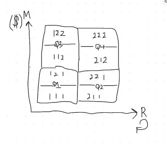
I have a data frame
    Rfm  Count    %
0   111  88824  57.13
1   112  5462   3.51
2   121  32209  20.72
3   122  15155  9.75
4   211  5002   3.22
5   212  1002   0.64
6   221  3054   1.96
7   222  4778   3.07
How can I plot a graph like this?
Background - The numbers are the RFM scores. R is Repeat (number of days since customer ordered) F is frequency (number of jobs from customers) M is monetary (how much customer is paying)
The R,F and M scores are either 1 (bad) or 2 (good).
I would like to segment them into 4 Quadrants.
I would also like the size of the blob to be proportional to the percentage.
I.e. blob 111 (57%) will be much larger than blob 212 (0.64%).
I really want to get better at data visualization, please help a beginner out. I'm familiar with seaborn and matplotlib.
Ps: Is it possible to add a third dimension to the plot? 3rd Dim would be the frequency.
Edit: The second image is a simple static way of achieveing my goal. Any input for doing it with matplotlib or seaborn? For a more interesting illustration.
[Second Image]
