6

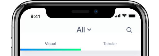
I have a tab bar functionality in which I show a Donut chart and list of vehicles but I need to show which tab the user selected for that I have indicatorColor in TabBar but I need to fill with gradient line as shown in the image please help me out.

PS: If possible please let me know how to give theme color means primary color in main as a gradient???

return Scaffold(
    body: new DefaultTabController(
        length: 2,
        child: new Column(
          children: <Widget>[
            new Container(
              width: 1200.0,
              child: new Container(
                color: Colors.white,
                child: new TabBar(
                  labelColor: Colors.black,
                  tabs: [
                    Tab(
                      child: new Text("Visual",
                      style: new TextStyle(fontSize: 20.0)
                      ),
                    ),

                    Tab(
                      child: new Text("Tabular",
                      style: new TextStyle(fontSize: 20.0)), 
                    ),
                  ],
                ),
              ),
            ),
            new Expanded(
              child: new TabBarView(
                children: [
                  Tab(
                    child: new RefreshIndicator(
                      child: new Text('DONUT CHART'),
                      onRefresh: refreshList,
                      key: refreshKey1,
                    ),
                  ),
                  Tab(
                    child: new RefreshIndicator(
                      child: new Text('List of vehicles'),
                      onRefresh: refreshList,
                      key: refreshKey2,
                    ),
                  ),
                ],
              ),
            ),
          ],
        ),
      ),
    );

enter image description here

enter image description here

Harsha Vardhan
  • 1,048
  • 6
  • 19
  • 34

3 Answers3

9

Instead of changing core files here is a better answer that worked for me.

TabBar(
          controller: tabController,
          indicatorPadding: EdgeInsets.all(0.0),
          indicatorWeight: 4.0,
          labelPadding: EdgeInsets.only(left: 0.0, right: 0.0),
          indicator: ShapeDecoration(
              shape: UnderlineInputBorder(
                  borderSide: BorderSide(
                      color: Colors.transparent,
                      width: 4.0,
                      style: BorderStyle.solid)),
              gradient: LinearGradient(colors: [pinkLight, pinkDark])),
          tabs: <Widget>[
            Center(
              child: Container(
                alignment: Alignment.center,
                color: whiteColor,
                child: Text(
                  "Rating",
                  style: themeData.accentTextTheme.title,
                ),
              ),
            ),
            Container(
              alignment: Alignment.center,
              color: whiteColor,
              child: Text(
                "Category",
                style: themeData.accentTextTheme.title,
              ),
            ),
            Container(
              alignment: Alignment.center,
              color: whiteColor,
              child: Text(
                "Friend",
                style: themeData.accentTextTheme.title,
              ),
            ),
          ],
        ),

make indicator padding to zero, label padding to zero and indicatorWeight to 4.0 or your require size after that instead of using text in tabs use Container at top and give it color.

swarna
  • 91
  • 1
  • 4
5

I think the only way is to create your custom TabBar. You can copy the code of TabBar from tabs.dart and in _TabBarState you have to change Decoration get _indicator.

Something like:

return ShapeDecoration(shape: UnderlineInputBorder(), gradient: LinearGradient(
    colors: [Colors.blue, Colors.green]));

UPD:

Got it. ShapeDecoration doesn't work. With it I can set gradient for whole tab. For underline - there is _IndicatorPainter class in same file. And there is Rect indicatorRect method of this class.

return Rect.fromLTWH(tabLeft, 0.0, tabRight - tabLeft, tabBarSize.height);

This string return rect for decoration. If you change it - you can get underline:

return Rect.fromLTWH(tabLeft, tabBarSize.height - 4.0, tabRight - tabLeft, 4.0);

And inside Decoration get _indicator don't forget change return UnderlineTabIndicator to

return ShapeDecoration(shape: RoundedRectangleBorder(), gradient: LinearGradient(
    colors: [Colors.blue, Colors.green]));

And here's result enter image description here

Andrii Turkovskyi
  • 27,554
  • 16
  • 95
  • 105
1

Custom Gardient Line in a TabBar Indicator Simply give the following attributes to the class and you’ll have the desired TabBarGradientIndicator: 1.gradientColor, 2.insets, 3.indicatorWidth,

class TabBarGradientIndicator extends Decoration {{this.borderSide = const 
BorderSide(width: 2.0, color: Colors.white),
    this.insets = EdgeInsets.zero,
    this.indicatorWidth = 2,
    this.gradientColor});
    final List<Color>? gradientColor; 
    final BorderSide borderSide;
    final EdgeInsetsGeometry insets;
    final double indicatorWidth;
    @override
 Decoration? lerpFrom(Decoration? a, double t) {
  if (a is TabBarGradientIndicator) {
  return TabBarGradientIndicator(
    borderSide: BorderSide.lerp(a.borderSide, borderSide, t),
    insets: EdgeInsetsGeometry.lerp(a.insets, insets, t) ??
        const EdgeInsets.all(0),
  );
}

return super.lerpFrom(a, t);
  }
@override
Decoration? lerpTo(Decoration? b, double t) {
if (b is TabBarGradientIndicator) {
  return TabBarGradientIndicator(
    borderSide: BorderSide.lerp(borderSide, b.borderSide, t),
    insets: EdgeInsetsGeometry.lerp(insets, b.insets, t) ??
        const EdgeInsets.all(0),
  );
}
return super.lerpTo(b, t);
}
@override
BoxPainter createBoxPainter([VoidCallback? onChanged]) {
return _UnderlinePainter(
    decoration: this,
    gradientColor: gradientColor,
    indicatorWidth: indicatorWidth,
    onChanged: onChanged);
   }

  }
   class _UnderlinePainter extends BoxPainter {
  _UnderlinePainter(
  {required this.decoration,
    VoidCallback? onChanged,
    this.gradientColor,
    this.indicatorWidth = 2})
  : super(onChanged);

 final double indicatorWidth;
final TabBarGradientIndicator decoration;
BorderSide get borderSide => decoration.borderSide;
EdgeInsetsGeometry get insets => decoration.insets;
List<Color>? gradientColor;

 @override
void paint(Canvas canvas, Offset offset, ImageConfiguration configuration) {
assert(configuration.size != null);

  final Rect rect = offset &
  insets.deflateSize(
    (configuration.size ?? Size(indicatorWidth, indicatorWidth)));
  Rect myRect = Rect.fromLTWH(
    rect.left,
    rect.bottom - indicatorWidth * 0.5 - 1,
    rect.width,
    indicatorWidth * 0.5);

  final Paint paint = borderSide.toPaint()
  ..strokeWidth = indicatorWidth * 0.5
  ..strokeCap = StrokeCap.square
  ..shader = ui.Gradient.linear(
      Offset(myRect.left, 0), Offset(myRect.right, 0), gradientColor ?? []);

   canvas.drawRRect(
    RRect.fromRectAndRadius(myRect, Radius.circular(indicatorWidth * 0.25)),
     paint);
 }
 }

Result

indicator: const TabBarGradientIndicator(
gradientColor: [
  Color(0xffF11ED6),
  Color(0xff2AAFDC),
],
insets: EdgeInsets.fromLTRB(0.0, 0.0, 0.0, 68.0),
indicatorWidth: 5),
khizar
  • 9
  • 5