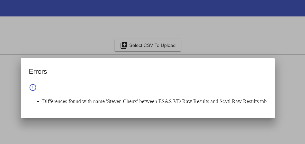
I'm creating a sample app using material design as per what I've learned so far, but I noticed that the out of the box fonts for the material design are different for different components. For the material title element within a material dialog, the title shows in a nice Roboto font but the material dialog content shows in Roman:
Here's my html component for the dialog:
<h3 mat-dialog-title>{{title}}</h3>
<mat-icon color="primary">error_outline</mat-icon>
<mat-dialog-content>
<ul>
<li *ngFor="let error of errorMessages">
{{error}}
</li>
</ul>
</mat-dialog-content>
I don't want to have to create custom styles but would rather use the default styles associated with the element right out of the box. If I add
body {
  font-family: Roboto, Arial, sans-serif;
  margin: 0;
}
to my gobal styles.css that fixes the font within the mat-dialog-content but I'd rather not have to do that.
Also, the icon is so tiny as you can clearly see out of the box. Is there a way to choose a larger icon set from the icons library at runtime? Thanks in advance!