2

SegmentedButton

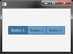
I'm trying to add a border to the ControlsFX SegmentedButton. When I change the background colors they keep the correct shape as shown in the above image.

Here is the CSS:

.segmented-button{
    -fx-focus-color: transparent;
    -fx-faint-focus-color: transparent;
    -fx-background-color:  -color-background-light-purple;
}

.segmented-button:selected{
    -fx-background-color: -color-heading-dark-blue;
    -fx-text-fill: white; 
 }

But when I try to add a border, the shape is not adhered to. SegmentedButton with Border

Here is the CSS:

.segmented-button{
    -fx-focus-color: transparent;
    -fx-faint-focus-color: transparent;
    -fx-background-color:  -color-background-light-purple;
    -fx-border-color: -color-heading-dark-blue;
    -fx-border-width: 0.2;
}

Can someone please tell me how to add the border to keep the shape of each button within the SegmentedButton?

SedJ601
  • 12,173
  • 3
  • 41
  • 59

1 Answers1

2

The ControlsFX-SegmentedButton contains ToggleButtons and thus you have to assign your style to the ToggleButton with .segmented-button .toggle-button {...}.

For example:

 .segmented-button .toggle-button {
     -fx-background-color: derive(STEELBLUE,30%);
     -fx-border-color: derive(STEELBLUE,0%);
     -fx-border-width: 2;
 }

 .segmented-button .toggle-button:selected,
 .segmented-button .toggle-button:focused {
     -fx-background-color: derive(STEELBLUE,-10%);
     -fx-border-color: derive(STEELBLUE,-40%);
     -fx-border-width: 2;
     -fx-text-fill: WHITE;  
 }

results in:

enter image description here

The portion

 .segmented-button {
     -fx-background-color: derive(ORANGE,30%);
     -fx-border-color: derive(ORANGE,0%);
     -fx-border-width: 10
 }

merely styles the SegmentedButton (i.e. the container) itself:

enter image description here

EDIT:

You can distinguish between the left, intermediate and right-buttons with

.segmented-button .toggle-button.left-pill {...}

.segmented-button .toggle-button.center-pill {...}

.segmented-button .toggle-button.right-pill {...}

for a different styling of the buttons (e.g. rounded corners). The radius can be set as usual with -fx-background-radius. This allows the following style with rounded corners for the outer buttons (similar to yours):

enter image description here

A good blueprint for a custom styling is the SegmentedButton.css of ControlsFX. You can find it inside the controlsfx-9.0.0.jar at org\controlsfx\control\segmentedbutton.css.

Topaco
  • 40,594
  • 4
  • 35
  • 62
  • Thank you for your answer. But this doesn't achieve what I'm trying to do. I want the buttons' shapes to stay intact. The first and last buttons have border radii on their sides and the center buttons don't. – LocoTangerine Oct 14 '18 at 18:31