0

I am trying to create a list of items where items can be expanded over other items on hover/click/some other event.

Currently I am using a WrapPanel and I'm binding Items to ItemsControl's ItemsSource property. Items look good and WrapPanel works well when its size changes, but I cannot think of a way in which an item will be able to expand outside of its original bounds, over other items in the WrapPanel.

Maybe an image will make it clearer.

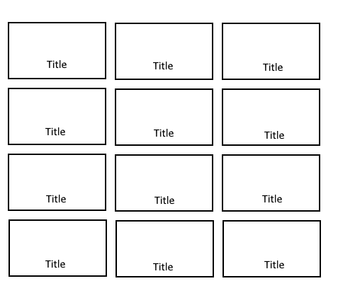
This is what items look like:

enter image description here

And this is what I want to achieve on item hover/click:

enter image description here

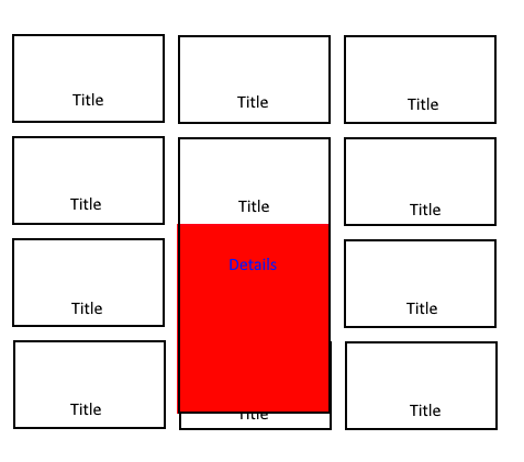
Of course the item needs to go back to its original size when mouse leaves it.

This is the code I'm using:

LIST:

    <ScrollViewer VerticalScrollBarVisibility="Auto">
        <ItemsControl ItemsSource="{Binding Items}">
            <ItemsControl.ItemTemplate>
                <DataTemplate>
                    <local:WorkoutsListItem/>
                </DataTemplate>
            </ItemsControl.ItemTemplate>

            <ItemsControl.ItemsPanel>
                <ItemsPanelTemplate>
                    <WrapPanel/>
                </ItemsPanelTemplate>
            </ItemsControl.ItemsPanel>
        </ItemsControl>
    </ScrollViewer>

ITEM:

    <Border  Style="{StaticResource WorkoutsButton}" Height="150" Width="250">
        <Grid>
            <Grid.RowDefinitions>
                <RowDefinition Height="*"/>
                <RowDefinition Height="60"/>
            </Grid.RowDefinitions>
            <Image Grid.Row="0" Height="70" Width="70"/>
            <Grid  Grid.Row="1">
                <Grid.ColumnDefinitions>
                    <ColumnDefinition Width="Auto"/>
                    <ColumnDefinition Width="*"/>
                    <ColumnDefinition Width="Auto"/>
                </Grid.ColumnDefinitions>
                <StackPanel Grid.Column="0" Orientation="Horizontal">
                    <TextBlock [...]/>
                    <TextBlock [...]/>
                </StackPanel>
                <TextBlock Grid.Column="1" [...]/>
                <StackPanel Grid.Column="2" Orientation="Horizontal">
                    <TextBlock [...]/>
                    <TextBlock [...]"/>
                </StackPanel>
            </Grid>
        </Grid>
    </Border>

Thanks for help!

Marcin Bator
  • 341
  • 1
  • 8
  • 23
  • 1
    Have you tried to use an `Expander` or a `Popup` linked to the `Mouse Enter`/`Mouse Leave` Events? – LittleBit Oct 11 '18 at 08:50
  • @LittleBit I tried using an Expander and while it did expand, it only expanded within item's bounds. I did not try a Popup, but thanks for a suggestion. – Marcin Bator Oct 11 '18 at 08:53
  • 1
    I think this happens because you set the `Width` and `Height` of the `Border` in the ITEM. Setting those Values freezes the `Border` Size and it will not adjusted when the size of the Content changes. – LittleBit Oct 11 '18 at 09:02
  • @LittleBit I tried not setting the `Width` and `Height` and while the Expander expands fully, the whole row of items gets expanded so it fits the new, larger item instead of the expander showing in front of other items. – Marcin Bator Oct 11 '18 at 09:13
  • 1
    Do you plan to set the size of the Container Elements (like your `Border`) to a fixed Size? If so, i could provide you a solution. – LittleBit Oct 11 '18 at 09:49
  • @LittleBit Do you mean after expanding? I guess I could expand from a fixed size to a fixed size, I think all elements inside the expanded part will have a fixed size anyway. – Marcin Bator Oct 11 '18 at 09:59

1 Answers1

1

I suggest you use an Expander with negative Margin. With this neat little trick, the UIElement does not change its Size but can render the Content outside.

The Following Style should work for you

<ScrollViewer VerticalScrollBarVisibility="Auto">
    <ItemsControl ItemsSource="{Binding Images}">
        <ItemsControl.ItemTemplate>
            <DataTemplate>
                <!-- Bind IsExpanded to MouseOver to expand it automatically -->
                <Expander Width="100" IsExpanded="{Binding Path=IsMouseOver, RelativeSource={RelativeSource Self}, Mode=OneWay}">
                    <!-- Normal View -->
                    <Expander.Header>
                        <StackPanel>
                            <Image Height="70" Width="70"/>
                            <Label Content="Title"/>
                        </StackPanel>
                    </Expander.Header>
                    <!-- Details displayed underneath, with same width as the preview -->
                    <StackPanel Height="80" Background="LightGray" Width="{Binding Path=Width, RelativeSource={RelativeSource AncestorType={x:Type Expander}}}">
                        <Label Content="DETAILS"/>
                        <TextBlock Text="Lorem ipsum dolor sit amet" TextWrapping="Wrap"/>
                    </StackPanel>
                    <!-- Set negative Margin to render Details outside of the Boundaries -->
                    <Expander.Style>
                        <Style TargetType="{x:Type Expander}">
                            <Style.Triggers>
                                <Trigger Property="IsMouseOver" Value="True">
                                    <!-- Note: The Margin must be the same as the Detail Height -->
                                    <Setter Property="Margin" Value="0,0,0,-80"/>
                                </Trigger>
                            </Style.Triggers>
                        </Style>
                    </Expander.Style>
                </Expander>                      
            </DataTemplate>
        </ItemsControl.ItemTemplate>

        <!-- Bring Item to front when Mouse is over it -->
        <ItemsControl.ItemContainerStyle>
            <Style TargetType="{x:Type ContentPresenter}">
                <Style.Triggers>
                    <Trigger Property="IsMouseOver" Value="True">
                        <Setter Property="Panel.ZIndex" Value="1" />
                    </Trigger>
                </Style.Triggers>
            </Style>
        </ItemsControl.ItemContainerStyle>

        <ItemsControl.ItemsPanel>
            <ItemsPanelTemplate>
                <WrapPanel/>
            </ItemsPanelTemplate>
        </ItemsControl.ItemsPanel>
    </ItemsControl>
</ScrollViewer>
LittleBit
  • 1,076
  • 6
  • 14
  • Thanks for the answer. While the details panel does expand out of item's boundaries, it stops when it reaches the end of the list control. Do you know if it would be possible for the item to go outside of lists' boundaries as well? – Marcin Bator Oct 12 '18 at 06:37
  • After your suggestion with a Popup I fixed the issue by adding it and setting a trigger to change its `IsOpen` property. – Marcin Bator Oct 12 '18 at 06:43
  • 1
    You are right, i did not test the Elements at the bottom of the `Control`. This would be far more complicated than using a `Popup`, so i am glad you already found a solution based on some hints by yourself. – LittleBit Oct 12 '18 at 07:11