It's a little unclear from your question, by pre-aggregating I assume you mean you've already computed the means, quartiles, etc. of each series, and you want to draw a box plot directly from these? I don't think there is anything in Holoviews to do that, but it's simple enough to just use Bokeh directly which is what I would advise:
from bokeh.plotting import figure, show
# aggregated data
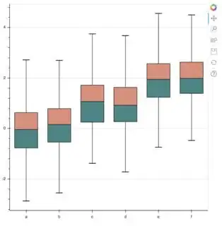
cats = list("abcdef")
mean = [-0.04, 0.16, 1.07, 0.92, 1.95, 1.99]
q1 = [-0.77, -0.54, 0.25, 0.27, 1.24, 1.39]
q3 = [0.63, 0.79, 1.72, 1.63, 2.57, 2.63]
upper = [2.72, 2.70, 3.75, 3.68, 4.56, 4.50]
lower = [-2.87, -2.55, -1.38, -1.72, -0.74, -0.473]
p = figure(x_range=cats)
# stems
p.segment(cats, upper, cats, q3, color="black")
p.segment(cats, lower, cats, q1, color="black")
# boxes
p.vbar(cats, 0.7, mean, q3, fill_color="#E08E79", line_color="black")
p.vbar(cats, 0.7, q1, mean, fill_color="#3B8686", line_color="black")
# whiskers (almost-0 height rects simpler than segments)
p.rect(cats, lower, 0.2, 0.01, color="black")
p.rect(cats, upper, 0.2, 0.01, color="black")
p.xgrid.grid_line_color = None
show(p)