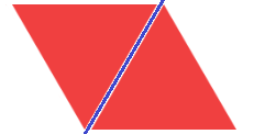
I have two div elements of the same size. They overlap each other and each of them has a background image of an equilateral triangle pointing in one of two directions:
I would like to apply a transformation so that the right triangle is flipped and lands exactly on top of the left triangle. The rotation axis shall be the center of the gap between the sides that the two triangles almost share (marked in blue in the image). This way, the bottom right corner of the right triangle is supposed to land on the top left corner of the left triangle.
Right now I can rotate the right triangle only along one axis (using transform: rotateY(180deg)), but can't figure out how to get the right angle.
JSFiddle: https://jsfiddle.net/0841c7bm/27/
The code I used for the transformation:
transform-style: preserve-3d;
transition: all 1s linear;
transform: rotateY(180deg);
Any help is appreciated.
EDIT:
Got it to work with the help of Denis McDonald's comment below.
The updated JSFiddle: https://jsfiddle.net/0841c7bm/29/
The updated relevant code part:
#triangle2 {
  background-image: url(https://i.imgur.com/C6sWFbQ.png);
  left: 79px;
  transform-origin: 75px 0px 0px;
}
.flip {
  transform-style: preserve-3d;
  transition: all 0.25s linear;
  transform: rotate3d(1, -1.732, 0, 180deg);
  margin-left: -4px;
}
Explanation:
The first 3 values the rorate3d CSS property accepts are not degree values but rather Cartesian coordinates defining a point in 3d space. To my understanding, the line connecting the origin with the given point is defined to be the rotation axis for the element.
I needed the triangle to rotate around an axis that is parallel to the left-hand side of the second triangle. Such a line would create a 60 degree angle between itself and the x axis. A possible point I could pass to the rotate3d property that would define this line is (1, sqrt(3), 0).
I used a transform-origin, and a -4px left margin (because the second triangle was pushed by 4px to the right to begin with).