4

I'm using the React-Admin framework and want to combine the button actions to a single options button.

Basically, I want to turn this:
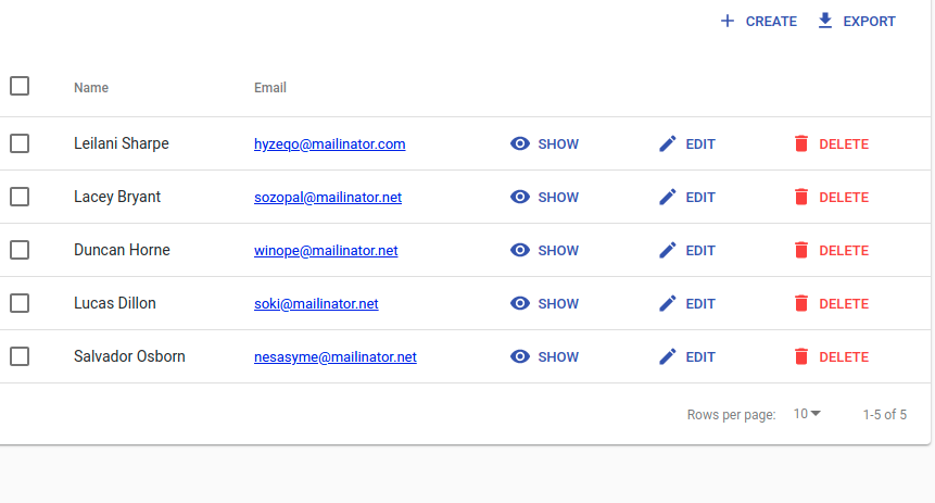
enter image description here

Into This!

enter image description here

I think it just looks a lot less cluttered and the button is widely used for more options.

Is there an existing solution for this? or how can it easily be done?

Edit: My Solution:

MoreOptions.jsx

import * as React from "react";
import { Link, DeleteButton } from "react-admin";
import IconButton from "@material-ui/core/IconButton";
import QueueIcon from "@material-ui/icons/Queue";
import EditIcon from "@material-ui/icons/Edit";

import _objectWithoutProperties from "babel-runtime/helpers/objectWithoutProperties";

const MyEditButton = (props) => (
  <IconButton 
    component={Link} 
    to={props.basePath + "/" + props.record.id} 
    color="primary" 
    aria-label="Edit"
  >
    <EditIcon style={{ fontSize: '20px' }} />
  </IconButton >
);

const MyCloneButton = (props) => (
  <IconButton component={Link} to={{
    pathname: props.basePath + '/create',
    state: {
      record: _objectWithoutProperties(props.record, ['id', 'paxDbName'])
    }
  }} color="primary" aria-label="Clone">
    <QueueIcon style={{ fontSize: '20px' }} />
  </IconButton>
);

const EditCloneDelete = (props) => {
  let a = props;
  return <div>
    <MyEditButton {...props} />
    <MyCloneButton {...props} />
    <DeleteButton basePath={props.basePath} record={props.record} resource={props.resource} label=""/>
  </div>;
};

export default EditCloneDelete

posts.jsx

import EditCloneDelete from './MoreOptions.jsx';

Works pretty well!

Ben Winding
  • 10,208
  • 4
  • 80
  • 67

1 Answers1

3

My solution was to create a new component that encapsulated all of the buttons in to one cell. I also don't show the label. I'm sure there is a cleaner solution but my quick way is:

const MyEditButton = (props) => (
    <IconButton classes={{root: props.classes.buttonSize}} component={Link} to={
        ${props.basePath} + "/" + ${props.record.id}
    } color="primary" aria-label="Edit"  ><EditIcon style={{fontSize: '20px'}}/></IconButton>
);

const MyCloneButton = (props) => (
    <IconButton classes={{root: props.classes.buttonSize}} component={Link} to={{
        pathname: props.basePath + '/create',
        state: {record: _objectWithoutProperties(props.record, ['id', 'paxDbName'])}
    }} color="primary" aria-label="Clone"><QueueIcon style={{fontSize: '20px'}}/></IconButton>
);

const styles = {
    buttonSize: {
        width: "28px",
        height: "28px",
    },
};

const EditCloneDelete = (props) => {
    let a = props;
    return (
        <div>
            <a href={
                `http://localhost:8001/api/v1/namespaces/kube-system/services/https:kubernetes-dashboard:/proxy/#!/overview?namespace=${props.record.customerName ? props.record.customerName : props.record.name}`
            } target="dashboard">
                <IconButton classes={{root: props.classes.buttonSize}} color="primary" aria-label="Edit"><img src={K8sIcon} style={{width: '20px', height: '20px'}}/></IconButton>
            </a>
            <MyEditButton {...props}/>
            <MyCloneButton {...props}/>
            <OptionalDeleteButton {...props} classes={{deleteButton: props.classes.buttonSize}} label={""} disabled={
                !props.showDelete(props.record)
            }/>
        </div>
    );
};

export default compose(withStyles(styles))(EditCloneDelete)

You could just as easily create a first class React component that is a button container that would make this more subtable for reuse.