I have developed a system in R for graphing large datasets obtained from wind turbines. I am now porting the process into Java. The results I get between the two systems are inconsistent.
As shown below:
- The dataset is first plotted using using R, and secondly using JFreeChart.
- The red line in both graphs correspond to my respective calculations in each language (which are detailed below).
- The brown dashed line in #1 corresponds to the blue line in #2, there are no discrepancies here, they are provided for reference
- The shaded area represent the data points, grey in #1 and red in #2.

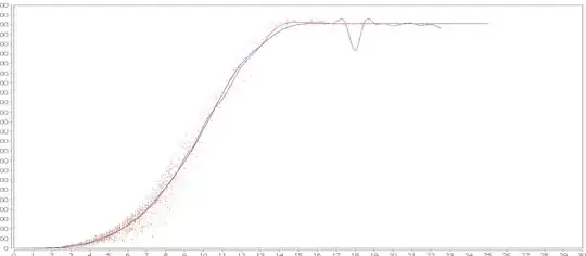
I can explain the discrepancies between the (red) calculated lines and that is due to the fact that I am using different calculation methods.
In R the data is processed as follows, I wrote this code with a little help and have no idea what is going on here (but hey, it works).
df <- data.frame(pwr = pwr, spd = spd)
require(mgcv)
mod <- gam(pwr ~ s(spd, bs = "ad", k = 20), data = df, method = "REML")
summary(mod)
x_grid <- with(df, data.frame(spd = seq(min(spd) + 0.0001, maxi, length=100)))
pred <- predict(mod, x_grid, se.fit = TRUE)
x_grid <- within(x_grid, fit <- pred$fit)
lines(fit ~ spd, data = x_grid, col = "red", lwd = thickLineWidth)
In Java (SQL infact) I am using the method of bins to calculate the average at every 0.5 on the x-axis. The resulting data is plotted using a org.jfree.chart.renderer.xy.XYSplineRenderer I do not know too much about how the line is rendered.
SELECT
    ROUND( ROUND( x_data * 2 ) / 2, 1)   AS x_axis, # See https://stackoverflow.com/questions/5230647/mysql-rounding-functions
    AVG( y_data )                        AS y_axis
FROM
    table
GROUP BY
    x_axis
My take on the variance between the two graphs:
- Presence of a single outlier at 18 on the x_axis (most visible on the R graph) seems to have an enormous impact on the shape of the curve.
- Even between 5 and 15 on the x-axis it seems that the line in the R graph is more continuous, it doesn't change trajectory as readily as that produced by Java.
- The 'crater' evident at 18 on the java x-axis has to 'mounds' each side of it, I believe this is due to polynomial effects in the rendering system.
These are things that I would like to eliminate.
So in an effort to understand the difference between the two graphs I have a few questions:
- Exactly what is going on in my R script?
- How can I, or, do I want to port the same process to my Java code?
- Can anyone explain the spline system used by JFreeCharts, is there another?