6

I have a mat expansion panel that I would like to extend over the element below it rather than simply moving that element down. I tried adjust the z-index of the mat-expansion element but that did not work. I haven't seen anything in the angular material docs/github that suggests this can be done. Has anyone done this or know how this could be achieved?

Any help/tips/suggestions would be much appreciated.

my expansion

UPDATE: my desired solution should look similar to this. It could contain several elements (mat-selection, date picker, etc..)

enter image description here

Brian Stanley
  • 2,078
  • 5
  • 24
  • 43
  • 2
    Did you considered adding custom classes and CSS declarations or overwriting them? – DWA Aug 31 '18 at 13:21
  • 1
    Why are you using mat expansion panel for something so small? Just create your own element. Expansion panel is designed to work as an accordion. And accordion does push stuff down :) – Vinod Bhavnani Aug 31 '18 at 13:21
  • 1
    Or rather use mat menu – Vinod Bhavnani Aug 31 '18 at 13:23
  • Just use a div, show it when needed with *ngIf, you can animate it also. Tell me if you need help I can provide an example – wFitz Aug 31 '18 at 13:23
  • @wFitz what animation pieces would be need to get the same expand as the mat-expansion? – Brian Stanley Aug 31 '18 at 13:48
  • 2
    Please see : https://stackblitz.com/edit/angular-rb5vmu the last example "Animated Div" should give you a starting point – wFitz Aug 31 '18 at 21:15

2 Answers2

6

Big thanks to @wixFitz for getting me going in the right direction but here is the end product. enter image description here

animation.html:

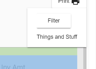
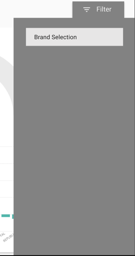
<div class="report-filter">
  <button 
    mat-raised-button 
    class="filter-button"
    type="button"
    click)="showDiv()"
    ngClass]="{'menu-button-active': filterActive}">
    'TOOLTIP.filter' | translate }}
    <mat-icon>filter_list</mat-icon>
  </button>
  <div [@divState]="divState" class="menu mat-elevation-z8">
    <button
      class="center"
      mat-button
      click)="closeMe()"
      mat-icon-button>
      <mat-icon>close</mat-icon>
    </button>
    <div class="search-brands">
      <mat-form-field>
        <mat-select placeholder="Brands" [(value)]="selectedBrand" panelClass="brandSelectDropdown">
          <mat-option (click)="resetBrand()" value="">none</mat-option>
          <mat-option *ngFor="let brand of brands" (click)="setBrand(brand.brand)" value="brand.brand">{{ brand.brand }}</mat-option>
        </mat-select>
      </mat-form-field>
    </div>
  </div>
</div>

animation.scss:

.report-filter {
  display: flex;
  .filter-button {
    margin: 1rem 0;
  }
}

.menu {
  position: absolute;
  top: 248px;
  right: 23px;
  background-color: $grey600;
  border: 1px solid gray;
  border-radius: 4px;
  z-index: 2;
  .search-brands {
    margin: 2rem 1rem;
    border: 1px solid black;
    background-color: $grey300;
    mat-form-field {
      width: 95%;
      margin: 0rem 0.5rem;
    }
  }
  button {
    mat-icon {
      color: white;
      margin: 0 0 0 0;
    }
  }
}
.menu-button-active {
  background-color: $grey600;
  color: white;
}

animation.ts: In @Component object

animations: [
  trigger('divState', [
    state('show', style({ height: '100vh', width: '20vw' })),
    state('hide', style({ height: '0vh', display: 'none'})),
    transition('show => hide', animate('200ms ease-out')),
    transition('hide => show', animate('300ms ease-in'))
  ])
]

global var

divState: string = "hide";

open and close functions

showDiv() {
  this.divState = (this.divState == 'hide') ? 'show' : 'hide';
  this.filterActive = !this.filterActive
  this.getBrands();
}
  
closeMe() {
  this.divState = 'hide';
  this.filterActive = !this.filterActive
}
Good Night Nerd Pride
  • 8,245
  • 4
  • 49
  • 65
Brian Stanley
  • 2,078
  • 5
  • 24
  • 43
  • This code gives a warning when opening the overlay and skips the animation. The close animation works though. The warning: `The animation trigger "divState" is attempting to animate the following not animatable properties: display` – Good Night Nerd Pride Jun 01 '23 at 08:42
  • Fix for the above: `state('hide', style({ height: '0vh', visibility: 'hidden' }))` – Good Night Nerd Pride Jun 01 '23 at 08:46
0

The above solution mentioned by @Brian Stanley is really complicated. Apply css styles and add FlexLayoutModule as mentioned in the below link. I have tried it and my expansion panel overlays perfectly.

Panel Overlay Demo

Ansif
  • 182
  • 2
  • 14