1

I am trying to embed google maps in the website using iframes. I need this map to be fullscreen on any device when the map is shown. I can't figure out a way to do this, tried setting width and height to 100% which made it look like this ):enter image description here But right now my website looks like this: enter image description here

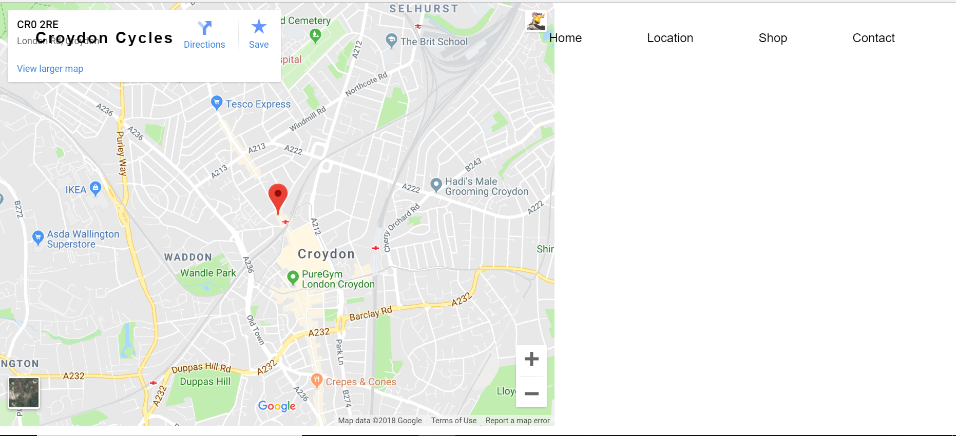
Any way of making the map fullscreen?

$(document).ready(function() {
    $(".menu-icon").on("click", function() {
          $("nav ul").toggleClass("showing");
    });
});

// Scrolling Effect

$(window).on("scroll", function() {
    if($(window).scrollTop()) {
          $('nav').addClass('black');
    }

    else {
          $('nav').removeClass('black');
    }
})
html, body {
    margin: 0;
    padding: 0;
    width: 100%;
}

body {
    font-family: "Helvetica Neue",sans-serif;
    font-weight: lighter;
    height:100%;

}


.content {
    width: 94%;
    margin: 4em auto;
    font-size: 20px;
    line-height: 30px;
    text-align: justify;
}

nav.black .logo {
    color: #fff;
}

nav.black ul li a {
   color: #fff;
}

.menu-text {
    color: #000;
    z-index:1;
}


.logo {
    line-height: 60px;
    position: fixed;
    float: left;
    margin: 16px 46px;
    color: #000;
    font-weight: bold;
    font-size: 20px;
    letter-spacing: 2px;
    z-index: 0;
}

nav {
    position: fixed;
    width: 100%;
    line-height: 60px;
}

nav ul {
    line-height: 60px;
    list-style: none;
    background: rgba(0, 0, 0, 0);
    overflow: hidden;
    color: #fff;
    padding: 0;
    text-align: right;
    margin: 0;
    padding-right: 40px;
    transition: 1s;
}

nav.black ul {
    background: #000;
}

nav ul li {
    display: inline-block;
    padding: 16px 40px;;
}

nav ul li a {
    text-decoration: none;
    color: #fff;
    font-size: 16px;
}

.menu-icon {
    line-height: 60px;
    width: 100%;
    background: #000;
    text-align: right;
    box-sizing: border-box;
    padding: 15px 24px;
    cursor: pointer;
    color: #fff;
    display: none;
}

@media(max-width: 786px) {

    .logo {
          position: fixed;
          top: 0;
          margin-top: 16px;
    }

    nav ul {
          max-height: 0px;
          background: #000;
    }

    nav.black ul {
          background: #000;
    }

    .showing {
          max-height: 34em;
    }

    nav ul li {
          box-sizing: border-box;
          width: 100%;
          padding: 24px;
          text-align: center;
    }

    .menu-icon {
          display: block;
    }

}
<!DOCTYPE html>
<html lang="en">
  <head>
        <meta charset="UTF-8">
        <meta name="viewport" content="width=device-width, initial-scale=1.0">
        <meta http-equiv="X-UA-Compatible" content="ie=edge">
        <title>Responsive Sticky Navbar</title>
        <link rel="stylesheet" href="location-style.css">
        <link rel="stylesheet" href="https://maxcdn.bootstrapcdn.com/font-awesome/4.7.0/css/font-awesome.min.css">
        <script src="https://code.jquery.com/jquery-3.3.1.js"></script>
  </head>
  <body>
    <div class="wrapper">
      <header>
        <nav>
            <div class="menu-icon">
                <i class="fa fa-bars fa-2x"></i>
            </div>

            <div class="logo">
                Croydon Cycles
            </div>

            <div class="menu">
                <ul>
                    <li><a class="menu-text" href="index.html">Home</a></li>
                    <li><a class="menu-text" href="location.html">Location</a></li>
                    <li><a class="menu-text" href="shop.html">Shop</a></li>
                    <li><a class="menu-text" href="contact.html">Contact</a></li>
                </ul>
            </div>
        </nav>
      </header>
    </div>
    <div class="box">
            <iframe src="https://www.google.com/maps/embed?pb=!1m18!1m12!1m3!1d11180.547025315635!2d-0.1158441147859454!3d51.38130328678796!2m3!1f0!2f0!3f0!3m2!1i1024!2i768!4f13.1!3m3!1m2!1s0x4876072fde46e81d%3A0x8d9bd9aaec99a20!2sLondon+Rd%2C+Croydon+CR0+2RE!5e0!3m2!1sen!2suk!4v1535311898666" width="720" height="550px" frameborder="0" style="border:0" allowfullscreen></iframe>


    </div>


    </div>

  </body>
</html>

    
Community
  • 1
  • 1
Fuze 360
  • 91
  • 1
  • 8
  • Not an answer, but you might have an easier time embedding google maps onto the page rather than using an iframe. – Goose Aug 26 '18 at 20:46
  • @Goose Isn't an iframe the way to embed Google Maps? – SuperDJ Aug 26 '18 at 20:47
  • Possible duplicate of [Responsive iframe (google maps) and weird resizing](https://stackoverflow.com/questions/12676725/responsive-iframe-google-maps-and-weird-resizing) – SuperDJ Aug 26 '18 at 20:57
  • @SuperDJ The recommended way is demonstrated here. https://developers.google.com/maps/documentation/javascript/examples/map-simple The end result is an iFrame, but you have a JavaScript object you can use to control various aspects about the embedded map, where with direct iframe embed you can only pass URL parameters to control the map. Not sure if this will help OP with this particular issue but in general I'd recommend using this approach. – Goose Aug 26 '18 at 21:37
  • @Goose that is when you use the JS api. However when in google maps you get the option to embed the map and google gives you the iframe – SuperDJ Aug 26 '18 at 21:42
  • @SuperDJ Yes I'm aware – Goose Aug 27 '18 at 00:09
  • Have a look at my updated answer. The last example uses CSS variables and JS to make a pixel perfect fullscreen map. – SuperDJ Aug 27 '18 at 08:13

3 Answers3

0

sorry i cant really get into adjusting your css right now but here is a little something i came up with when i need to output YouTube videos in iframes. try it out

<style>
       #mediaPlayer{
        position: relative;
        height: auto;
        padding-bottom: 56.25%;
        padding-top: 1.875em; 
        overflow: hidden;
        border: 0.1875em double #185875; 
        background-image:url('../video_loading.gif'); 
        background-repeat: no-repeat;
        background-size: cover;
        -webkit-background-size: cover;
        -moz-background-size: cover;
        -o-background-size: cover;
        background-position: center;
        background-attachment: fixed;
        /*to adjust the height and width*/
        margin-right: 20%;
        margin-left: 20%;
        margin-top: 20%;
        margin-bottom: 20%;
        /*or you can use it in single line*/
        margin:20%;
        /*or if you want different margins for different sides in a single line*/
        margin: 20% 20% 20% 20%;
        /* the above means margin: top right bottom left; */
       }

    #mediaPlayer iframe{
        position: absolute;
        top: 0;
        left: 0;
        right: 0;
        bottom: 0;
        max-width: 100%;
        max-height: 100%;   
    }
</style>

/*instead of using margin just add a div and specify the exact height and width you want*/ 
<div style="height: 50%; width:50%;">
 <center>
  <div id="mediaPlayer">
    <iframe id="play_now" width="100%" height="100%" src="" value="" frameborder="0" allow="autoplay; encrypted-media" allowfullscreen></iframe>
  </div>
 </center>
</div>

The video_loading.gif background is usually a good idea for users with slow network to have something in the background while your iframe content is loading

but you have to find your own unique gif file/image and set it's location in the background-image:url('../file-location-here.gif');

just replace your <div class="box"></div> with the code above let me know how it turns out.

Bobby Axe
  • 1,491
  • 13
  • 29
  • thanks for your response, I added your code which made the map look much better, but the map is now bigger than the page of the webpage so I have to scroll down for the whole map is there a way to make the map to full screen so you don't have to scroll up or down. – Fuze 360 Aug 26 '18 at 20:57
  • okay for that just use `margin-left: 20%; margin-right:20%; margin-top:10%; margin-bottom:10%;` adjust until you get the needed size see updated answer – Bobby Axe Aug 26 '18 at 21:12
  • please note only use one `margin set` at a time as the last set will over-write the previous and by set i mean each set of margin in between the comments. did that solve your problem? also **note** that you can throw every thing inside a `div` an give that div the exact height and width you want – Bobby Axe Aug 26 '18 at 21:28
  • I added the extra bit of code this helped resize the map but there is a white gap of where the map used to be before I added the code is there a way to get rid of it? – Fuze 360 Aug 26 '18 at 22:31
  • depending on what you added? it may be an effect of the newly added property you can use/add `clear: both;` property on the div after the white space or affected by the space **also did you see the update in the answer ?** just add a div and set the div to the size to what you want instead of using margin – Bobby Axe Aug 26 '18 at 22:42
  • @Fuze360 just realized that it may have been a padding issue set `padding: 0;` – Bobby Axe Aug 30 '18 at 03:42
0

Are you looking for something like this? Add the following code to your css and see if it does the trick.

iframe {
  height: 100vh;
  width: 100vw;
  box-sizing: border-box;
}

Take a look at using viewport percentage

code
  • 1,041
  • 1
  • 12
  • 28
0

How about the following example. The solution came from Responsive iframe (google maps) and weird resizing. By tweaking padding-top and padding-bottom you can change the size.

$(document).ready(function() {
    $(".menu-icon").on("click", function() {
          $("nav ul").toggleClass("showing");
    });
});

// Scrolling Effect

$(window).on("scroll", function() {
    if($(window).scrollTop()) {
          $('nav').addClass('black');
    }

    else {
          $('nav').removeClass('black');
    }
})
.box {
  position: relative;
  padding-bottom: 56.25%;
  padding-top: 25px;
  height: 0;
  overflow: hidden;
}

.box iframe {
  position: absolute;
  top: 0;
  left: 0;
  width: 100%;
  height: 100%;
  border: none;
}

html, body {
    margin: 0;
    padding: 0;
    width: 100%;
}

body {
    font-family: "Helvetica Neue",sans-serif;
    font-weight: lighter;
    height:100%;

}


.content {
    width: 94%;
    margin: 4em auto;
    font-size: 20px;
    line-height: 30px;
    text-align: justify;
}

nav.black .logo {
    color: #fff;
}

nav.black ul li a {
   color: #fff;
}

.menu-text {
    color: #000;
    z-index:1;
}


.logo {
    line-height: 60px;
    position: fixed;
    float: left;
    margin: 16px 46px;
    color: #000;
    font-weight: bold;
    font-size: 20px;
    letter-spacing: 2px;
    z-index: 0;
}

nav {
    position: fixed;
    width: 100%;
    line-height: 60px;
}

nav ul {
    line-height: 60px;
    list-style: none;
    background: rgba(0, 0, 0, 0);
    overflow: hidden;
    color: #fff;
    padding: 0;
    text-align: right;
    margin: 0;
    padding-right: 40px;
    transition: 1s;
}

nav.black ul {
    background: #000;
}

nav ul li {
    display: inline-block;
    padding: 16px 40px;;
}

nav ul li a {
    text-decoration: none;
    color: #fff;
    font-size: 16px;
}

.menu-icon {
    line-height: 60px;
    width: 100%;
    background: #000;
    text-align: right;
    box-sizing: border-box;
    padding: 15px 24px;
    cursor: pointer;
    color: #fff;
    display: none;
}

@media(max-width: 786px) {

    .logo {
          position: fixed;
          top: 0;
          margin-top: 16px;
    }

    nav ul {
          max-height: 0px;
          background: #000;
    }

    nav.black ul {
          background: #000;
    }

    .showing {
          max-height: 34em;
    }

    nav ul li {
          box-sizing: border-box;
          width: 100%;
          padding: 24px;
          text-align: center;
    }

    .menu-icon {
          display: block;
    }

}
<!DOCTYPE html>
<html lang="en">
  <head>
        <meta charset="UTF-8">
        <meta name="viewport" content="width=device-width, initial-scale=1.0">
        <meta http-equiv="X-UA-Compatible" content="ie=edge">
        <title>Responsive Sticky Navbar</title>
        <link rel="stylesheet" href="location-style.css">
        <link rel="stylesheet" href="https://maxcdn.bootstrapcdn.com/font-awesome/4.7.0/css/font-awesome.min.css">
        <script src="https://code.jquery.com/jquery-3.3.1.js"></script>
  </head>
  <body>
    <div class="wrapper">
      <header>
        <nav>
            <div class="menu-icon">
                <i class="fa fa-bars fa-2x"></i>
            </div>

            <div class="logo">
                Croydon Cycles
            </div>

            <div class="menu">
                <ul>
                    <li><a class="menu-text" href="index.html">Home</a></li>
                    <li><a class="menu-text" href="location.html">Location</a></li>
                    <li><a class="menu-text" href="shop.html">Shop</a></li>
                    <li><a class="menu-text" href="contact.html">Contact</a></li>
                </ul>
            </div>
        </nav>
      </header>
    </div>
    <div class="box">
            <iframe src="https://www.google.com/maps/embed?pb=!1m18!1m12!1m3!1d11180.547025315635!2d-0.1158441147859454!3d51.38130328678796!2m3!1f0!2f0!3f0!3m2!1i1024!2i768!4f13.1!3m3!1m2!1s0x4876072fde46e81d%3A0x8d9bd9aaec99a20!2sLondon+Rd%2C+Croydon+CR0+2RE!5e0!3m2!1sen!2suk!4v1535311898666" allowfullscreen></iframe>


    </div>


    </div>

  </body>
</html>

You can also try and use CSS variables:

$(document).ready(function() {
    $(".menu-icon").on("click", function() {
          $("nav ul").toggleClass("showing");
    });
});

// Scrolling Effect

$(window).on("scroll", function() {
    if($(window).scrollTop()) {
          $('nav').addClass('black');
    }

    else {
          $('nav').removeClass('black');
    }
})

let events = ['load', 'resize'];
let googleMaps = document.querySelector('.box iframe');

events.forEach( event => {
  window.addEventListener(event, () => {
    googleMaps.style.setProperty('--google-maps-height', `${window.innerHeight}px`);
  });
});
.box {
  height: 100%;
}

.box iframe {
  width: 100%;
  height: var(--google-maps-height);
  border: none;
}

html, body {
    margin: 0;
    padding: 0;
    width: 100%;
}

body {
    font-family: "Helvetica Neue",sans-serif;
    font-weight: lighter;
    height:100%;

}


.content {
    width: 94%;
    margin: 4em auto;
    font-size: 20px;
    line-height: 30px;
    text-align: justify;
}

nav.black .logo {
    color: #fff;
}

nav.black ul li a {
   color: #fff;
}

.menu-text {
    color: #000;
    z-index:1;
}


.logo {
    line-height: 60px;
    position: fixed;
    float: left;
    margin: 16px 46px;
    color: #000;
    font-weight: bold;
    font-size: 20px;
    letter-spacing: 2px;
    z-index: 0;
}

nav {
    position: fixed;
    width: 100%;
    line-height: 60px;
}

nav ul {
    line-height: 60px;
    list-style: none;
    background: rgba(0, 0, 0, 0);
    overflow: hidden;
    color: #fff;
    padding: 0;
    text-align: right;
    margin: 0;
    padding-right: 40px;
    transition: 1s;
}

nav.black ul {
    background: #000;
}

nav ul li {
    display: inline-block;
    padding: 16px 40px;;
}

nav ul li a {
    text-decoration: none;
    color: #fff;
    font-size: 16px;
}

.menu-icon {
    line-height: 60px;
    width: 100%;
    background: #000;
    text-align: right;
    box-sizing: border-box;
    padding: 15px 24px;
    cursor: pointer;
    color: #fff;
    display: none;
}

@media(max-width: 786px) {

    .logo {
          position: fixed;
          top: 0;
          margin-top: 16px;
    }

    nav ul {
          max-height: 0px;
          background: #000;
    }

    nav.black ul {
          background: #000;
    }

    .showing {
          max-height: 34em;
    }

    nav ul li {
          box-sizing: border-box;
          width: 100%;
          padding: 24px;
          text-align: center;
    }

    .menu-icon {
          display: block;
    }

}
<!DOCTYPE html>
<html lang="en">
  <head>
        <meta charset="UTF-8">
        <meta name="viewport" content="width=device-width, initial-scale=1.0">
        <meta http-equiv="X-UA-Compatible" content="ie=edge">
        <title>Responsive Sticky Navbar</title>
        <link rel="stylesheet" href="location-style.css">
        <link rel="stylesheet" href="https://maxcdn.bootstrapcdn.com/font-awesome/4.7.0/css/font-awesome.min.css">
        <script src="https://code.jquery.com/jquery-3.3.1.js"></script>
  </head>
  <body>
    <div class="wrapper">
      <header>
        <nav>
            <div class="menu-icon">
                <i class="fa fa-bars fa-2x"></i>
            </div>

            <div class="logo">
                Croydon Cycles
            </div>

            <div class="menu">
                <ul>
                    <li><a class="menu-text" href="index.html">Home</a></li>
                    <li><a class="menu-text" href="location.html">Location</a></li>
                    <li><a class="menu-text" href="shop.html">Shop</a></li>
                    <li><a class="menu-text" href="contact.html">Contact</a></li>
                </ul>
            </div>
        </nav>
      </header>
    </div>
    <div class="box">
            <iframe src="https://www.google.com/maps/embed?pb=!1m18!1m12!1m3!1d11180.547025315635!2d-0.1158441147859454!3d51.38130328678796!2m3!1f0!2f0!3f0!3m2!1i1024!2i768!4f13.1!3m3!1m2!1s0x4876072fde46e81d%3A0x8d9bd9aaec99a20!2sLondon+Rd%2C+Croydon+CR0+2RE!5e0!3m2!1sen!2suk!4v1535311898666" allowfullscreen></iframe>


    </div>
  </body>
</html>
SuperDJ
  • 7,488
  • 11
  • 40
  • 74