I want to make a full screen dialog box. Dialog box background must be opaque.
Here is an example:
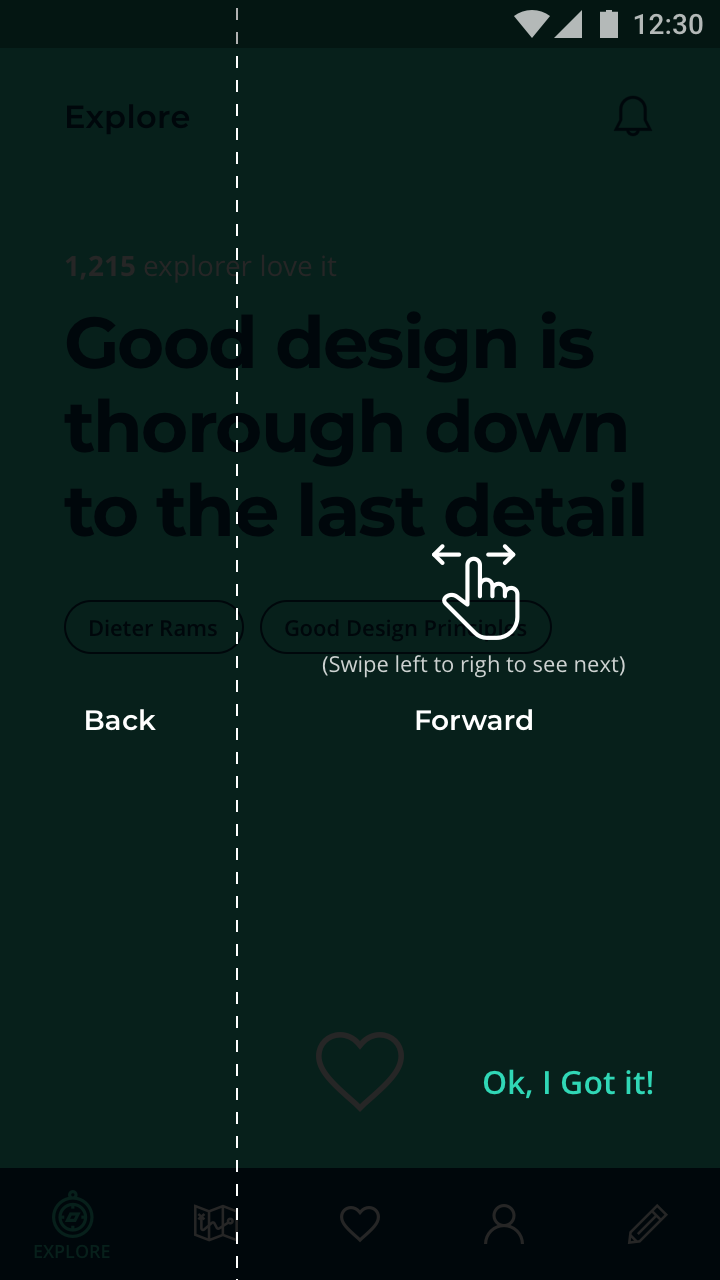
How to make like this in Flutter?
You can use the Navigator to push a semi-transparent ModalRoute:
import 'package:flutter/material.dart';

class TutorialOverlay extends ModalRoute<void> {
  @override
  Duration get transitionDuration => Duration(milliseconds: 500);

  @override
  bool get opaque => false;

  @override
  bool get barrierDismissible => false;

  @override
  Color get barrierColor => Colors.black.withOpacity(0.5);

  @override
  String get barrierLabel => null;

  @override
  bool get maintainState => true;

  @override
  Widget buildPage(
      BuildContext context,
      Animation<double> animation,
      Animation<double> secondaryAnimation,
      ) {
    // This makes sure that text and other content follows the material style
    return Material(
      type: MaterialType.transparency,
      // make sure that the overlay content is not cut off
      child: SafeArea(
        child: _buildOverlayContent(context),
      ),
    );
  }

  Widget _buildOverlayContent(BuildContext context) {
    return Center(
      child: Column(
        mainAxisSize: MainAxisSize.min,
        children: <Widget>[
          Text(
            'This is a nice overlay',
            style: TextStyle(color: Colors.white, fontSize: 30.0),
          ),
          RaisedButton(
            onPressed: () => Navigator.pop(context),
            child: Text('Dismiss'),
          )
        ],
      ),
    );
  }

  @override
  Widget buildTransitions(
      BuildContext context, Animation<double> animation, Animation<double> secondaryAnimation, Widget child) {
    // You can add your own animations for the overlay content
    return FadeTransition(
      opacity: animation,
      child: ScaleTransition(
        scale: animation,
        child: child,
      ),
    );
  }
}


// Example application:
void main() => runApp(MyApp());

class MyApp extends StatelessWidget {
  @override
  Widget build(BuildContext context) {
    return MaterialApp(
      title: 'Flutter Playground',
      home: TestPage(),
    );
  }
}

class TestPage extends StatelessWidget {
  void _showOverlay(BuildContext context) {
    Navigator.of(context).push(TutorialOverlay());
  }

  @override
  Widget build(BuildContext context) {
    return Scaffold(
      appBar: AppBar(title: Text('Test')),
      body: Padding(
        padding: EdgeInsets.all(16.0),
        child: Center(
          child: RaisedButton(
            onPressed: () => _showOverlay(context),
            child: Text('Show Overlay'),
          ),
        ),
      ),
    );
  }
}
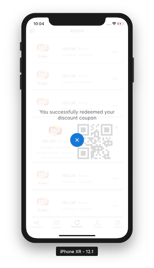
Well here is my implementation which is quite straightforward.
from first screen
Navigator.of(context).push(PageRouteBuilder(
    opaque: false,
    pageBuilder: (BuildContext context, _, __) =>
        RedeemConfirmationScreen()));
at 2nd screen
class RedeemConfirmationScreen extends StatelessWidget {
@override
Widget build(BuildContext context) {
return Scaffold(
  backgroundColor: Colors.white.withOpacity(0.85), // this is the main reason of transparency at next screen. I am ignoring rest implementation but what i have achieved is you can see.
.....
  );
 }
}
and here are the results.
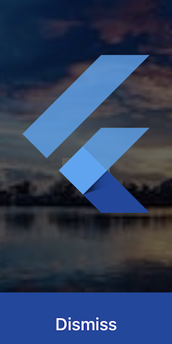
Call this method to show the dialog in fullscreen.
showGeneralDialog(
  context: context,
  barrierColor: Colors.black12.withOpacity(0.6), // Background color
  barrierDismissible: false,
  barrierLabel: 'Dialog',
  transitionDuration: Duration(milliseconds: 400),
  pageBuilder: (_, __, ___) {
    return Column(
      children: <Widget>[
        Expanded(
          flex: 5,
          child: SizedBox.expand(child: FlutterLogo()),
        ),
        Expanded(
          flex: 1,
          child: SizedBox.expand(
            child: ElevatedButton(
              onPressed: () => Navigator.pop(context),
              child: Text('Dismiss'),
            ),
          ),
        ),
      ],
    );
  },
);
Note: This answer does not discuss making the modal transparent, but is an answer is for the stated question of "How to make a full screen dialog in flutter?". Hopefully this helps other that find this question through a search like I did, that don't need a transparent modal.
Create your modal dialog class:
class SomeDialog extends StatelessWidget {
  @override
  Widget build(BuildContext context) {
    return new Scaffold(
      appBar: new AppBar(
        title: const Text('Dialog Magic'),
      ),
      body: new Text("It's a Dialog!"),
    );
  }
}
In the class that needs to open the dialog, add something like this:
void openDialog() {
  Navigator.of(context).push(new MaterialPageRoute<Null>(
    builder: (BuildContext context) {
      return new SomeDialog();
    },
    fullscreenDialog: true));
}
If fullscreenDialog above is true, then the app bar will have an "x" close button. If false, it will have a "<-" back arrow.
If you need to get the result of a dialog action, add a button to your dialog that returns a value when popping the navigation stack. Something like this:
onPressed: () {
  Navigator
    .of(context)
    .pop(new MyReturnObject("some value");
}
then in your class opening the dialog, do capture the results with something like this:
void openDialog() async {
  MyReturnObject results = await Navigator.of(context).push(new MaterialPageRoute<MyReturnObject>(
    builder: (BuildContext context) {
      return new SomeDialog();
    },
    fullscreenDialog: true));
}
You can use showGeneralDialog method with any widget extends from Material like Scaffold, Card, ..etc.
For example I am going to it with Scaffold like this:
showGeneralDialog(
    context: context,
    pageBuilder: (context, animation, secondaryAnimation) => Scaffold(
      backgroundColor: Colors.black87,
      body: //Put your screen design here!
    ),
  );
And now you can set your design as a normal screen by using Scaffold.
Note: if you want to go back you can Navigator like this:
Navigator.of(context).pop(null)
showDialog<void>(
  context: context,
  useSafeArea: false,
  builder: (BuildContext context) {
    return const SomeScaffoldView();
  },
);
showCupertinoDialog<void>(
  context: context,
  builder: (BuildContext context) {
    return const SomeScaffoldView();
  },
);
transitionBuilder, here's a random guide with example animations.showGeneralDialog(
context: context,
pageBuilder: (
BuildContext context,
Animation<double> animation,
Animation<double> secondaryAnimation,
) {
return const SomeScaffoldView();
},
);
class SomeScaffoldView extends StatelessWidget {
  @override
  Widget build(BuildContext context) {
    return Scaffold(
      appBar: AppBar(
        title: const Text('Sample Fullscreen Dialog'),
      ),
      body: const Center(child: Text('Dialog Body')),
    );
  }
}
You can use AlertDialog with zero insetPadding like below:
    showDialog(
      barrierDismissible: false,
      context: context,
      builder: (BuildContext context) {
        return StatefulBuilder(builder: (context, setState) {
          return AlertDialog(
            insetPadding: EdgeInsets.zero,
              shape: RoundedRectangleBorder(
                  borderRadius: BorderRadius.all(Radius.circular(10.0))),
              content: SizedBox.expand(
                child: Column(
                  children: <Widget>[
                    SingleChildScrollView(
                        physics: BouncingScrollPhysics(),
                        child: Wrap(
                          children: <Widget>[
                            Row(
                              children: <Widget>[
                                Expanded(
                                  flex: 1,
                                  child: Text(
                                    "Sample type",
                                    style: TextStyle(fontWeight: FontWeight.w700),
                                  ),
                                ),
                                Expanded(flex: 1, child: Text(""))
                              ],
                            ),
                          ],
                        )),
                  ],
                ),
              ));
        });
      },
    );
RFlutter Alert is super customizable and easy-to-use alert/popup dialogs for Flutter. You may create reusable alert styles or add buttons as much as you want with ease.
Alert(context: context, title: "RFLUTTER", desc: "Flutter is awesome.").show();
It's easy to use! :)

It's now possible with Dialog.fullscreen which implements the Material 3's full screen dialogs.
More details are available on the PR and the issue.
Here is a demo on DartPad.
Wrap your top-level widget with Navigator widget like so:
return Navigator(
        pages: [
          MaterialPage(
            child: MainScreen(
              child: widgets...
then call showDialog and because useRootNavigator is set to true in default it will use the root navigator that we added above the MainScreen
you can do like this if you use popular flutter library getx
void showAlertDialogg(
    String body,
    String? confirmButtonText,
    String? cancelButtonText,
    Function(bool onConfirm, bool onCancel) clickEvent,
    {barrierDismissible = false}) {
  Get.dialog(
    Column(
      mainAxisAlignment: MainAxisAlignment.center,
      children: [
        TextComponent(
          body,
          textAlign: TextAlign.center,
          fontSize: textSmallFontSize,
          fontWeight: titleFontWeight,
          color: Colors.white,
        ),
        Row(
          //crossAxisAlignment : CrossAxisAlignment.center,
          children: [
            Expanded(
              flex: 1,
              child: OutlineButtonComponent(
                text: cancelButtonText,
                borderColor: kPrimaryColor,
                onPressed: () {
                  Get.back();
                  clickEvent(false, true);
                },
                textColor: kPrimaryColor,
                padding: EdgeInsets.fromLTRB(16, 16, 8, 16),
              ),
            ),
            Expanded(
              flex: 1,
              child: ButtonComponent(
                text: confirmButtonText,
                buttonColor: kPrimaryColor,
                onPressed: () {
                  Get.back();
                  clickEvent(true, false);
                },
                textColor: Colors.white,
                padding: EdgeInsets.fromLTRB(8, 16,16, 16),
              ),
            ),
          ],
        )
      ],
    ),
    barrierColor: Colors.black12.withOpacity(0.8),
    useSafeArea: true
  );
}

you can pas params as you want & call this method where you need it. it supports widget so you can setup the widget as you want.