4

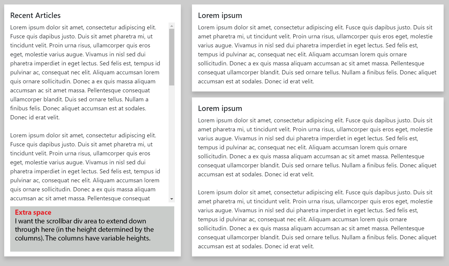
So I'm using Bootstrap 4 with two columns. The two columns currently match each other in height, but I will have so much content in the left column that I'll need a scrolling div whose height spans the rest of the container. The issue I'm running into is that it's currently within a column div whose height is set to 100% (which makes it match the other column).

As a sidenote, this class only has a max-height set in the fiddle so that it doesn't stretch the left column, which already matches the height of the right:

.recent-articles-list {
    max-height: 30rem;
}

Any help would be much appreciated, thank you! I have a feeling it might be something simple, but I haven't been fruitful in my research. (I've tried solutions using absolute positioning, setting height to 0/1px...)

JSFiddle: http://jsfiddle.net/3zeh7af4/

(Do note that the viewport has to be above 1200px to see what I'm talking about.)

Added image for desired effect:

Example of desired effect

lahu
  • 51
  • 1
  • 5
  • 2
    It's a bit unclear to me what you are trying to achieve. Can you clarify, what are you trying to do, where you are failing, and what it should the end result look like when done correctly? That will be helpful. Thanks. – Roy Scheffers Aug 07 '18 at 18:25
  • Hi @RoyScheffers, I apologize for the confusion -- I had difficulty wording it. I added an image that shows the current example in the JSFiddle. I can't use a fixed height for the scrollbar div, because it needs to be variable to the content in the right column, but I can't set a percent because the column on the left already uses a height of 100%, therefore the scrolling div would simply push the left column content down continuously. I hope that makes a little more sense. Thank you! – lahu Aug 07 '18 at 18:50
  • 1
    @lahu What do you expect to happen when the content on the right exceeds viewport height? – Carol Skelly Aug 07 '18 at 18:52
  • Hi @Themes.guide -- The JSFiddle shows an example of when the content exceeds the viewport height, so I'm not sure what you mean. I will have another row below this content. – lahu Aug 07 '18 at 18:59

2 Answers2

2

What you seem to be asking for is to shrink the height of the left column, to match the height of the right, and then scroll any overflow in the left column which is this: https://www.codeply.com/go/UTOSeASfnt

.recent-articles {
    flex: 1 1 0;
    overflow-y: auto;
}

.recent-articles-list {
    overflow-y: auto;
}

However, IMO, that layout doesn't work well since the user must scroll the body of the entire page in order to see all content in the left column (when the content on right is taller than the viewport). The question doesn't explain what you expect to happen when the content on the right is taller than the viewport.

A better solution is to create a full-height layout, and then have the 2 sides scroll independently. You can do this by making the left side fixed or sticky as shown here...

Sticky left column:

.mvh-100 {
    height: 100vh;
}

.recent-articles {
    overflow-y: auto;
    position: sticky;
    top: 1rem;
}

.recent-articles-list {
    overflow-y: auto;
}

<div class="container-fluid body-container">
    <div class="row">
        <div class="col-xl-5 py-3">
            <div class="shadow recent-articles bg-white mvh-100 p-3">
                <h5>Recent Articles</h5>
                <div class="recent-articles-list">
                    ...
                    ...
                </div>
            </div>
        </div>
        <div class="col-xl-7 py-3">
            <div class="row">
                <div class="col-xl-12 shadow">
                    ...
                </div>

                <div class="col-xl-12 shadow">
                    ...
                </div>

                <div class="col-xl-12 shadow">
                    ...
                </div>
            </div>
        </div>
    </div>
</div>

https://www.codeply.com/go/cNfS3EOQdV

Fixed left side:

Another option is to make the left side position:fixed, but it's more complex as it requires calc to adjust for spacing.

https://www.codeply.com/go/AqFxOD8gst


Related: Fixed and scrollable column in Bootstrap 4 flexbox

Carol Skelly
  • 351,302
  • 90
  • 710
  • 624
2

What I understand from your problem depiction is that you want left column to be exactly same as right even if right column height is varying, and off course for left column to have scroll you need to fix it's height so you have done.

.recent-articles-list { max-height: 30rem; }.

if that's the case, the good solution for this situation is the code below

.recent-articles {
  background-color: #fff;
  padding: 1rem;
  height: 100%;
  position: relative;
}

.recent-articles-list {
  padding-right: 1rem;
  position: absolute;
  top: 50px;
  left: 0;
  right: 0;
  bottom: 0;
  overflow-y: auto;
}
Jitendar
  • 497
  • 2
  • 5
  • 11
  • I initially had issues with using relative/absolute when I tried it, but this worked for me! I was able to easily add media queries for smaller screen sizes, too. Thank you so much! – lahu Aug 07 '18 at 20:26