browser zoom is not the same as different screen sizes.
You can compare it to an image you want to print out.
If you'd use a magnification glass the image appears to be bigger than it really is but the physical size is still the same.
If you would instead print it on a bigger piece of paper it would actually be bigger.
For responsive design you I don't thing that the zoom is going to be of any help.
The dev tools are a better use for this as you can resize the website however you want.
Firefox for example also offers some settings emulating real screen sizes.
I would encourage you to use Firefox since the dev tools are just awesome.
Here are some screens showing how you can test your responsive design in Firefox.
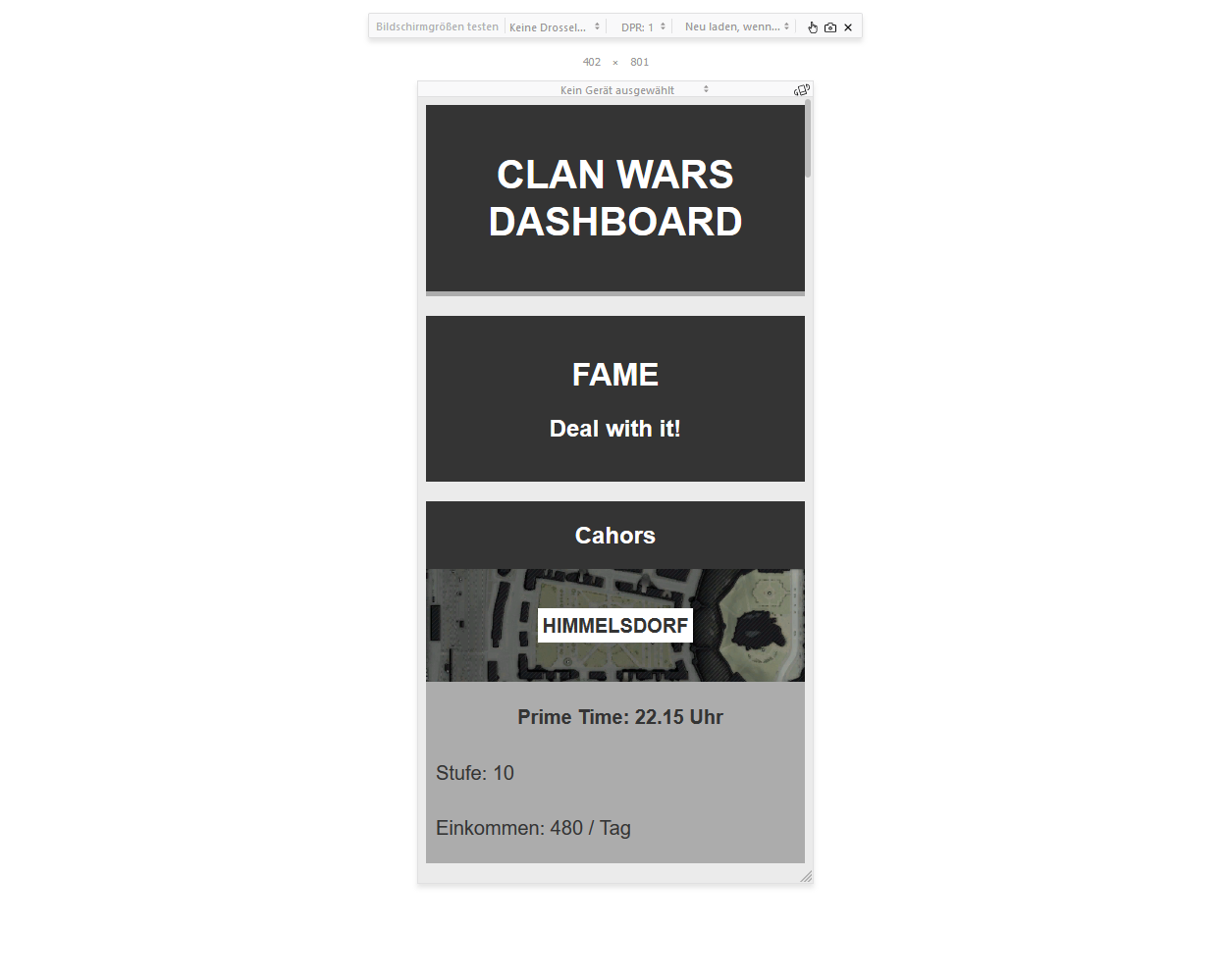
 custom resolution
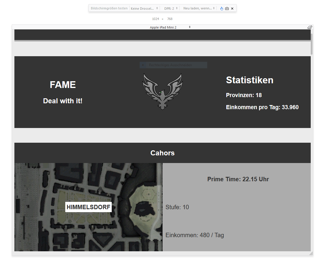
 emulating iPad Mini 2 screen
If you would like to create responsive designs I would also encourage you to have a look at CSS Grid since it makes building repsonsive websites really easy.
Link to Firefox Dev Tools: [LINK]