I am playing around with custom Buttons by defining different states in a StateListDrawable and setting it as the background on a Button.
I realized that when these different states contain png images as their background, the default AppCompatButton behavior (pull up animation, shadow etc.) gets deactivated, just leaving the plain images for the different states.
But when I use the same StateListDrawable with xml shapes (example at the bottom), it keeps the default Button behavior. Why is that?
StateListDrawable:
<?xml version="1.0" encoding="utf-8"?>
<selector xmlns:android="http://schemas.android.com/apk/res/android">
<item
    android:state_pressed="true"
    android:drawable="@drawable/button_pressed" />
<item
    android:state_enabled="false"
    android:drawable="@drawable/button_disabled" />
<item
    android:drawable="@drawable/button_default" />
</selector>
Example for an xml shape:
<?xml version="1.0" encoding="utf-8"?>

<shape xmlns:android="http://schemas.android.com/apk/res/android" android:shape="rectangle">
    <gradient
        android:startColor="#00CCFF"
        android:centerColor="#0000CC"
        android:endColor="#00CCFF"
        android:angle="90"/>
    <padding android:left="7dp"
        android:top="7dp"
        android:right="7dp"
        android:bottom="7dp" />
    <stroke
        android:width="2dip"
        android:color="#FFFFFF" />
    <corners android:radius= "15dp" />
</shape>
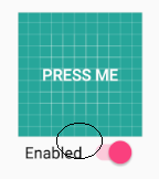
Screenshots:
For testing purposes I just took the launcher icon background as the button image. You can see that if I choose the launcher image as the background, the button loses it's shadow and pull up animation. But when I use an XML shape as the background, it keeps both.
