0

I have a stacked bar char where I want to add a dynamic threshold line. The threshold is calculated via a simple formular (90% of each specific value)

Graphic attached. The green line is what I am looking for. Looking forward for any idea how to approach this problem.

enter image description here

Random Cotija
  • 613
  • 1
  • 10
  • 26
ProjektWeinheim
  • 201
  • 3
  • 10
  • 2
    Please provide your attempts so far. – nicoco Jul 04 '18 at 12:31
  • threshold = [0.8, 0.6, 0.5, 0.8, 1.0, 0.5, 0.7, 0.8] ax.plot([0, 7], [threshold, threshold], "k--") - adds 8 lines over the chart – ProjektWeinheim Jul 04 '18 at 13:01
  • please post how your data is structured, ie do you plot from numpy arrays, or a pandas dataframe, ...? So that answers can start from this common base. – SpghttCd Jul 04 '18 at 18:55
  • just for sake of completeness please clarify if threshold is at 80% (from legend) or 90% (from question text) - in the end it doesn't matter as a parameter in the code – SpghttCd Jul 05 '18 at 12:03

2 Answers2

2

Here is what I came up with:

The idea was to have a continuous segment of Xs projected with a constant y value with a 0.5 excess before and after:

import numpy as np
import matplotlib.pyplot as plt

groups = 9

X = list(range(1, groups))
y = [1, 1, 2, 2, 1, 2, 1, 1]

threshold_interval_x = np.arange(min(X) - 0.5, max(X) + 0.5, 0.01).tolist()

threshold_y = []
for y_elt in y:
    for i in range(0, int(len(threshold_interval_x) / (groups - 1))):
        threshold_y.append(y_elt * 0.9)

plt.bar(X, y, width=0.4, align='center', color='yellow')

plt.plot(threshold_interval_x, threshold_y, color='green')

labels_X = ['PD', 'PZV', 'PP', 'FW', 'BA', 'IA', 'EA', 'NA']
plt.xticks(X, labels_X, rotation='horizontal')

plt.show()

And here's the output:

Output

Mehdi
  • 765
  • 9
  • 19
0

You could use matplotlibs step-function for this:

import pandas as pd
import matplotlib.pyplot as plt

supposed your data is structured like this:

df = pd.DataFrame({'In': [1, 1, 1, 2 , 0, 2, 0, 0], 'Out': [0, 0, 1, 0, 1, 0, 1, 1]}, index=['PD', 'PZV', 'PP', 'FW', 'BA', 'IA', 'EA', 'NA'])

     In  Out
PD    1    0
PZV   1    0
PP    1    1
FW    2    0
BA    0    1
IA    2    0
EA    0    1
NA    0    1

Then plotting the bars would be

df.plot(kind='bar', stacked=True, rot=0, color=['gold', 'beige'])

and plotting the threshold line at 90% of the sum would be

plt.step(df.index, df.sum(1) * .9, 'firebrick', where='mid', label = 'Ziel: 90%')

add legend:

plt.legend()

leads to:
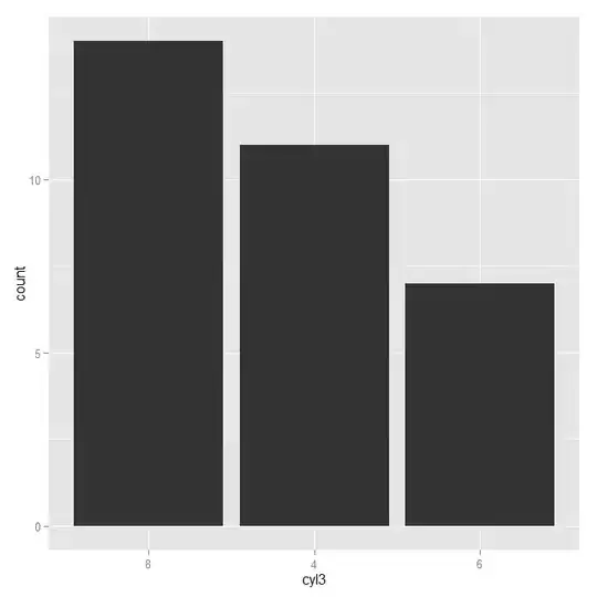
enter image description here

SpghttCd
  • 10,510
  • 2
  • 20
  • 25
  • Hi, very weird. I 100% copy & pasted your code, and my result is: https://preview.ibb.co/k75UWd/330_EEA37_C0_F7_402_B_A465_AEC1_B5_A07_B1_E.png – ProjektWeinheim Jul 05 '18 at 12:38
  • I assume with 100% you mean including definition of df, not applying my plotting to your dataset. Could you check the output of df and df.sum(1)? Do they have the same index columns? and if so, is python, pandas and matplotlib up to date? – SpghttCd Jul 05 '18 at 19:18