14

Sorry if I duplicate a question - didn't find any information about my problem.

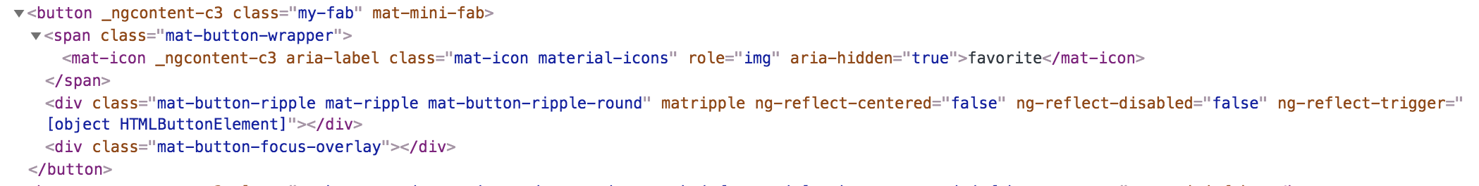
I'm using angular 6 with material design. I need to change size of a button mat-fab-mini and icon inside it. At inspect tool html presented with such way:

enter image description here

To change size I used following code, but it doesn't make smaller size of icon inside the button:

html

<button mat-mini-fab class="my-fab">
    <mat-icon aria-label="favorite">favorite</mat-icon>
</button>

scss

.my-fab {
    width: 20px;
    height: 20px;
    line-height: 16px;

    .mat-button-wrapper {
         padding: 2px 0 !important;
         line-height: 16px !important;
         width: 16px !important;
         height: 16px !important;

         .mat-icon {
              font-size: 16px;
              padding-right: 4px;
              line-height: 16px;
          }
    }
}

And here is result:

enter image description here

Attributes of .mat-button-wrapper doesn't change at all. Icon is at the bottom of button and size of icon didn't change. How can I change the size of icon at material2 to avoid it?

Merge-pony
  • 1,668
  • 3
  • 18
  • 32

10 Answers10

17

Alright, I found solution. It's really hard to change inherit properties in angular material 2 components. To do that in my situation I should do as answered here (already plused :D )

So in my code I made following changes in scss:

.my-fab {
     width: 20px;
     height: 20px;
     line-height: 14px;
     font-size: 14px;

     &::ng-deep .mat-button-wrapper{
         line-height: 14px;
         padding: 0;

          .mat-icon {
              font-size: 14px;
              padding-right: 4px;
              padding-top: 4px;
          }
    }
}

And now everything looking great. If you know better and proper way to change size of mat-fab-mini and icon inside it - answer here, if it work I'll mark it as correct answer. Otherwise I'll mark my answer as correct after 2 days.

Merge-pony
  • 1,668
  • 3
  • 18
  • 32
  • 6
    using ng-deep is not the best solution (deprecation) – tprieboj Dec 19 '18 at 09:48
  • 1
    ng-deep is deprecated, but currently, there is no designed replacement to achieve the desired goal (https://angular.io/guide/component-styles). This is the quote: "The shadow-piercing descendant combinator is deprecated and support is being removed from major browsers and tools. As such we plan to drop support in Angular (for all 3 of /deep/, >>> and ::ng-deep). Until then ::ng-deep should be preferred for a broader compatibility with the tools." – Yennefer Jan 02 '19 at 11:50
  • @Yennefer instead of using `ng-deep`, you should use a class, like 'my-smaller-fab', and set your style in `styles.scss`. That makes a generic style, reusable by any other componant, just by using your custom class. – Random Nov 12 '22 at 20:34
9

Quick and easy :)

<button mat-mini-fab color="primary" [ngStyle]="{transform: 'scale(0.8)'
              }">
   <mat-icon>cloud_download</mat-icon>
</button>
Whisher
  • 31,320
  • 32
  • 120
  • 201
  • works great though i don't see why you use ngStyle in here since there's nothing dynamic – gil Jan 18 '22 at 05:51
6

I succeeded this way :

html

<button mat-mini-fab color="basic" class="button24">
  <mat-icon class="icon24">attach_file</mat-icon>
</button>

css

.button24 {
  background-color: #eee;
  width: 24px;
  height: 24px;
}
.icon24 {
  font-size: 16px;
  margin-top: -8px;
}

JPM

JPMous
  • 343
  • 5
  • 12
4

The root cause for this problem is that the icon is an inline element.

So the clearest way to resize the icon is to change it to a block element:

HTML

<button mat-raised-button>
  <mat-icon>create</mat-icon>
</button>

CSS

button {

      mat-icon {
        display: block;
        width: 128px;
        height: 128px;
        font-size: 128px;
        line-height: 128px;
      }
    }
maimArt
  • 389
  • 1
  • 11
4

You can try scaling the mat-mini-button without messing around the font and positioning. See below for an example.

HTML

<button mat-mini-fab>
    <mat-icon>favorite</mat-icon>
</button>

CSS

button[mat-mini-fab] {
 transform: scale(0.7) !important;
}
Michael Seltene
  • 543
  • 1
  • 5
  • 17
2

From my experience of messing with the styling for angular material components, I can say that their styles are deeply nested and almost all the times the hierarchy is such that whatever code you write targeting the classes on the elements, does not work.

However, when it comes to the icons, there is a simple solution. Use the <i> tag and meaningful material classes instead of <mat-icon>

<button mat-mini-fab class="my-fab">
  <i class="material-icons md-18" aria-label="favorite">favorite</i>
</button>

In the above code, class md-18 defines the font size of the icon to be 18 pixels. you can also use md-24, md-36 or md-48 which are all predefined classes in the material framework. If you want a custom size you can target the <i> tag inside your button with my-fab class in css and change its font size like below

.my-fab i {
  font-size: 15px;
}

hope this helps!

rgantla
  • 1,926
  • 10
  • 16
  • Note: the `md-18`, `md-24`, `md-36` and `md-48` are **not** included with Google's Material Icons. You have to declare them yourself. – Edric Jul 03 '18 at 15:10
  • @rgantla, unfortunately it didn't help. that `span class="mat-button-wrapper"` always overrides `line-height` whatever attributes I've provided. I don't know how to fix. Seems this `span` creates by `mat-mini-fab` – Merge-pony Jul 04 '18 at 07:46
0

Worked for me

HTML

  <button mat-fab>
    <mat-icon class="md-36" inline aria-label="Home button">
      home
    </mat-icon>
  </button>
  <button mat-fab>
    <mat-icon class="md-48" inline aria-label="Up button">
      expand_less
    </mat-icon>
  </button>

CSS

.material-icons.md-18 {
  margin-top: -3px;
  font-size: 18px;
}
.material-icons.md-24 {
  margin-top: -3px;
  font-size: 24px;
}
.material-icons.md-36 {
  margin-top: -3px;
  font-size: 36px;
}
.material-icons.md-48 {
  margin-top: -4px;
  font-size: 48px;
}

The icons are properly centered and the wrapper div doesn't overflow the fab/button Not too elegant I guess

0

My solution to use a smaller edit button in titles (SCSS):

h3 > button {
    width: 1.8rem !important;
    height: 1.8rem !important;
    line-height: 80% !important;

    .mat-button-wrapper {
        padding-top: 0.4rem !important;
        line-height: 80% !important;
    }

    .mat-icon {
        width: 80%;
        height: 80%;
        font-size: 80%;
    }
}

Template:

<h3>
    Title
    <button mat-mini-fab color="primary" class="ml-2" title="Edit" (click)="edit()">
        <mat-icon>edit</mat-icon>
    </button>
</h3>
Spikolynn
  • 4,067
  • 2
  • 37
  • 44
0

seems like to get the button size changed, we have change 1.button size 2. span which is wrapper for icon and 3. size of included icon as well. Also create a mixin in your global style.scss file as below so that it can be reused for different sizes.

@mixin change-button-size($btnsize,$fontsize) {
    height: $btnsize;
    width: $btnsize;
    line-height: $btnsize;
    span{
        height: $btnsize;
        padding: 0px !important;
        i{
            font-size: $fontsize;
        }
    }
}
.mat-mini-fab.mdb-30{
    @include change-button-size(30px, 15px);
}
.mat-mini-fab.mdb-40{
    @include change-button-size(40px, 20px);
}
Anoop Isaac
  • 932
  • 12
  • 15
0

I have faced similar issue for mat fab icon with text. actually there is a simple solution is there without using ng deep which is deprecated

  .my-custom-fab-button {
        display: flex;
        align-items: center;
        justify-content: space-around;
   }

and for icon

.mat-icon-button {
           line-height: 1;
                 }

and if you are using mat fab icon with text content(round button) then you can use like

.my-fabbutton-with-text {
    width: 50px;     //for the outline
    height: 50px;    // for the outline
    font-size: 14px; //for the text in icon
    display: flex;
    align-items: center;
    justify-content: space-around;
      }

hope it help some one

S Wizard
  • 21
  • 4