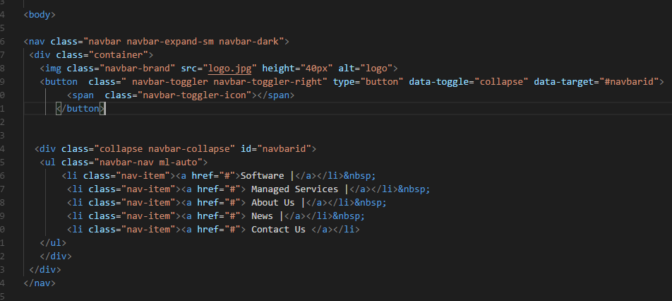
I want to show the bootstrap navbar Hamburger at md(992px) Screen. Below is my code.
What should I do?
I want to show the bootstrap navbar Hamburger at md(992px) Screen. Below is my code.
What should I do?
Try changing the behaviour of "collapse" or "navbar-collapse" classes. Though it's not recommended because those are bootstrap classes. You should encounter a @media command in the CSS code, there specify your desired pixels. Hope it helps!
By default, nav collapse at 992px. Override it to whatever size you want it collapse. However, it is better to customise the source code of Bootstrap, but i am not sure if there is a specific break-point variable for navbar-collapse.
I copied this code from Bootstrap.css. You need to put it in your custom CSS.
@media (min-width: 992px) {
  .navbar-expand-lg {
    -ms-flex-flow: row nowrap;
    flex-flow: row nowrap;
    -ms-flex-pack: start;
    justify-content: flex-start;
  }
  .navbar-expand-lg .navbar-nav {
    -ms-flex-direction: row;
    flex-direction: row;
  }
  .navbar-expand-lg .navbar-nav .dropdown-menu {
    position: absolute;
  }
  .navbar-expand-lg .navbar-nav .nav-link {
    padding-right: 0.5rem;
    padding-left: 0.5rem;
  }
  .navbar-expand-lg>.container,
  .navbar-expand-lg>.container-fluid {
    -ms-flex-wrap: nowrap;
    flex-wrap: nowrap;
  }
  .navbar-expand-lg .navbar-collapse {
    display: -ms-flexbox !important;
    display: flex !important;
    -ms-flex-preferred-size: auto;
    flex-basis: auto;
  }
  .navbar-expand-lg .navbar-toggler {
    display: none;
  }
}
In <nav class="navbar navbar-expand-sm navbar-expand-md navbar-dark"> add one more class navbar-expand-md for the md devices. Now it will work.