I'd like to use CSS Grid. Something like this I think…
html {
height: 100%;
}
body {
min-height: 100%;
display: grid;
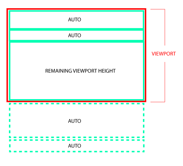
grid-template-rows: auto auto [whatever's left of the vh] auto auto;
position: relative;
}
I'd like to use CSS Grid. Something like this I think…
html {
height: 100%;
}
body {
min-height: 100%;
display: grid;
grid-template-rows: auto auto [whatever's left of the vh] auto auto;
position: relative;
}
Set the viewport with display: flex and height: 100vh and add to the last element
flex-grow: 1
.viewportDiv {
  display: flex;
  flex-direction: column;
  height: 100vh;
}
.div1{
  background-color: yellow;
  height: 100px;
}
.remainingDiv{
  background-color: red;
  flex-grow: 1;
}
<div class="viewportDiv">
<div class="div1"></div>
<div class="remainingDiv"></div>
</div>
Using CSS Grid you need to wrap the top two elements and the remaining space and then apply display: grid to that.
In other words, your diagram actually was the solution.
The wrapper should have a height of 100vh…
html {
  height: 100%;
}

body {
  margin: 0;
  min-height: 100%;
  background: pink;
  display: grid;
  grid-template-rows: 100vh auto auto;
  position: relative;
}

.wrapper {
  display: grid;
  grid-template-rows: auto auto 1fr;
}

header {
  background: green;
  padding: .25em;
}

nav {
  background: orangered;
  padding: .25em;
}

main {
  background: rebeccapurple;
}

footer {
  background: yellow;
}

.subfooter {
  background: blue;
}
<div class="wrapper">
<header>
Lorem ipsum dolor sit amet consectetur adipisicing elit. Ratione magnam placeat quia iusto, quisquam cum temporibus modi, ex dolorem velit fuga! Minima, ex.
</header>
<nav>
Lorem ipsum dolor, sit amet consectetur adipisicing elit.
</nav>
<main></main>
</div>
<footer>Lorem, ipsum.</footer>
<div class="subfooter">Lorem ipsum dolor, sit amet consectetur adipisicing elit. Ex dignissimos ratione maxime officia eum. ea!
</div>
You can do it using flex.
.a {
  width: 100%;
  height: auto;
}

.remaining {
  width: 100%;
  flex-grow: 1;
}

.holder {
  display: flex;
  flex-direction: column;
  height: 100%;
}

html,
body {
  height: 100%;
}
HTML code:
<div class="holder">
  <div class="a">
   Content here
  </div>
  <div class="a">
    Content here
  </div>
  <div class="remaining">
    Content here
  </div>
</div>