0

I believe this was possible with Bootstrap 3, but am unsure as to how to implement the following with Bootstrap 4 (4.1).

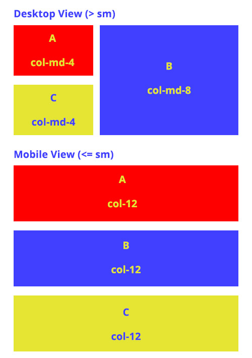
I would like a column with C beneath A and another column with B, but on mobile, display ABC. See the example image below.

Example

Thanks!

Michael Benjamin
  • 346,931
  • 104
  • 581
  • 701
DanielRH
  • 75
  • 1
  • 9
  • Please post the code in the question. As explained in the duplicate answer, you need to disable the flexbox responsively and float cols. https://www.codeply.com/go/RYDUXOFUgY – Carol Skelly Apr 23 '18 at 09:47

1 Answers1

1

I don't think that the ability to insert 'B' between 'A' and 'C' when the screen size shrinks is supported by Bootstrap out-of-the-box.

However, it works nicely with a bit of custom CSS. This solution requires that the container (i.e. row) have a defined height.

.pull-up {
  top: -50%;
}

.split-row-1 {
  height: 100%;
}

.split-row-2 {
  height: 50%;
}
<script src="https://code.jquery.com/jquery-3.3.1.min.js"></script>
<script src="https://stackpath.bootstrapcdn.com/bootstrap/4.1.0/js/bootstrap.bundle.min.js"></script>
<link href="https://stackpath.bootstrapcdn.com/bootstrap/4.1.0/css/bootstrap.min.css" rel="stylesheet" />

<div class="row" style="height:50px;">
  <div class="col-12 col-md-4 split-row-2" style="background:red">A</div>
  <div class="col-12 col-md-8 split-row-1" style="background:blue">B</div>
  <div class="col-12 col-md-4 split-row-2 pull-up" style="background:yellow">C</div>
</div>
Jake Reece
  • 1,140
  • 1
  • 12
  • 23