I want to make my cards have fixed size, but they fit all types of screens.
Currently they are fixed size, but on smaller screens they are getting one over the other, I want them to fit on the screens.
1920x1080px:
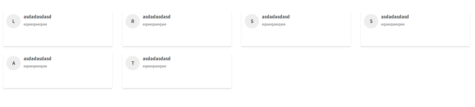 Here is correct, but on screens larger than this, there could be more cards per line.
1366x768px:
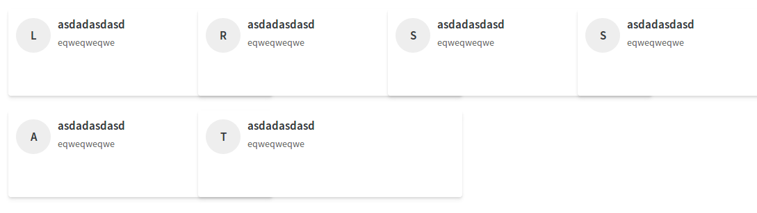 Here it is wrong, it can be only 3 per line.
<div class="row">
    <section class="catalogos">
        <div class="catalogo">
            <div class="col-lg 3 col-md-3 col-sm-12 col-xs-12" ng-repeat="sistema in $ctrl.sistemasFavoritos | filter:search">
                <div class="panel catalogo-item">
                        <div class="media-left media-middle">
                            <div class="catalogo-item-icone-conteudo">
                                <a href="{{sistema.url}}" target="_blank">{{ sistema.nome.substring(0, 1) | uppercase}}</a>
                            </div>
                        </div>
                        <div class="media-body">
                            <h4 class="media-heading">
                                <a href="{{sistema.url}}" target="_blank">{{sistema.nome | uppercase}}</a>
                            </h4>
                            <p>{{sistema.descricao}}</p>
                        </div>
                        <div class="media-right">
                            <a ng-click="$ctrl.removeFavorito(sistema)" class="fa fa-star yellow"></a>
                        </div>
                </div>
            </div>
        </div>
    </section>
</div>
css:
 .catalogo-item {
    height: 100%;
    width:100%;
    max-width: 380px;
    max-height: 125px;
    min-width: 380px;
    min-height: 125px;
    padding: 10px;
}